Exercise: Illustrating Visual Space.
Using the images of : A Tree, A Child running or walking and a Building in black and white upon a square format. The exercise using the ability to use the same image/s in various sizes against each other.
How does your sense of the image and its meaning change when the figure is smaller than the other elements?
By placing in various sizes and locations on the base square and integrating a horizon on some occasions I was able to create some interesting and visual stories. From using the largest to the smallest in the three subjects allowed me to investigate how the sizes and positions can completely change and direct the story of the images. By using larger sizes against the smaller images it allows dominance of the image to convey what is important in that scene. If I use one of the smallest of the images against the two largest images it then dictates that the story is actually about the smallest image, the sense of surrounding and enclosed smaller space draws the smallest image to the front rather than distract.
 |
| Here we have the largest tree and largest building. The child is the smallest. In position the figure is central, higher on perspective on the format. No sense of horizon or grounding apart from the building and tree being foreground. But the child, is she in the foreground too? Without implanting the horizon we can look at this and be undecided what the story is. Who is most important, the tree, the building or the child? The child maybe considered the most important in terms of automatically as the item we are most comfortable with or is she important because she is above the other items? Would it be the same if the building and tree was small too? I think it would. We would always pro forward the child as important out of the three even if subconsciously. |
If the elements are at differing angles to each other and at an angle to the frame, what dynamic is suggested?
Using a base format and having the ability to maneuver the pieces around and in size it can lead to some confusing and stimulating pieces. Working on the basis of not presenting a fixed horizon or a fixed up or down I can position the items freely. Using variants of the sizes allows me to see how they work and how they feel. Approaching the images into different angles makes the work look chaotic but the most exciting.
 |
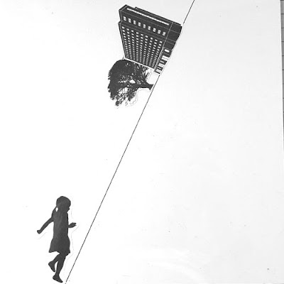
| The tree is angled, are we laying down looking up from the floor? The building is tilting too, inverting into the image and the child is running across the top, but only if we consider this the top! If you look at it from either side of the image it makes no sense but some sense to one or more of the images. The chaotic but thrilling twist of not knowing what is correct lets there be two major situations occur. A). The dominance of one item is irrelevant in size, all three are absorbed and noted. B). The story rotates around, is the girl running to the tree? IS the girl running away from the building? Is the building encroaching on the tree? Is the Tree feeding out into the building and the girl? A successful image selection which could easily be adapted for many illustrative formats. |
If all the elements are completely horizontal or vertical to the frame what dynamic is suggested? What is your opinion about this image and what sensation does it communicate?
By creating a horizontal line and using this to guide the images, it automatically creates foreground and back ground and gives the viewer a complete sense of size, proportion and what is moving in the picture. By using a vertical line, we find the same feeling of movement and direction, I think this is because we automatically let our brains fill out the missing spaces and position what is close by and what is afar, this allows us to predict how close or what distance is between the items.
 |
| Using the horizontal line lines the image into a sense of proportion. The child is small, the building i large the tree is medium, however as we have used a line we automate the building is humongous in size, the child is running in the foreground and is the correct size, the tree is a huge tree but is far away on the horizon. Using the line whether vertical or horizontal lets us predict what we are looking at and where it is in our version of reality.If we take the lines away we would see a building floating above a child. |
Which is your favourite composition? Explain why you feel it is most successful.
Once I had got an array of sizes in each image I had an extensive few hours experimenting with them. I used the suggestion of a horizontal and a vertical line. My most intriguing piece came from make a diagonal line across the format and using that as an horizon. I found the story was obtainable from both views.
 |
| The tilted horizon, The mirror is not of the building but of the child and the tree. It almost states the building is hiding these beneath, or that it is replacing them. The sizes tell us the girl is in the foreground of the horizon and is running to the tree in the distance, the building dominates the two and we wonder why is it over powering the human and nature. Is the story these have what has escaped from the building? I think this image is my favourite for being so different and a complete play on the sizes and stature of the three images. |
Exercise: Illustrating Visual Space - course work
 |
| Using various sizes. |
 |
| Using various sizes. |
 |
| Using various sizes. |
 |
| Using various sizes. |
 |
| Using various sizes. (using one item to dominate the two others). |
 |
| Using various sizes. (Overlaying and predictive positioning). |
 |
| Using largest images. (overlaying in terms of relevance to the story). |
 |
| Introducing lines. (Horizontal and vertical). |
 |
| Horizontal line. Smallest image against largest in the fore ground. |
 |
| Experimenting with the horizon. Which way is up? |
 |
| Testing a diagonal line, creates a sense of confusion as we fight to stabilize what we see and try and rationalize how it should be. |
 |
| Experimenting with only seeing partial imagery of the three items. |
 |
| Using the horizon. Predictable positioning. |
 |
| Using the Horizon. Largest building and tree, but partial use of the tree makes it somehow look in proportion. |
 |
| Using various sizes on an horizon line. |
 |
| Diagonal line is the girl falling or is the world sliding? |
 |
| All items centrally gravitating, All three are automatically looked at from the centre outwards. |
Exercise: Illustrating Visual Space. - (learning log)
I found this exercise very positive in terms of learning a new skill, using the different sizes and plain format lets me value the images in the picture and their importance in terms of presence and size. The integration of the horizon allows for me to create even more scenes but the lack of horizon means I can use perception to tell the story and focus on the three images and which is important.
I found the best solution to creating images is to copy and create various sizes. I found my images online and sized as: 100%, 85%, 65%, 50%, 35% and 25%. I then cut the images out and layered onto a 8 x 8 inch white card. Using a large piece of acetate I overlaid this to keep the images in place and took photographs. This allowed me to experiment easier and also step back and come back to second look and know the images have not moved or changed.
Exercise: Reading an Image.
Looking at the illustration by Mark Oliver and breaking the image down into the constituent parts, which dissects the image and like a recipe lists all the ingredients which make the whole. The first item we see is the dragon, the chair and treasure, the cave, the children, the warrior armory, the floor, the claws, the flame and the colours.
What the image is about. What is it saying?
There is a story behind this image immediately. The first things we see leads to questions. Why are the children in the cave? Why has the dragon got all the treasure? what happened to the people who wore the armory? Is it night time? Is it deep in a cavern? Why is there a chair? Is the dragon fierce? Are the children in danger?
To me, the image is saying and asking all these things, rather than just tell the story it is letting you create the story from the questions too, which a good illustration should do, as that is one of the main purposes of an image.
 |
| The original piece by Mark Oliver. |
Work out the narrative and identify the story.
The illustration projects the story half way through, first the dragon has belongings, this must be the beginning or part of the story as is the armory on either side of the sleeping dragon. From this we can think: The dragon has killed many soldiers or hunters, we can see by the armory it is medieval times or folklore set. The dragon is asleep, this is his home. It is in a cave or cavern, which is dark. There is riches which the dragon protects, at this point we do not know is he protecting them because he owns them, or is he protecting what he has gained? The children are with a torch, the second child is pointing to the exit, they should not be there. The first child is brave and points to the dragon. At this moment from the picture we do not know why they are there but if we look closely, the dragons tail is pointing too!
Describe the palette and tonal range which has been used. Note if the colours are hot or cold, whether the elements are detailed or textural and where these approaches are used.
The colours used to enhance the image help tell the story too. The red tones and yellow tones help to dominate the importance of certain parts. The red dragon, He is almost solid red to engage us with the thoughts of heat and danger, the use of white and black for his horns and teeth against the red allow us to see this immediately. The red blending to yellow on the cavern ceiling first softens the red towards the children suggesting these are less of a danger but the warm tonal offer them as important too and integral. The combination of the highlighted yellow and red on the children's faces and hands lets us depict the situation and their body language as one of the first things we ascertain. There is clever use of the bright green, this is a warm green due to its hue, we see it straight away, the chair, and the same tone is used to colour the child at the front, is there a link between these two parts. I think there is. The cool colours are used to exaggerate the cave and the dankness, the darker parts are used to cast the shadows and the ceiling depth. The hints of green on the armory reflect these items to us to know they are prominent in the back story. Textural effects have been used for the cave floor, suggesting the cold stone, and the ceiling texture echos this. There is not much texture on the dragon a slight amount on the side to show some effect of scales. The image is also reflective at an angle so it is balanced, the warm colours central and the same amount of green is used and blues.
 |
| Here we see the balance of colour and the reflection of the warm colours against each other and the dominance of the two is similar though in fact the dragon is larger, the presence of the children shows similar importance. |
 |
| Here I have marked some of the parts of the image that help convey the story. 1.There is the warm tones from the torch, this draws us the the children. 2. The use of texture and darker cool colours to echo the shadows and the coldness of the cave. 3. The green chair, it has its own sign, the dragon tail points to the seat. 4. The neutral black and white for the dragons horns. Good or bad dragon? 5. The dark cool blues with the hot solid red and white against it, the dragon is dominant to this story. |
Is there any connection between hot colours and the importance of the element in telling the story?
The choice of what the colours are an assistance in telling the story. I would think as humans our autopilot would always draw our eyes to what is red first, this as a natural reaction as we are set to associate red with danger or of high importance. I think the use of the hot colours here reflects two things, the first is that it shows us the dragon as integral to the story and then it shows us the radiant from the children which also shows their importance, the tones make us think the children are of no danger, as the use of a lot of warm yellow is added and the basis of their bodies is in cooler colours. The second thing is colours make us associate with temperature, the hot reds against the cool shades make us associate the walls and floor as being a cold place. Both these factors of the use of colour help us fill these parts in quite quickly.
Begin to identify the hierarchy within the image. Which are the most important elements in terms of carrying the narrative or conveying the ideas and how have these been treated?
As previously suggested, I think the importance of the green chair is what this story is about, the dragon surrounds this, in terms of colour the red envelopes the green, the green used is not a cool or neutral green it is bright and vivid. I think the lesser detail on the back side of the dragon is purposeful so we look at the centre of the dragon where the treasure and chair sits. The children are important to this part of the story, with the use of colour we can see this by the warm tonal shades surrounding them, they eye draws down to them and we look at the way the main figure is pointing to the chair/dragon. By adding hints of the green to the armory this echos that secondary they are slightly important to what the story is, more important than the floor or walls or the back of the dragon as we can see detail and colours. The use of the darker shade of blue has been used on parts that useful to the story, we see this used to make the armory stand out, the shadow around the dragon, the cave mouth, the children. The use of the dark against the other colours subtlety brings these into the picture so we look at them but know they are not the first thing of importance in the image.
Exercise: Reading an Image - Course work.
To understand the options of colours I looked at a basic version of warm and cool colours. When you do this you can clearly see against the illustration my Mark Oliver how he is been very clever and used a sample of three or four basic warm and cool colours. This has kept the illustration simple and clear.
 |
| You can see on this colour wheel the way the illustration uses the colours. From the warm side we have the dark red, the yellow and the green. From the cool side we have the dark blue, the light blue and the purple. Some colours or tones are difficult to suggest if they are warm or cool as I think it depends on their accompanying colours. EG: Black, white and brown. It would depend on the brown how much red it held too. |
 |
| Here the illustration has been converted to black and white. What do you look at first? It still lets the story but we tend to look all over the picture. The children do not stand out so much. There is detail in the chair. The dragons horns are quite prominent too! |
Exercise: Reading an Image. - (learning log)
Learn this technique is not only useful for creating but also useful for deciphering other works. Often I use colour as what suits my mood and not what is correct for that particular image, subconsciously I would suspect we select the right tones but this will definitely enhance using colour in illustration for me.
 |
| Learning log page - notes |
 |
| Learning log page - notes |
 |
| learning log page - notes |
 |
| Learning log page - quick sketch and breakdown of the illustration. Using it as a guide to pinpoint pieces that I notice with the use of the colours and textures. |
Exercise: Image Development
From the image, I have created 10 separate images that can show different sections of the story form the imagery. I have cut out two L shaped pieces to create a segmented frame. By laying the frame on to the image, moving the L shapes in and out and in different situations within the image I can encapsulate segments that give a different perspective. This helps break the image down and also allows me to tell a story from sections of the picture which as a whole we may completely overlook.
 |
| This is the landscape image I have used for this project. I have opted for a scene that has different elements and perspectives within it. There is foreground, action, figures, movement and a background. |
After I had created ten separate sectioned images, I found it easier to crop them down and frame them onto plain black card to focus on that particular image. I named all my pieces with consideration, looking at what elements were in that section and what it said to me. I was surprised by the words and the difference in some of them.
When the picture is broken down some sections create a dark feeling, others probe questions, some can tell a full story within it's section.
 |
| Chosen image of the section to create a poster. This piece I had named Hobo. The colours are sampled to emulate the feeling in the poster. |
 |
This is my poster. It has been taken from a small segment of the images, possibly one of the smallest from the ten. I have named the image Boho. This is because the original clipped piece reminded me of a typical derelict carriage seen in USA and what a homeless person or nomad my reside in for a short term. I used elements of colours from the carriage, trying to create a rusted iron feel and ripped edged as it is worn and used. I also overlaid the paint with the illustration using a pen and ink technique to emulate an antique feel. The black areas are created with a brush and indian ink.
The Text chosen is a loose flowing soft text. informal, brushed and soft. I chose white to reflect the importance of the word against the darkness of the carriage. |
Exercise: Image Development Course work.
Here is a selection of my imagery that I used for this project.I used the L shaped frames to highlight the section I wanted to use.
I have placed their chosen name beneath each piece.
 |
| Journey. |
 |
| Iron. |
 |
| Pause. |
 |
| Departing. |
 |
| Grey. |
 |
| Anticipation. |
 |
| Station. |
 |
| Meeting. |
 |
| Hobo. |
 |
| Waiting. |
Exercise: Image Development (Learning Log)
 |
| A selection of images ready to dissect with the L shaped frames! |
 |
| Here are the 10 sections, I framed each piece in Black to announce the section. Just as an experiment I relaid each piece to recreate the image. |
 |
| Sketch ideas for chosen Image. |
 |
| Sketch ideas for chosen Image. |
 |
| Sketch ideas for chosen Image. |
 |
| Learning Log Page Notes |
 |
Learning Log Page Notes
|
Exercise: Abstract Illustration
Via this exercise I have explored the aspects of how to understand and let yourself create an abstract piece. This is created by feelings, emotions and senses of placing movement, sound and colour into an image or set of images.
Abstract work often leaves a huge question mark over my head as it takes an in depth period to look within an image and for see whatever the artist or illustrator wanted to convey.
From the selection of suggested musicians I opted for Miles Davis. I was unfamiliar with what I would be working with and I think it was the best option to start literally from a blank canvas in influence and expectation.
I started with my first piece and let myself place lines down, It took me some considerable time to complete. I found by repeating the same piece of music and reapplying onto the work I could express the sensations with the colouring and line work.
Once done, and I felt satisfied with the piece I used the framing method to select my final option. I recreated my design on square 12 x 12 inch board and used chalk based paint pens to really emphasize the strengths of the musical piece and again I listened to the piece as I worked through the work. Some of the line work from the original is copied through to the final piece but some pieces I changed as I went as they wanted to feel smoother and slick, like the music.
I created the mock of a CD cover to see if my work would pass as an illustration. I have to be honest with myself and say it possibly wouldn't, why? I am not experienced enough in trying abstract art so I don't know if the levels I have worked at represent the sentiment enough or it is too obvious and I also understand abstract also represents what a personal opinion is, it is what is abstracted from my version of the music, it may not be suggestive enough for a wider audience. I think to look at from another persons perspective it may not message what the music is. The fluidity of the imagery I created was supposed to represent the smoothness of the music changing from quite stream like a flush of water, hence the blue from narrow to wide. I used elements such as the thumb of the musician pressing down an the red shape represents two parts, the mouth and also the hands of a saxophone player. The blocks shading from red to yellow are the peaks and troughs of the music interludes. The sharp points are the high notes and the bubbles are the back tune.
Overall, this exercise has been longer and deeper into examining how I create a piece and has been worth wile in the experience of learning a new way to create and also entering the field of abstract.
 |
| My final piece as a CD cover. I found the fluidity of the chalk paint matched the movement and context of the music piece I used. Some of the parts maybe too obvious to be classed as an abstract piece but for me this is the first experience of processing and learning within this field. |
Exercise: Abstract Illustration - Course work
 |
| This is my original piece created in my sketchbook via listening to Miles Davis. The blends of water and ink and pencil lines are all because the work was done in several stages. I found by starting and stopping and coming back to work on the piece I found a more satisfying result. |
 |
| Using a frame to depict a part of the work to recreate into another piece. |
 |
| Deciding on a selected part of my work was tricky, it was a challenge to decide which part was the most pleasing to me and still carried the overall freshness and feeling I had created in the original. |
 |
| I moved my sketchpad around at different degrees to see how the imagery reflected from a different angle! |
 |
| I looked at sections that had the fluidity and movement I wanted to represent the music. |
 |
| I found by moving the frame just slightly to one side or another it changed the central focus and looked completely different! |
Exercise: Abstract Illustration - (learning log)
Abstract: Adjective
Existing as an idea, feeling or quality, not as a material object.
|
|
This is my final piece before I created the CD cover. The blends of white to black and white to pink represent the movement of sharp keys to a soft played piece and the deep red is to show the solid sound of the brass. The White bubbles are showing the small details which you do not notice at first, but as you listed again and again, they become more apparent.
|
Exercise: Giving Instruction
Opting from the selection of suggestions in the exercise I have chosen the Title of "Getting to My House". I wanted to make a one piece diagram that would be self-explanatory to the viewer, have direction, purpose and suggest the correct hierarchy of what is the important features of the illustration. I took the considerations of what I wanted to project as the message and what I wanted the imagery to look like.
As the title "Getting to my house" conjured up an almost child like quality to what I imagined, as most adult instructions would be written words or for example a postcode and a house number. I looked at this as an opportunity to break it down to a simple dialect of images that could be followed by young and old alike in a fun and easy way.
 |
| This is my final piece for this exercise. I have used a simple clear palette. The colours I have chosen relate to the surroundings. I have grayed the buildings and the scenery out that bare little reference or importance. The red signals the direction and the importance of the buildings you may pass as does the combinations of the green and the white. (Flag on the Italian restaurant, the colours of the football club). The only selection of any format of written text is the house number to emulate an actual direction or building pinpoint.By using shades of green it simplifies the map and also holds some relevance to parts of the diagram we want to be noticed among the other parts of it illustration. |
 |
| Feedback - after my assignment, I took on board the feedback regarding this map and tried it again by scanning the image in and reworking the colours. I went back to a previous visual piece and used this one to highlight the red and soften the background colours with saturation to create a more pleasurable palette to view and follow. It does actually work much better than my final piece! This is the best part of some of the assignments as it is always the second look after a period of time that enables you to view it with a fresh and highlighted insight. |
Exercise: Giving Instruction - Course work
 |
| My very first suggestion in design was to plan the route. I depicted important items or buildings and points of interest that would arise if following the plan. I did not want to use any words if possible and wanted to depict using obvious buildings the correct path and recognizable route. |
 |
| From my research of different diagrammatic instructions I considered how I could use these methods in my map design. I looked at step by step boxes, comic strip style routing, 3D viewing and overhead views. |
 |
| I started by planning my design via my research notes and deciding on the POI along the way and using these I let them dictate what would be the best colours to use, I wanted to use a simple palette and not over elaborate the illustration. I considered reds, greys, blues, greens. |
 |
| My first main design, I have opted for black and white ink drawing. At this stage in design I have still been choosing colour ways and manipulating what to include in the design. |
 |
| First colouring test, using markers to highlight the places and areas. I have tried to minimize colouring and keep the map simple. |
 |
| I scanned the image in, polarized it and used digital enhancement to smooth my drawn lines, I have also added a very simple palette of colours. I want to make the colours lead the eye around. I have compared this to my final piece. I exchanged some of the colours, I did not settle with he negative version. It is too forceful and oppressive for a quite pleasant diagram. |
Exercise: Giving Instruction - (learning log)
 |
| Learning log page - notes |
 |
| Learning log page - notes |
 |
| Research into designs and the use of imagery in instruction. |
 |
| Looking at methods of illustrations and designs. |
 |
| Image of Forest Hills map by Illustrator Jane Sanders |
I researched the methods of how we use diagrammatic instructions in so much today, the reasons maybe because so many items are produced for different cultures and languages that the imagery is world wide and understood. The other reason maybe we want instant information, this method stops people reading and at a glance an image can convey more that one or two meanings. The other suggestion maybe also in the aspect of design, the images can look slick, smooth and does away with messy text and printing.
I produced a small spider diagram to enable me to ensure I pinpoint the main factors and also I have looked at traditional maps of the area. I have noticed the use of either similar or less colours on some maps. This is a very important factor in the design. In my research I located a map of Forest Hills, I really like this design as it has influenced my final design as in the way the houses and roads overlap and show the planning of the streets. Though In my final design I have used placement of buildings etc. to depict the street rather than the names.
Exercise: Viewpoint
Using the suggested gatherings of objects via theme I have chosen "The Morning After". I gathered various objects that worked and I really like the effects of glass through glass though this proved quite a difficult to actually draw. Though the overall shapes and circles and straight lines created some interested negative shapes to work around. I wanted the piece to look like the remnants of a night out, I wanted the overall positioning not to to be central, a bit off skew and aside.
 |
| My final design using one of my thumbnails to articulate the positioning of the image. It is approximately x 2.5 from the original thumbnail. I used the thumbnail and while the gathering was still there I used this to draw in situ. |
Exercise: Viewpoint - Course work
After I had created the still life of the related objects I placed them on plain white background to keep focus on the items. I firstly took several digital images from angles, different distances and degrees.
The next section while I had the ability to keep the object in place I went around and made thumbnail sketches using different view points as suggested. I did not use a frame but instead lined my start points up with either my left hand or pencil and worked out different shapes. I also used a chair to stand over the objects and to allow me to have vision at other angles.
 |
| A selection of my still life thumbnails in my sketch book. |
 |
| A selection of my still life thumbnails in my sketch book. |
Exercise: Viewpoint (learning Log)
Which viewpoint best fitted the word your objects illustrated? Why was that?
I liked quite a few of the viewpointss to express the theme. The chaotic look of the objects being gathered and not in any order shows the lack of care and organisation of a alcohol fueled point. I liked the birds eye view as it showed the randomness and the circles of the glasses and bottles all mimic each other and it looks uniform in a unintentional sense.
What format best illustrated your words?
I liked the thumbnail sketches to show the stillness and the shapes of the bottles and the drinks but the photographs allow the effect you get from glasses and bottles which isn't as achievable to show in a pencil/line drawing.
Did changing viewpoints make you think differently about your choice of objects and arrangement of them?
I liked the selection, though I think the added use of colours would have been good to extend the reflection of the materials but, as it was representative of the night out/morning after it needed that emptiness to represent that feeling and almost abandonment.
 |
| I photographed the piece I was trying to draw, I found it was just as easy to use the still like to take studies from for pencil drawing. |
 |
| Learning log page - Notes |
|
|
Thumbnail taken to inspire the finished piece. If I did this again, I would leave more of a blank space as I think it has that vacant area to show the items are left out unattended in the morning light.
|
Exercise: Client Visuals
Using two points of illustration from my previous exercises, I have used the suggestions and guidance from the exercise to see how I can produce two pieces that would present to a client whether I was in presence or not and without too much instruction the client would understand the approximation of the line work and how it would create the final visual.
I used one illustration from a vintage 1950's Avon advert, the second was a lithograph from Edward Bawden's imagery of London.
 |
| This is my final line drawing for the 1950's advert. I looked at the points of interest of the image and what were the most important parts of the image that the client would want to see as priority and be the message of the final illustration. I assessed that no background would be required. The primary story is the beautiful face using the product. Here, without over lined work, you can see where the products would sit, what the lady is doing and still obtain the full sense of the original. |
 |
| Here is the original picture so you can see how the colouration, shade, tone amplifies the sensation of luxury and femininity. The palette of colour is very well placed to enhance the colours of the brand products. There is much detail missing, but the pencil lines in my line visual still shows how the image should look. |
 |
| The choice for doing this illustration was that I could have picked a easier image but I wanted to break down the lines on a more detailed illustration where there is no presidency over one article in the image. By using lines to outline shapes and carefully making sure the lines I use are the ones to convey what that part of the image is doing. For example the two people on the bench, i have conjoined yo allow the client to understand two people are there but the line work is fuss free. |
 |
| This is the original print from Edward Bawden's London illustration book. There is a lot happening here, The overall emphasize is the park is busy and a place of leisure for many lifestyles. I hope I have managed this in the line drawing. |
Exercise: Client Visuals (Course work)
 |
| This was my first attempt on expanding the image and creating a pencil line visual. The difficulty with the first image is not to overwork or extend pencil lines unnecessarily. The fist attempt has more or less used every possible line detail. |
 |
| I redid the image again. I tried to resist over working the lines. Also I looked at continuing lines rather than over doing them. I stopped here and restarted the third attempt a few days later. |
 |
This is the last result. Using continued lines I can show the bottles, the face and use less detail, but still the same actual illustration would present it's self to the client.
|
 |
| Here is my first line drawing. I found this very hard to ensure that I kept the details but didn't over work or swamp the image in unrequired line work. Also expanding the image exposed lines that may not be noticed on a smaller scale. |
Exercise: Client Visuals. Learning log
This has been a difficult task. I first find the copying or interpreting the illustrations into line work quite difficult. The two reasons being the attempt to personalize the imagery and the second to re position parts of the images. I can now see the great importance in being able to read a line visual to the client. It needs to still show the mood, movement, spacing and impact as would be similar to a finished article to allow the client a fair and honest view of your idea and suggestion. The expansion of scaling has been useful and the information on axis ad decrease and increase purposes will be a method to continue to use.
 |
| Learning log page - notes |
 |
| Learning log page - using other illustrations to depict the line work that would suffice to work in the original suggestion to the client/publisher. Delicate line work may be required on the small illustration, but the illustrator could explore the minimum use of detail, such as the cup pattern, the striped arm. etc.. |
Feedback - One point made from my report is the maybe look at more fluid and looser, gestural images for final pieces. I looked back over the visuals and I think I understand this point with regards to the fine line details I have provided. I completely get the point and think this is something I will develop over my course work. I am still finding sometimes I draw quite strict and do not break into fluidity with work that is "Client" (exercised) based, I think this is one area that I will be working on throughout the course and hope it will come naturally to me in time. I seem to hold a certain amount of ease within such as thumbnails but I feel a little restriction on creating the larger visuals. It will be interesting to look back on these in a few months time and see how I have changed or if I have changed!
Exercise: Making a Mock-up
From the book which I have choosen - Goodbye to Berlin by Christopher Isherwood. This is from the publishers Vintage Classics.
First I have read and absorbed the description on the back of the book. Here I can see the main characters and the setting for the books story. From this I know it is set in the mid 1930's in Germany. Times are hard but the opulence of the 1920's and wealth still exists. The characters seem to live a life beyond means and all have dreams of a different life.
The original brief from the illustration would have included the colour palette, the details of the characters, the original does process the information well and has created a good cover. I wanted to use the same influences but make an illustration that showed a modern design but had the air of the period it was set.
 |
| Original design for the book cover. Using this and working backwards to dissect what would have been the original brief for the illustrator to work from. These can help me create a cover version and ensure it remains of suit and worthy of being a consideration to a would-be client. |
 |
This is my digitally and hand drawn illustration. I wanted to use the software to make the cover have the soft sheen printed look as is with the original cover. I also used the software to enable me to arrange the colours according to the digital palette. To ensure I used similar colours, I scanned the cover of the original and sampled different sections of the image.
With regards using text - I have used clear and precise typeface. The title is in font representative of the silver screen period.
One of the main characters is on the cover, Sally Bowles, a cabaret singer. Her fashion was mixed and she is seen wearing a bright yellow beret. |
 |
A revised version after some feedback - though this is still not my finished piece as I prefer the previous version, I still enjoyed giving this another go and seeing how changing a couple of the back ground colours and font style can alter the page/cover design and its overall feel. Saturation has been used to soften the image and endorsed the age of the book story.
|
Exercise: Making a Mock-up - Course Work
 |
| Using thumbnails to get some ideas down for a mock-up of the cover. Made some figures and coordinating notes to the images. |
 |
| I extended the thumbnail designs to create some mocks of the front cover, thinking about colours and detail and placement. |
 |
| First copy using inks and basing the design around one character within the book. |
 |
| Digital colour palette. Using the samplings of colours from the original book cover I have used these to create a colour chart of the tones and shades used on the original illustration. |
Exercise: Making a Mock-up (learning log)
 |
| Learning log page - notes |
 |
| Old postcard of Berlin pre WW2 |
 |
| The cabaret and bar life of Berlin. |
 |
| There was a rich/poor divide which escalated into the war. |
 |
| Cabaret girls |
 |
| Show image of 1930s |
 |
| German cabaret girl |
 |
| Liza Minnelli in the Cabaret film. |
Assignment Three: A Poster
Over the exercises experienced throughout this section I have used the information and techniques to help establish and commit to this assignment. The assignment has aspects from the past exercises which interlink these methods and allow me to build upon these skills.
The short brief gives me enough to work with and create the poster. I have not over exercised the final piece but used the styles and important aspects of the assignment to help understand the usage of thumbnails and using line drawings to have as reference for myself and for a client.
I have opted for the Jazz Evening theme to create a poster. The stages were broken down and I stepped through each part. My first being brainstorming, then progressing to mood boards and theme collecting. From this I have drawn inspiration to create thumbnail ideas for the poster.
From taking two designs I then pencil lined the idea to detail, from these two designs I redefined the line work to make less complex but keep the actual idea visible.
The chosen piece I recreated by hand and added colour to establish my final idea.
The final piece has been created by using hand drawn sections and enhanced with the use of software to emphasize a more professional finished piece.
 |
| This is my finished poster. I ave selected a suitable text to emulate the imagery as a completed piece. The hand drawn elements have been enhanced with software to ensure a profession finish. The theme of 1950's Jazz resurgence is my influence and the colours derive from looking at similar images of clubs and artwork related to the period and the music style. |
 |
| After some great feedback I reassessed the poster work and came up with this version. The points made regarding the font spacing were taken on board and thoroughly used to create a more professional version. I am much more happier with this version and the style! |
Assignment Three: A Poster - Course work
 |
The first step in this assignment is to brainstorm and use this method to develop so ideas and linkage to the themed poster. I used my own words and suggestions and also engine searched the word and read brief history and also looked in images.
|
 |
| Going in a different direction, I created a digital mood board by searching in images and looking at the ones that most depicted the theme. There seemed to be a common use of black and white imagery and in colour palettes the various images us a lot of yellows, browns, reds, quite warm and fired colours. |
The next stage was to create some designs using my inspirations, I created some thumbnail ideas as I would if presenting to other work colleagues or the client to offer some suggestions.
 |
| Thumbnail ideas |
 |
| Thumbnail ideas |
 |
| Thumbnail ideas |
 |
| Thumbnail ideas |


 I found the best solution to creating images is to copy and create various sizes. I found my images online and sized as: 100%, 85%, 65%, 50%, 35% and 25%. I then cut the images out and layered onto a 8 x 8 inch white card. Using a large piece of acetate I overlaid this to keep the images in place and took photographs. This allowed me to experiment easier and also step back and come back to second look and know the images have not moved or changed.


No comments:
Post a Comment