Here is one of my illustrations, taken from a thumbnail and used to create a limited edition glossy print. The idea behind this decision lays with how my sketch looks and how it portrays a part of my illustrative work in a different light. It touches into the boundaries are what maybe considered art. I like this fact and I like the fact it was created from pure inspiration from a previous exercise and the piece does not reflect or dictate what was of the exercise in question and gives the sketch its own standing as a piece of illustrative art.
The options for printing was actually easier than expected in some respects. I researched online and there are many companies that now offer re-printing and give a number of various options to play with. In the field of illustration this can be a boon for independents wanting to allow tasters of their work to be purchased without the need for gallery to air just one print. An ideal solution for art exhibitions. The options to sell prints online as an illustrator is also accessible.
 |
| These glossy postcards came out much better than I expected. The consideration that this is taken from a thumbnail and it works really well. I would consider selling these as limited editions. |
This has really given me food for thought with regards to my direction. The opportunities to develop and use my illustration can be walked into many different routes I did not really contemplate.I am still leaning towards the graphic /picture novel artwork and also I am considering how illustrative work is used in fashion rather than fashion illustrating. I think if money and time were an option I had to play with I think I would look at sample printing on fabrics and maybe also more glossy artwork prints in larger sizes. However using the thumbnail design and creating the postcards has been fun and I have shown them to quite a few friends and colleagues and had quite a good response.
Exercise: Your Own Work - Course Work
I spent some time going through my sketchbook, papers and designs from my past assignments and exercises and personal pieces in my sketch book. I selected designs and illustrations on what I liked, not for their merit or success but from my own preference. Partially looking at how they can be used and developed. The free thinking enabled me to view the created lines in a different light and view these creations as pieces in their own right and accept that though they may or may not have been used for final pieces or towards final pieces they are accepted as part of my illustrative progress and work. Each individual sketch or idea belongs to myself and is my work. Below is selected pieces of a gallery of my illustrations that I have personally selected.
 |
| Gallery A |
 |
| Gallery B |
 |
| Gallery C |
 |
| Gallery D |
 |
| Gallery E |
 |
| Gallery F |
 |
| Gallery G |
Into the consideration of which authorial practice would be suited depended upon my option of which piece I decided to promote. Via the sections of categories within the practices I looked at what my work would suit rather than fitting my work to suit the method. I want to feel that the piece I have chosen will be beneficial to what my influences and styles can be, To publish my work I have considered these following attributes:
*What avenue is best suited to this illustration?
*What is my audience?
*Which point and purpose of manufacture/reproduction is ideal?
*What are my production options?
*What are my costs?
I have valued all these aspects whilst looking through the various options and choices. (Some are which in my learning log below). I have found that if this was to be an option for work development it would improve in costs in many aspects on the more that the work was reproduced. For example: 5 prints would cost X amount, to reproduce 25 prints would be considerably cheaper. Would the cost effect the sale price? would it effect exclusivity if it was limited prints? All aspects are quite important and before reproduction begins of my artwork it would be a factor as to what value I would want to aim for or what market I am considering.
Exercise Your Own Work - Learning Log
Methods of Production for various illustrative work in your own right now allows for ones designs to be reproduced and used in many varieties that did not exist to the general illustrator. Where as a design would have to be produced for a company or manufacturer on a specified brief or to their specifications, the new open world of the internet allows for uploaded images to be printed and reproduced in a number of ways. One of the exciting new adaptions for this is fabric. Fabric allows illustrative work to be patterned and used in a manner of household designs and also in fashion clothes and also fashion accessories. For example the latest trends of calico or natural material tote bags for shopping is very much an in vogue item among most generations.
Other companies such as wovenmonkey.com offer similar service and the complexity of software is now at a minimum so the designer can create product with out too much technical abilities.
The use of imagery on other items such as ceramics allows the use of illustrative work to be used in home decor and allowances into other aspects of creativity. One being the use of companies whom will print decal images onto ceramics etc. This can create designer pieces which the illustrator / artist can resell or produce in limited quantity for their own store or wholesale to other means of out letting their products.
One company called ceramicdigital offers this service.
 |
| Sample of production of ceramic decal using an illustration. This can open a huge door into many opportunities for the illustrator working on their own to become known and venture within other boundaries of authorial practice. |
Another possibility to expand the production of imagery is to reproduce one piece and keep it to a limitation of prints. These can now be successfully created at a high quality efficiency via many printing companies who will also offer different textural and styles of printing and of course importantly sizes. This could be a great bonus for beginning illustrators who could offer the limited prints in various outlets or own store to allow the start of their own career. Also if limitation of print numbers is not an issue one it has been created it can be reissued again and again. One company that offers this service is toadprint.co.uk The prices can vary upon size/paper type and quantity. For example 5 plus prints of an A3 piece of work would be £8.31 plus VAT each, where as a single piece would be £10.39 plus VAT. The decision on the illustrators side would be to assess the best options for creating maximum profit to cover time and expenses in the start of the illustration to the final print.
Other companies that offer services:
vistaprint.co.uk
canvaschamp.co.uk
picanova.co.uk
hellocanvas.co.uk
It is always comparing prices and remembering to include VAT ans delivery costs of all implement the final production price.
Exercise: Editiorial Illustration
Melvyn Bragg - I'm a Class Mongrel.
Poor Melvyn. Even I feel a bit sorry for him. And I'm the one needling him. We're juggling teacups and Victoria sponge cakes and all the trappings of civilized gentility, but while it's all smooth and untroubled above the sofa, below it's another matter: He's paddling his feet so violently, I slightly fear for the carpet. And what's more, dammit, he won't answer my question. And it's not even a very hard one. But that's what you get when you start talking about class. Oh, it's such a juicy subject, I could talk about it all day...and today might very well be that day.
Because Melvyn, the working-class boy from Cumbria, now Lord Bragg of Wigton, has gone and made a whole BBC series about it. It's a handsome three part BBC2 series of the sort that doesn't really get made any more: Solid, interesting, well researched and slightly dowdy (and I mean that in a good way.) There are interviews and clips from TV and film, and excerpts from book, and the big theory is this: that culture replaced class.
(An interview with melvyn Bragg by Carole Cadwalladr. (The Guardian Newspaper).
 |
| This is my finished illustration for the interview with Melvyn Bragg. Using the influences of my sketches I created a line drawing impression of the interviewee. Using the themes within the story I wanted to express the points raised in the text. The change of culture and class. A smart man but is infiltrated by the modern culture of the iPhone and fashions. I used the gild frame as I think it adds the air of authentications of an classic picture but is actually modern and gaudy. |
 |
| After I had completed this illustration I then decided I liked it better without the frame. here is the work without the gilded frame. I think it works better. |
Excercise: Editiorial Illustration - Course Work
 |
| Looking through the newspaper and supplement, I located a selection of illustrations that were used in various articals. In this collection there is the weather image, which would be informative. The image relates to the description of weather in print allowing the end user to view the information and understand it very quickly. The war missiles relate to the story of the power of America and Russia. The text suggested all seriousness of the story and used the images to endorse the informative text and the clear styled illustration reflected the direct and text accompanying it. The representative image of the face in the mirror belonged to an item called "He's left me at 70" the dark illustration and details helped create a sense of drama between the text and image. The diagrammatic image of the race track help inform the reader of the sport story allowing quick reading. |
 |
| Within the supplement it used illustrations from animation to promote the films and tv programmes. I would actually call thsi informative and it shows the actual show for a quick immediate glance and understand the information accompanying the illustration/screen shot. Another image shows the individual that is being presented in the editorial called "Big shot of the week" The editorial was not written negatively, and most words were directed at presenting the person in quite a factual way, though I thought the image with the enlarged head suggested a slight dislike for the individual, this shows the power of the illustration and how it can direct a story. |
 |
| The main illustration is directed at a political editorial against the previous prime minister and selected members of the government. The item reads to direct persecution against the politics. The image is obviously a representation of the situation to depict greed and the use of the animals being pigs is quite tongue in cheek. The satire accompanying the main story allows the user to ensure the story is not taken with all intended seriousness. A similar style of representational work lies with an illustration of a judge and the item suggests a serious crime story, but the latter of the story explains it is fictional and this allows the image to be used for such a serious story as it is not "real". |
Poor - Sorry - Needling - Teacups - Victoria Sponge - Civilized Gentility - Smooth - Untroubled - Violently - Question - Class - Juicy Subject - Working-Class - Handsome - BBC2 Series - Solid - Dowdy - Theory - Culture Repaced Class.
The above words are taken from a selected text from the interview. I have read and re-read the passages and highlighted words which I think emphasize and enhance the piece. They are the descriptive of the paragraphs and also the words I think I need to produce a piece of illustrative work to use along side this. The chosen words are the ones I am drawn to and I think offer identification to the text as to what the interview is about. I am looking at the paragraphs and thinking the words as the bones of the story and picking out the bits that conjure up what the interviewer is trying to get across to the reader regarding the interviewee. I noticed some of the words and descrpitives used are very much polar. The image of "Victoria Sponge" and "Gentility" is then up against "Violently" and "Solid".
 |
| Sketch ideas using the text as a guide. Freely using ideas as they flow. Some don't really make sense but I just let ideas flow as I read through again and again. |
 |
| I read and re-read the text through and filled one sheet and started sketching. I kept pinpointing the words I had underlined as a guide hence some images probably may not come across as related directly. |
 |
| This is almost like brainstorming in visual method rather than words. For example I literally sketched a sponge cake but then added a designer label tag. It was an impulse idea and I liked this. I just thought of each word as individual imagery and created as I sketched. |
Firstly before I started on the working on the final piece I used my sketches to inspire a few design ideas. I had looked at aspects of the article I read and where it was from and used this on a basis of influence as The Guardian is sometimes heading towards the reader who would appreciate a god illustration. I have recently been doing continual line work on a couple of personal projects and have brought this to this exercise as I think it will work well.
After completing several ideas loosely based my suggestives from my sketches I created a visual. From this I worked on the drawing by hand, I opted for smooth white card (tracing the image onto this as I think in print from a crisp backgound it would transfer well to newspaper/magazine print), once I was pleased with the final piece I scanned this is and enhanced the imagery with digital colouration and incorporated a background using copywright free images to help the suggestion of the story.
As the story was online from the newspaper, I looked at similar editorials within the illustrations from the paper and supplement I had analysed. I want the image to be in print at 110mm x 136mm (this was the size of one of the images I viewed).
 |
| Working from sketches to visuals to line work. Trying to establish final size and positioning of the figure. Once drawn the image is scanned and uploaded and using software to enhance with flat colouring and background adaption. |
Exercise: Editiorial Illustration - Learning Log
 |
| "He's Left me at 70" - Illustrative piece accompanying the editorial. The dramatic and personal details within the text reflect in the metaphor of a face looking in the mirror and seeing the distance of the man. A very clever image. |
Decorative - Serving only to decorate, in contrast to providing a meaningful experience.
Conceptual - Pertaining to concepts or to the forming of concepts.
Informational - Knowledge communicated or received concerning a particular fact or circumstance: news.
Metaphor -
Figure of speech in which a term or phrase is applied to something to which it is not literally applicable in order to suggest a resemblance.
Representational - Depicting an object in a recognizable manner.
Abstract - Relating to the formal aspect of art, emphasizing lines, colors, generalized or geometrical forms, etc., especially with reference to their relationship to one another.
Diagrammatic - In the form of a diagram or graphic or outline.
Throughout the images within the newspaper and the magazine I found several images I liked. I really appreciate illustrative works that tells a story in its own representative manner. I liked the image of the face in the mirror (Above). This uses colour as an influence to provide drama and the mystery of not having a full face on show is brilliantly done. The detailed print of the background is hardly noticeable but it adds the sense of it being a home or inside.
Exercise: Travel Guides
Brief: Design and provide three covers for travel books. Helsinki, Istanbul and Milan. Create a diagrammatic design that will help persuade the book to be picked up over others in that field. Book size is 12.7 x 20.3cm. They are all same size. Consider colour and style and target market. Think about market appeal. Who is the book aimed at? Think about text and drawn style.
 |
| Mock up using colours and technique I wanted to use. This technique is done by firstly drawing the design out in pencil. Once complete I place a piece of acetate over the image and drawing with a linemarker the details of the picture. While the mixed acrylic is drying, I flipped the acetate and carefully painted the black on the reverse of the lines and once dry fixed them together. Afterwards I think I wanted to add something to link the images for the viewer. I thought about arrows or maybe foot prints. I did not want to do this and ruin the painting, I need more practice at taking risks! |
 |
| Helsinki Visual |
 |
| Milan Visual |
Exercise: Travel Guides - Course work
 |
| Helsinki 1 - My first action has been to create some digi-storyboards of the locations. Using various imagery I can soon build up a feel for the colours and textures and movements for the city. It gives me an insight into what each city has to offer. |
 |
| I like to select the images from the city scenes that reflect the culture and diversity. Some points to notice are the national flag, traditional dress styles and of course food which is important in city destinations! |
 |
| Helsinki Imagery - 4 of the best! I particularly like the vibrant colours of the food and the sharp blues of he city photographs. |
 |
| Traditional dress and traditional clothing is hugely important in terms of offering a suggestive to colourways and styles for the design. I am thinking of the detail and line work for such as bordering or typeface influence. |
 |
| Warm sandy colours and the mix of blues and whites produce these images and the importance of he shadows on the buildings offers a suggestion of the climate and conditions. |
 |
| Looking at traditional decorative items, this gives me some sense of a starting point with regards to ideas and styles. |
 |
| The old buildings with the new and modern designs, shapes and shades. |
 |
| City life with that cosmopolitan feel. Food, fashion and socializing, surrounded by history and beautiful buildings. |
 |
| This bottom left corner, I love the colours and sense of movement in the photograph. |
 |
| Looking at various travel guides that are of similar ilk. The covers are mainly photographic images. This gives me an insight to imagery used in these books. To incorporate the image to be diagrammatic and still enhance the feel and sensations of the destination is going to be the task to overcome first. I am considering thumbnail sketches and suggestions while being influenced by the research in images and colours associated with the locations. |
 |
| One of the influences on the overall designs is going to be colouration. I want the colours to reflect the actual design theme. I researched into what is traditional on each location. I looked at traditional clothing, local food and local traditional market. The Turkish market bazaar in Istanbul include many stalls with ceramics and traditional home decor such as lamps. There was a couple of inspirations from the images, I used some images to inspire colour suggestions and also the decorative styles and shapes of the lamps and ceramics. |
 |
| Coming up with some ideas. I found that using places I had little knowledge about meant I had to spend a lot of time researching into the cities. There is plenty of information and suggestion from the internet. This also gave me good pointers to search as a tourist to find what is influential in that city and what others were looking for, this gives me some source to use for ideas for what needs to go on the cover. |
 |
| More sketching...I did look under a few pointers via internet searching such as traditional wear, traditional food, attractions within the cities. I want the images on the front to represent a cross section of locations within the city. |
 |
| A good source of imagery came from going on a site called "Trip advisor" as there are many amateur tourist photos which offer more less staged images to investigate and can see different details to those commercially published. For instance suh as colour tones, building doors and windows, people and ambiance in general. |
 |
| Working on the basis of previous exercises, my next step after sheets and sheets of sketches! I decided to start putting some rough ideas down as thumbnail type scratches of suggestions. |
 |
| For each design I created a large visual. I worked on upscale of 1:2 on my book cover from my size in the brief. I took the designs from my thumbnails. |
|
| From my scaled pieces I created visuals of the covers. I used the minimalized lines to keep the covers simple and understandable. The Text is clear and hand written. The mock-ups would incorporate colour and more detail. I appreciate that at this stage a mock-up is to show the client the influence of the idea and is a point to be working from towards pinpointing the clients satisfaction. |
 |
| Working on adding colour and deciding on medium method. I want to covers to look similar and look like are work in their own right. Them to be fluid and I think the maret would be for late20's - 40's age range of those whowould city break to these particular cities. For my mock, I added black paint to acetate and painted the detail on backwards so when it lays onto the paint it outlines the shapes and adds the painted text. (See learning log for reflection on this). |
Exercise: Travel Guides - Learning Log
This exercise though entices the use of free reigns to explore possibilities also encourages me to incorporate myself to us deadlines and be productive in methods. From the previous exercises this gives me plenty of scope to endorse my style and try and come up with some great ideas. I thought a good starting point would be the digi-storyboards. I like this as I can refer to them via my tablet via the blog any time and place if I have spare time or get creative or in the instances when I have time but in different location so can still access my inspiration.
I am intending to work from these and start with some rough sketching to just get some ideas down onto the paper. For the brief I have looked at what has been asked and then added what I know needs to be included in the design.
 |
| Turkish lamp - The mosaic styling and coloured glass offered me so great inspiration and ideas for the cover design. |
When I investigated the cities, I made a list of all the local places for the traveler to visit. I looked at Religious points and buildings, historic buildings, statues or latest art instillation, also some older traditions such as colours and shapes. Looking at diagrammatic methods I did not want to be obvious with map placement. I wanted the cover to appeal to those I expect would travel to these cities for weekends break. I liked the suggestion of the wide borders suggesting roads. The paths would lead from one location / attraction to another.
 |
| Notes - Learning Log |
 |
| Notes - Learning Log |
 |
| This is my start of a visual for Istanbul. |
Exercise: Text and Image
This exercise covers the sense of visual stimulation of the word in conjunction with the descriptive meaning, the aspects of the colour, texture and presentation. Using different font type can help interpret the word and its meaning via the readers senses picking up on the visual style of the letters used.
Typeface and font styles show the importance of how lettering can influence positively and negatively on what the author / illustrator is trying to say. For instance a serious letter should not be typed in Comic Sans. The comic sans would work well within a strip or a fun text on a poster.
 |
| Big - I copied the lettering but overlapped the letters to suggest he letters are so large. I referred to a picture I found when searching "BIG" and it was huge carnival tent, hence the colouring. This is done in ink, pen and collage for the measuring tape. The tape is to exasperate the size. |
 |
| Small - Looking at the text used and how I could elaborate the feeling of small? I decided to make the text bigger but using collage and gloss paint and inking to create the magnify glass to enhance the sizing of the larger text. |
 |
| Fat - Using basic pencil work, making the letters look distorted by the ropes, each letter is meant to look like it is being restricted and is bulging unnaturally. When I researched the words Fat & Thin both encased human body image, I thought this was a really obvious route to take so I wanted to try something different for the two. |
 |
| Thin - I pencil lined the words onto card and scanned the sketch. I used software to create the same text by overlaying sticks. I maneuvered the branches so that they would fit over the curvature of the lettering so it stayed they same. |
 |
| Fast - I pencil lined the words onto the card and overlay-ed a thin piece of copier paper, I traced around my word and carefuly cut them out, with masking tape I fixed the negative over the top of my original and used a tyre stamp to create the look of a track. It took three attempts as I kept catching the makeshift stencil! |
 |
| Slow - This one I really struggled to come up with an original idea. Slow is such a difficult word to describe and emulate the feeling of. I carefully created a dot to dot over my pencil lines. It was slow work if nothing else! |
 |
| Fun - Used my favourite - sharpies. Made the letters bright and funky and circus like patterns created from a couple of images I found. I adapted the paint work off fairground rides, using a couple of designs on each letter to create a chaotic mix of bright colours! |
 |
| Boring - Pencil lined the font, coloured with grey promarkers, using a darker one fading to light at the bottom. I thought to add any colour or detail would be against the word. |
 |
| Calm - Painted in acrylic over the words and used a very soft sage green and blue for reflection. In my mood board for Calm, I seemed to gather quite a lot of blues and water scenes. It must be a natural progression for the word. Still waters. |
 |
| Mad - This has the double meaning, we always associate anger with red, and I wanted to look at the other type of Mad as insane too. I pencil lined the work, with masking fluid I covered the lettering and let dry, afterwards using watercolour paint and a toothbrush I spritz over the word and ensured it looked crazy adding finger prints in red and spraying metallic paint from a bottle too to add the splashes and erratic strokes of paint. |
Exercise: Text and Image - Course Work
 |
| Trying to write the words in font styles similar to the word meaning! I noticed on the use of upper and lower case how it orked better on some words. For example the word "mad" definitely conveys the more apt feel with the use of capital letters - reads like a shout or a scream! The lowercase effectively works better on such words as "small" and "slow" and "calm". |
 |
| Using various typefaces to convey the words meaning. As pointed out to me on one previous exercise I worked on Software automates the spaces between letters, this can assist and desist the way, look and feel of the word/s. In this case, look at the word "BIG", the software has created the equal spacing between each letter regardless of the space each letter has used. Would the word look more effective if the "B" and "G" were approaching inwards to squeeze space between the "I", offering a sense of limitation in space around the word. |
 |
| Pencil line tracing of the words. Big - A plum like purple, not sure if this is an association with Charlie and the chocolate factory character who turns purple and gets bigger? But the colour seemed to suit. Small - I used a pale blue that was insignificant in colour depth. Thin - In a pale flesh tone to represent skin, as Thin is usually only used to describe people or objects relating to being healthy "Thin person, or thin slice of cake!!" Fat - Again, a word we seem to only use in conjunction with human weight and descriptive, I used a putrid light brown/orange as it is a awful sickly colour. Fast - I nearly used racing green, but I did try this and it didn't look the best, Black as it is often the colour of slick cars, tyres and roads. Slow - a very pale and dull green shade - I thought about slow animated living things such as plants and how they seem to take forever to grow, and tortoises and slow movement and their shades on their shells of pale greens and browns. |
 |
| Fun - Well, I did this one three times, and ended up thinking it looked better in colours mixed. Think what is fun? A clown for instance and the colouring of his wacky outfit,hair and makeup! Boring - this was in the grey pencil - I did think about using just a plain HB as that maybe would have been more apt. Calm - Lilac shade,a soothing colour, and lavender colour associated with calmness and well being. Mad - I was unsure whether to think Mad as angry or as in crazy, the colour and text style could actually cover both aspects. |
Exercise: Text and Image - Learning Log
 |
| Learning log page |
 |
| Learning log page |
 |
| Taken from a great website I found, which offers some good information on fonts! |
https://designschool.canva.com/font-design/ The site has some great samples and hints for someone in my position as a relatively new learner of illustrative work.
While looking for font information, I found the Youtube video. This software looks amazing!
When electing the fonts I did change a couple as I went along, I tried several for some words and then when I started copying the fonts to recreate them I did not like the feeling of them. I noticed how a lot of the negative words or words we use often in negative talk used serif style lettering and sans serif on the others. Is that because of how fonts are traditionally designed? I am not sure. The one word which works in different fonts but needs to be capital letters is "MAD". The way in which the word is decorated effects its meaning as much as the actual font does. Most of the other words do not look as well in various font styles.
 |
| Creating mini mood boards books to keep for reference. I have started quite a collection of magazines and print outs! The box needs a good sort through and organizing, but I do kind of like it as I have used it a few times for personal work too! |
Exercise: Packaging
The three visuals for the client all are at a scale of 1:2. The mock up create represents one flavour and design which would have similarity among the others so that the design becomes brand recognizable. There is aspects of what text to include and how it should be presented on the box front. As the general age for these is for young children and for the purchasing adults I want the box to have a clear and innocent and fresh feel offering a character that young children would find appealing and that can associate with the flavour of biscuit.
I think to elaborate on this project I would like to have completed all three designs in full colour to offer the variation on the colour and animal link and the flavour link. All the animals are extinct from Madagascar and think this could offer information on the reverse of the packet for each character.
Exercise: Pakaging - Course work
I spent time researching and going through various lists of extinct animals. I wanted the three that I picked to be easily related to young children and not go down the Jurassic period which I think is quite an easy option. I looked through a list of various locations and found one that really had a variety of extinctions of animals that are in the very least quite harmless o the majority of humans, in the sense they do not show huge fangs or claws and would be hopefully appealing to male and female children within a variety of younger ages. The animal needs to have certain points such as familiarity and be able to be incorporated into other products in the future and also if the design is successful it can be used by the manufacturer for other productions, merchandise and online and TV advertising. This means the animal needs to have appeal, movement and likability! I found the measurements of a box of biscuits that is a standard size of 12 biscuits. This size (80mm x 138mm) gives me a base to work from.
The thumbnails were done in pencil as usually I use marker pen but want to make the animals look softer and more fluid and often I can get this with pencil work rather than harsh ink. I think to enforce the naturalness of the organic product I will either use a pencil or soft brush pen and ink.
Exercise: Packaging - Learning Log
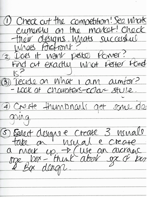
One of the first things I investigated for this exercise is what exactly is "Pester Power" I need to know the relevance of this before I start creating any work so I know my aims and directives are going to be accurate for my client.
Pester Power - Also known as Nag factor in the US. Pester power is the tricks used by media and manufacturers to bombard and influence children into that "Want & Need" urgency. The most common pester power is apparently aimed at 4 - 6 years old as they do not have their own expenditure and hence create the nag factor.
The first recorded notice of pester power was the first TV advertised toy, Mr Potato Head. The constant advertisements created a huge demand for the product which incidentally still runs today as a successful toy. One report on pester power, I found quite interesting which is against it being an actual motion, as children of such a young age should not be born with the ability to understand or be eloquent enough to methods of feasible persuasion.
I think looking at how the brands work within our supermarkets and TV/internet, that to try and sell and maintain a strong selling platform line of products without incorporating appeal to children would result in having to invest incredible well in creating branding and reliability and familiarity with new customers.
I found that this was a tough exercise, it took me a long time to decide on what I was aiming for. Also I struggled with font designing, but this is a good point as it has shown me areas I need practice in, once again using software and learning how to size letters and being aware of the spaces between each letter and how they can be positioned.
Exercise: Working for Children
Exercise: Working for Children - Course work
Exercise: Working for Children - Learing Log
From the start of this exercise one point issue is the set years for when an illustrative piece is age appropriate to the field audience aimed for. The easiest being is pre-reader, for at this age the shapes and colours would be clear, crisp without complexity to insure recognizable people or objects that a pre-reader would associate with.
The pre-school age should really start with pictures and introduce the use of text along side the imagery, but whether the age for this is within the boundaries of 3-5 years is only decided by what we as adults know and learn from what the children respond too.
A 6 year old or a 7 year old may still want to pick up a book aimed at 3 - 5 year olds but feel that they shouldn't because of the lack of text or because the imagery is designed for a younger age, not on the suggestion on whether they would enjoy the book or not.
I think once a child starts school and develops with other children maybe the sensations of bright colours is not as essential as we expectin importance to the story telling process.
As a child, I can still recall a book my elder sister had and I was drawn to looking in the illustrations and they were of the time. In very muted colours and intricate detail, and it was colour irrelevant but the fantasy and detail within the drawings that captured my imagination.
I think that perception of visual stimulation is on a completely higher level to written words and understanding the concepts of reading and word meanings. A child could look at an image and though the main character is within the picture it maybe the surroundings of the character that interacts with the child's imagination.
The three visuals for the client all are at a scale of 1:2. The mock up create represents one flavour and design which would have similarity among the others so that the design becomes brand recognizable. There is aspects of what text to include and how it should be presented on the box front. As the general age for these is for young children and for the purchasing adults I want the box to have a clear and innocent and fresh feel offering a character that young children would find appealing and that can associate with the flavour of biscuit.
 |
| Grebe Bird Visual - using as limited amount of line work to show the idea of the box front. The bird would represent the ginger biscuits. The background would be coloured to represent and mimic the associated tones of a ginger cookie. The visuals were created over copies of my design on a 1:2 size from the design size. |
 |
| The dwarf hippo visual is to show the small tiny hippo under a flower and the hearts would be brown to represent the chocolate flavour. The same basis of the design as I would expect in packaging to repeat among the range so familiarity is used. |
 |
| The Koala Lemur clings to his organic cookie, the same design of the basic circle and banner is used. I originally tried manually drawing the font but found that the hand drawn letters looked unprofessional, I think this is because I need more practice in performing this task as it maybe my style that needs more improvement. |
 |
| My mock up for the choc chip pack design. I have tried to create a realistic pack with the sort of text that may appear on the box front. I did try to create the illustration without ink but in pencil and watercolour but it looked too tepid. |
I think to elaborate on this project I would like to have completed all three designs in full colour to offer the variation on the colour and animal link and the flavour link. All the animals are extinct from Madagascar and think this could offer information on the reverse of the packet for each character.
Exercise: Pakaging - Course work
I spent time researching and going through various lists of extinct animals. I wanted the three that I picked to be easily related to young children and not go down the Jurassic period which I think is quite an easy option. I looked through a list of various locations and found one that really had a variety of extinctions of animals that are in the very least quite harmless o the majority of humans, in the sense they do not show huge fangs or claws and would be hopefully appealing to male and female children within a variety of younger ages. The animal needs to have certain points such as familiarity and be able to be incorporated into other products in the future and also if the design is successful it can be used by the manufacturer for other productions, merchandise and online and TV advertising. This means the animal needs to have appeal, movement and likability! I found the measurements of a box of biscuits that is a standard size of 12 biscuits. This size (80mm x 138mm) gives me a base to work from.
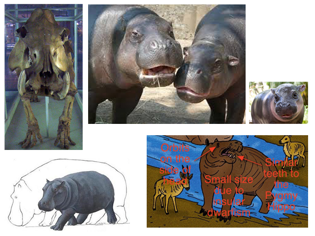 |
| Madagascan Dwarf Hippo - This possibly was last alive in 1500's. There are no photographs of this animal but obviously there are similar animals still around. I thought there is a lot of character and adaptability to help create this character to an image that would be associated to the food. Hippo is going to be choc-chip - the colouration will be suitable. Automation of though often puts hippo's wallowing in mud baths (chocolate?) |
 |
| This is the Alaotra Grebe bird - This was recently declared extinct in 2010 due to it only breeding in a small part of a Madagascan bay! The bird has some real character to it. The orange eyes and plucky feathers, it had peculiar feet too. Ideal for development of a character. |
 |
| The Megaladapis - Known as the Koala Lemur. This fellow became extinct a long, long tme ago such there is no animal in his style alive today apart from the ring-tail lemurs we know today.This animal has small eyes and with the option of him being extinct we can look at possible colouring changes that can be subtle to suit our creations. He looks from evidence to have been a tree dweller and lived pretty much like the lemurs today but his cumbersome size may have meant he was hunted to extinction. |
 |
| Pinpointing the sections that need to be noted. This is a current typical style on the market. I want to ensure that when I come to create the visuals and mock-ups I keep within the correct information needed. Inputting required information or over working a design or missing important aspects out will not influence the client in the design. |
 |
| Thumbnails |
 |
| Thumbnails |
The thumbnails were done in pencil as usually I use marker pen but want to make the animals look softer and more fluid and often I can get this with pencil work rather than harsh ink. I think to enforce the naturalness of the organic product I will either use a pencil or soft brush pen and ink.
 |
| These ideas included my colour ideas to incorporate a theme of added colour to the box design that relates to the flavour. |
 |
| Sample of one effort in the design, I firstly tried a brush pen but it looked quite harsh and too heavy. |
 |
| before i settled on my design, I looked at how the box could stand as a physical item, I wanted to see from the size and style how the imagery would look. I was not overly happy with my hand drawn font. The design was one of my thumbnails, but until the design is in a larger state it is always a chance it may not develop as expected. |
Exercise: Packaging - Learning Log
One of the first things I investigated for this exercise is what exactly is "Pester Power" I need to know the relevance of this before I start creating any work so I know my aims and directives are going to be accurate for my client.
Pester Power - Also known as Nag factor in the US. Pester power is the tricks used by media and manufacturers to bombard and influence children into that "Want & Need" urgency. The most common pester power is apparently aimed at 4 - 6 years old as they do not have their own expenditure and hence create the nag factor.
The first recorded notice of pester power was the first TV advertised toy, Mr Potato Head. The constant advertisements created a huge demand for the product which incidentally still runs today as a successful toy. One report on pester power, I found quite interesting which is against it being an actual motion, as children of such a young age should not be born with the ability to understand or be eloquent enough to methods of feasible persuasion.
I think looking at how the brands work within our supermarkets and TV/internet, that to try and sell and maintain a strong selling platform line of products without incorporating appeal to children would result in having to invest incredible well in creating branding and reliability and familiarity with new customers.
 |
| Looking through various packaging designs for Organic biscuits that are aimed at children. There is a selection on the current market. I noticed a couple of points. Most are aimed at very young children such as toddler age and very little for the 4 - 6 years. There is one or two that venture into the brighter style of packaging but most seem to stay within a pastel range. Maybe this is significant as we may associate bright colours with additives and falseness. Also the use of greens and beige's is quite prevalent. |
 |
| Notes from learning log |
 |
| Notes form learning log |
 |
| Before I started with coming up ideas via thumbnails I put pen and pencils to paper to try and get some rough sketches to down to get the ideas flowing for the designs. I workd on all three animals and had to decide whether I want the animals to look cute or natural. |
 |
| Super cute baby hippo! |
Exercise: Working for Children
 |
| Older readers - Giraffe - Scary. Making the links between the subjects proved harder than I thought it would. I had to keep referring to the brainstorming to ensure that the emotion of both is incorporated. Here I have selected that age of when school is a daunting thought. The unidentified eyes behind watching. I used the vulnerability of a young giraffe and characterized this in the school girl figure. I used dark inks and a restricted palette of inks to keep the darkness but did not want it too threatening. I also added the hint of red on the uniform to draw the image of the uniform and the character to the main point of the story. |
 |
| 3 - 5 Year old Readers - Baby Baboon - Family. With this one I first thought it would just be quite a simple task but as I tried to convey the word family into the image it was quite a tricky task. I did the illustration in a couple of mediums and was unsure what worked best. I ended up redrawing the line work and using digital software to block colour. I tried to keep towards the colour ranges I wanted to use to suggest the city/ town and the relation of the baboon father and son. I can see this one could be developed more so but at the current time I am little bit lost where to take it. I am unsure if I am going down a characterized route for the subjects or if I am trying to develop a more serious image. |
Exercise: Working for Children - Course work
 |
| An illustration by Rosa C. Petherick 1900. - This illustrative piece is possibly aimed at 3 - 5 years old looking at the age of the three children in the picture and the toys being a ball, doll and the young kitten. The illustration is very realistic in terms of detail and facial expressions and colouration. The black ink line work and the greyness of shadows in the background adds an edge to what would be a warm, soft image. Most modern illustrations are not so realistic and the change in mediums has lead to either images being exceptionally realistic or faltering the other way on surrealism. All still working for the children and their choice of books. |
 |
| This modern childrens book, Owl Moon, I am guessing this should be aimed at the ages of 5 - 7 by the amount of text within the large pages. The colouring and detail is so realistic even thought he illustrator has used a very limited palette, the picture still has enough detail to captivate and entice the reader to look within the pages at what is going on. The clever way the words are surrounded by the rest of the picture in gradual darker tones and the contrasting colour of the characters coming from the woods all help produce a successful double page illustration. |
 |
| Dali's Russian Dream - This very surreal image from an old Ukrainian story book. The imagination of a child would accept that the lobster can hold up the gramophone and the strange sea creature would wear a head scarf and dance to the music with it's multiple legs. A child of certain age will not question surrealism or what is correct, they tend to accept that what is being told in the story is happening as they still have the ability to imagine this, once they mature in ages, their imagination does not go but their reasoning may stop a story being so appealing. I think the imagination continues but it is the subject matter that would change. |
 |
| First before I begin the initial simple image of the character I am going to look at the animals and how they behave and move and try and get a sense of shape and size. |
 |
| I am trying to find the elements of the giraffe that link to any expressions, moods, physical likeness to the group or the illustrative piece.. |
 |
| Going through the same process for the baby baboon. Expressive and funny. This animal has a lot of scope. |
 |
| One of my workings trying the illustration in watercolour, I was unsure if this style was to tepid for such a young age. I think it could work as in some of the books and styles I researched use watercolour, I think at the moment I am not at the stage where I am stylized enought to produce what I am wanting in this medium. |
 |
| Quick visual with notes of what I am aiming for with the older reader image. |
 |
| Looking at keeping the basis of the image simple without over complex detail. I want it to be sketchbook/textbook ink style drawing as I think this style would suit the audience. |
Exercise: Working for Children - Learing Log
 |
| Pre-school (3-5years) FAMILY Brain storming in Learning log. |
 |
| Brain storming the animal ideas. |
 |
| Older agegroup SCARY Brain storming in Learning log |
 |
| Brain storming the animal ideas. |
From the start of this exercise one point issue is the set years for when an illustrative piece is age appropriate to the field audience aimed for. The easiest being is pre-reader, for at this age the shapes and colours would be clear, crisp without complexity to insure recognizable people or objects that a pre-reader would associate with.
The pre-school age should really start with pictures and introduce the use of text along side the imagery, but whether the age for this is within the boundaries of 3-5 years is only decided by what we as adults know and learn from what the children respond too.
A 6 year old or a 7 year old may still want to pick up a book aimed at 3 - 5 year olds but feel that they shouldn't because of the lack of text or because the imagery is designed for a younger age, not on the suggestion on whether they would enjoy the book or not.
I think once a child starts school and develops with other children maybe the sensations of bright colours is not as essential as we expectin importance to the story telling process.
As a child, I can still recall a book my elder sister had and I was drawn to looking in the illustrations and they were of the time. In very muted colours and intricate detail, and it was colour irrelevant but the fantasy and detail within the drawings that captured my imagination.
I think that perception of visual stimulation is on a completely higher level to written words and understanding the concepts of reading and word meanings. A child could look at an image and though the main character is within the picture it maybe the surroundings of the character that interacts with the child's imagination.
 |
| I collected some childrens illustrative books from a discount store. I got these so I can keep them and make notes within the pages and keep them for future reference. The different styles are very different even those presented to the similar reading ages. Some do present a strong palette of colour and some use a softer deeper range of colouring. |
 |
| Learning log page |
 |
| Learning log page |
Exercise: Educational Strip
Exercise: Educational Strip - Course work
Exercise: Educational Strip - Learning Log
Looking at modern comic strip versions and how their designs can vary in style, sense of humour, points and source of direction. Often, political, gender specific or age specific.
Looking through various websites I have found that comic strip is now less main stream but often used within groups to represent; thoughts, ideas and political views. Also the style in which the characters and story telling offers a varied version of how a story or point is presented across to the reader. I wanted to use this exercise to see if I could produce the comic strip with the 5 boxes and still perform a connection to the audience this is aimed at. I think it has to go from the mainstream point to a less popularized style to appeal to teens and offer alternative.
I really enjoy the comic strip illustrative works, it has shown me how difficult and time consuming i can be to create and endorse a character and the imput that is needed to create a successful piece. It has given me insight to character development and enjoying the learning process of the actual task.
Assignment: Seven Days
The seven days theme is a difficult subject to take on. Without a designated brief it was hard to determine which direction to enter.
I looked at what I have been studying over the last few months and wanted to incorporate some of these points within this assignment.
My first point to bring in was the use of hand drawn font. I wanted to include this but not overload myself and use this as the main concentration.
Also one of the points of font and typeface to use was to practice using the most suitable typeface available.
I wanted to create a design page for an independent Graphic comic. It wants to be designed to tell a story over seven days. Colour or black or white print. Limitations on text to be used and keep within the measurements of the 11 x 17 inch magazine. (Standard American sized page.)
Feedback - This end piece has really given me some indication at where my skills lie best, though I am not ruling out other avenues, this segment has pushed me to accomplish a piece of work with some real pleasing results. I have some great suggestions to try from my tutor for future similar work. I am really enjoying this experimental part and hope to continue this within and out of course work.
Assignment: Seven Days - Course Work
Assignment: Seven Days - Learning Log
The first thing I thought about when starting this assignment was to break down what the actual process and product is. A comic strip upon impression is a quick often witty stretch of two or several illustrations that depict a story or anecdote in a funny or satirical manner. Mainly when a comic strip is brought to mind it is the funny section of a newspaper or supplement. The modern comic strip is often used in adult material within the realms of novel form or on a very collectible basis.
The use of a repeated character or familiars in a strip would mean that the illustrator would hold a good bank of images of his/her characters so they can be referred to in various statures and keep their personality/design and colouration throughout.
The history of comic strips as we are familiar with starts from America in the very early 1900's. The origins vary of when the first strip was published, some associate the first imagery with a Swiss Artist.
This format has grown since into spawning not only massively followed publications but also entered the 3D world of cinema. For instance, Marvel started life as a comic strip magazine, but has created numerous films from the strips.
Another success is Manga style film which the majority started from the pages of comic strip stories.
I am not entirely sure why they are so popular today as often we can read and see images at a touch of a screen, the purchase of an book in graphic novel form must still hold a torch for many avid fans new and old.
I do not know if comic strip is a illustrative channel I would be good at as I think my style is currently not through one kind of medium or method, and my design is changing frequently. Though I do like the fact that you can create a database of imagery of this world that is being created and the fact it can be adapted and changed but kept familiar with in the use of the character/s and the style of illustration. So maybe I am being to negative on a path I may be wise to investigate further.
 |
| Educational strip visual plan for a four stage comic strip. Explaining the teen angst of spots. The main character wakes up in usual style and discovers the dreaded spots. The third section of the script shows her angst of having to face school friends only to discover everyone is in the same situation. I am a little concerned I think I have over detailed the images because I wanted to aim for a school book sketch style character and world. It was not my normal type of character but I wanted to try for a different version of drawing that would be more suitable. 1. "Yawn...Another sappy School day... 2. "What the??!!!...Noooooooo...Damn Spotfest...on my face...Nooooo!! I can't be at school! No Public can see me!" 3. Later on that morning after a change of heart "I have to face the world, show them I am confident enough to still be at school, Sill be me, an individual, they don't know what it's like..." 4. "Eh?...Oh, great..but i did this first, ok!" |
 |
| A front page illustration of the character. Using hand drawn fonts to incorporate the title within the illustration. I wanted the character to be fairly ambiguous of male / female roll as the subject is quite equal to both sexes at that age. The girl is tall and slightly out of proportion as of that age. |
Exercise: Educational Strip - Course work
 |
| Coming up with character ideas, creating a few pages of scribbles and draft ideas has helped create the main story character. Looking at different styles and shapes and how the illustration will take form. |
 |
| Some of the sketches of the character in the early stages, thinking about movement and the body. Looking for a surly teenager feeling withing the characters body. |
 |
| I have found sometimes making notes within the thumbnails helps recall the quick sketch ideas so I can relate back to them and feed off them. Sometimes what I draw does not always bring back the same idea, which is not always a bad thing! |
 |
| Making some quick ideas on how the main character will sit on the front cover of the leaflet and what can be incorporated to suggest the story or the leaflet information. |
 |
| Comic strip ideas. Looking at simplifying stories. Again, I found writing notes down in my log book as helpful with the thumbnails as it gives me ideas and keeps the theme on track. |

Character development. Looking and thinking how this person will behave and react to situations, their body language and typical stance. I have tried a couple of character ideas.
 |
| One of mid designs for the character. Looking at clothing / hair / what they are doing. |
 |
| Line visual for the main character - wanting to keep her simple but have enough expression and stance to relate to the audience it is aimed at. |
Exercise: Educational Strip - Learning Log
Looking at modern comic strip versions and how their designs can vary in style, sense of humour, points and source of direction. Often, political, gender specific or age specific.
 |
| Looking at modern comic strip version. Box identity and character details can vary dramatically. |
 |
| Not all the comic strips bother to incorporate a background. Is that because the story centers directly on the identifying characters? |
 |
| Background and minimal wording, using parody to suggest a point in question. Grey to represent colours and texture.. |
 |
| Comic characters not necessarily designed in obvious humour but character based upon how they are seen as real animated people. |
Looking through various websites I have found that comic strip is now less main stream but often used within groups to represent; thoughts, ideas and political views. Also the style in which the characters and story telling offers a varied version of how a story or point is presented across to the reader. I wanted to use this exercise to see if I could produce the comic strip with the 5 boxes and still perform a connection to the audience this is aimed at. I think it has to go from the mainstream point to a less popularized style to appeal to teens and offer alternative.
I really enjoy the comic strip illustrative works, it has shown me how difficult and time consuming i can be to create and endorse a character and the imput that is needed to create a successful piece. It has given me insight to character development and enjoying the learning process of the actual task.
 |
| Thinking about how this would work in terms of what to aim for for the story/comic strip |
 |
| Working on a larger scale - brainstorming once into the story ideas and what the character maybe facing. Wanting to look at one aspect and produce the strip with satire and though serious have a sense of humour included. |
Assignment: Seven Days
The seven days theme is a difficult subject to take on. Without a designated brief it was hard to determine which direction to enter.
I looked at what I have been studying over the last few months and wanted to incorporate some of these points within this assignment.
My first point to bring in was the use of hand drawn font. I wanted to include this but not overload myself and use this as the main concentration.
Also one of the points of font and typeface to use was to practice using the most suitable typeface available.
I wanted to create a design page for an independent Graphic comic. It wants to be designed to tell a story over seven days. Colour or black or white print. Limitations on text to be used and keep within the measurements of the 11 x 17 inch magazine. (Standard American sized page.)
 |
| Finished piece. Using seven boxes to express the week of a city worker who lives as a zombie - or is he just living a normal life?? I used a colour variation of the story. The work as done in alcohol inks and black ink pen. I used the opportunity to make some hand draw some of the font. I found the hardest part working towards telling a story with little text. I wanted the short story tor read easily and the audience to be left thinking what the story meant and whether it is a story of zombie life or a story of normal life feeling life a zombie. |
Feedback - This end piece has really given me some indication at where my skills lie best, though I am not ruling out other avenues, this segment has pushed me to accomplish a piece of work with some real pleasing results. I have some great suggestions to try from my tutor for future similar work. I am really enjoying this experimental part and hope to continue this within and out of course work.
Assignment: Seven Days - Course Work
 |
| I was not sure how this was going to develop even though we had a fairly free reign. This actually made it harder as once you have created the brief working the sketches etc. you have to make sure not to be tempted to divert. |
 |
| Some sketches from how I started to work out how to create the story. From the start I wanted the "play out" to have a beginning and a finish and develop within the few spaces. I am not sure on the comic style I will go for - I am working on realist illustrative to more character based illustration. |
 |
| Once I had started to compile a story I worked on the images for each story box. I wanted the detail to be enough to entice the reader to feel the life of the main character. I also wanted the scenes to have a familiarity about them. I found creating theses separate visuals the easiest way to build the story and dispose, change and alter as I read the story myself visually. |
 |
| Working on line visuals for the client... I did these a few times until I found the right balance of not over complex illustration and still give the sense of what I wanted the image o tell you. EG: He is on a bus, feeling ill. |
 |
| One of my designs for the start of the story, still working on how the story should roll - some changes happen as you design the story, it can read completely different once in imagery. |
 |
| Making a colour image of one of the story boxes. I wanted a sense of realism. But that edge of cartoon like qualities. |
 |
| Imagery before text. Working out the right amount of vocabulary and text is quite difficult in sense of over filling the information and needless words. I want the story to flow but I wanted the reader to look at the boxes and establish what the story is telling you. I would like to have had more time to try creating this in digital format. The bonus of digital intervention is the quick and easy use of colour change, shade and saturation. Also some soft ware allows for shading to be highlighted and pinpointed to draw direction of the audience eye within the story. |
 |
| I am not fantastically skilled at digital art, but this comic strip box, I scanned in and adjusted the light and shadows and tried to darken some of the areas. I am not sure if it has made the image too dark or if it works. I tried this after my report to see how I could improve the strip. |
Assignment: Seven Days - Learning Log
The first thing I thought about when starting this assignment was to break down what the actual process and product is. A comic strip upon impression is a quick often witty stretch of two or several illustrations that depict a story or anecdote in a funny or satirical manner. Mainly when a comic strip is brought to mind it is the funny section of a newspaper or supplement. The modern comic strip is often used in adult material within the realms of novel form or on a very collectible basis.
The use of a repeated character or familiars in a strip would mean that the illustrator would hold a good bank of images of his/her characters so they can be referred to in various statures and keep their personality/design and colouration throughout.
The history of comic strips as we are familiar with starts from America in the very early 1900's. The origins vary of when the first strip was published, some associate the first imagery with a Swiss Artist.
This format has grown since into spawning not only massively followed publications but also entered the 3D world of cinema. For instance, Marvel started life as a comic strip magazine, but has created numerous films from the strips.
Another success is Manga style film which the majority started from the pages of comic strip stories.
I am not entirely sure why they are so popular today as often we can read and see images at a touch of a screen, the purchase of an book in graphic novel form must still hold a torch for many avid fans new and old.
 |
| An old 1970's strip from Marvel. The story is told in small gasps of sentences or thoughts from the characters , but apart from this the reader is solely reliant on the imagery to conduct the full story. Also the background plays importance in some strip boxes, yet in others when centralization on a character is needed the background is not used or is minimal. |
I do not know if comic strip is a illustrative channel I would be good at as I think my style is currently not through one kind of medium or method, and my design is changing frequently. Though I do like the fact that you can create a database of imagery of this world that is being created and the fact it can be adapted and changed but kept familiar with in the use of the character/s and the style of illustration. So maybe I am being to negative on a path I may be wise to investigate further.
 |
| Looking at the layout of using strips without words. Greyscale or colour? Thinking about my layout and how to set the page out for the story using seven sections to depict the seven days. I was not sure on layout or design as the experience of laying the story out as you would a script is not something I am overly familiar with. |
Is this how you feel going to work ? :)
ReplyDeletePulling your legs...Nice and entertaining ..
Well done you can now rest a bit until the next course !