Assignment 4

Exercise: Identifying tools and materials
On this exercise I originally read through and thought of a few illustrators I knew and considered their work. Though, looking at what this exercise is referring to I reconsidered and researched into completely new illustrators to myself. I did not want to go  direct to pen and ink or pencil which I am more familiar with, I crossed over from one illustrator via internet search to another until I had compiled a selection of various Illustrators who work with different mediums. (I have kept notes and images for future reference).
I picked out a selection of works that use watercolour. I have chosen watercolour as when I use this method it is always within a colouring aspect rather than to create an illustration and so incorporating this in the exercise may broaden my abilities and not restrict my work so much.
Here are a few works of the following Illustrators I researched:
Amy Proud
Ian R Ward
Michael Frith
Jessine Hein
Marta Bartolj
Jaqui Lee
Though, mainly watercolour, I have however noticed among the most of the illustrators that they cross over from hand or as one illustrator referred to as “Analog” work to now scanning or using digital processes to either compliment work, or create new pieces using digital art from scratch. The most common software and tools now seem to be Photoshop or similar software and digital accessories such as inkling and other digital drawing devices.

When I look at watercolour illustrations there are some similarities within the works but there is a lot of contradictions too. Most watercolour work is soft, light, stillness and opaque yet some work also in watercolour offers vibrancy and a lot of movement. The watercolour allows a sense of fluidity that is harder to create in other mediums,and I think most watercolour illustrators take full advantage of this and use the medium to incorporate a sense of movement in their work. One other element I can link within a majority of these watercolour illustrators is the clever use of colour rather than shade, such as skin tones, where for example both Hein and Frith combine a tepid cerise with a pale blue, neither are which are true flesh colours in the literal sense but both use these to represent depth and shade and contours of the human face. 

Here is two separate pieces by Jessine Hein. The first is a portrait style illustration. The colours are muted and the brush strokes create form rather than the facial shape and hair being drawn in lines it is accumulated by the brush strokes and shades of colour. There is detail in the work, but there is also a lot of filled areas. Such as the watermark in the top of the hair, it does not distract the viewer from knowing this is the models hair, but it is not a true likeness, it is a gathering of colour that creates a space which fills in her hair. We look at this and we fill in the blanks by following the rest of the illustration.  The second piece is more refined as in it looks to be detailed, but when we look into the centre of the image, we cannot see detail. The detail is in the foreground and again Heir has filled the areas with watercolour blots and bleeding. The colour palette is restricted compared to the first piece I have here, but when you look there is blues, greys, creams, and dark shades within the imagery.

Jessine Hein - The image has at first view amazing detail and fluidity, the portrait is defined yet under closer inspection of the line work and brush strokes there is no definite shapes or solidity. It all fits together in a natural flow to create the illustration. The use of colour, tone, movement and space create the overall finished image. Using this image I am working towards taking these materials and method of production towards my reproductions of my visuals. I think Hein uses the darker areas to exaggerate the detail of it being a face and he sensual closeness of the detail. I found it interesting to play about with this image on Photoshop and over contrast and dilute brightness. It brought forward the vast whiteness and the deep colours jumped out. It still kept its representation. 
Jessine Hein - This piece has more defined detail within the foreground and yet lacks much structure in the back ground, this has created the sense of depth , stillness and bizarrely I think silence. The leaked water markings in the watercolours make the clarity of the foreground hard to focus on and yet we magically select what we see and predict this is looking down a gorge or stream lined with tall trees in the deepest of forests and the air is misty and the viewer could well be all alone.


Using the similar techniques and colours, the use of the white space and opaque washes I have recreated a visual piece from a previous assignment exercise. I used watercolour over a few guide lines to try and forge a pattern to how Jessine Hein works. I am pleased with the majority of the image, though I feel I have struggled to capture the vacant and almost ghost like sense of the models eyes. I also think upon reflection I have overworked the colours trying to capture the various techniques into one image. The fluidity and movement of the watercolour in Heins work is almost water like, I scanned my image and enhanced the colour and shadow to try and copy her digital imagery as well. In overall appearance I am pleased with the techniques and subjective/objective mix of how Hein uses both reality and fantasy to create the image by mixing the structure and accuracy with  textures and flow of unfamiliar colours.
On this visual I have tried to incorporate the techniques of using space and the colours to ascertain the depth and solidity of the shapes and structures. I have been less intense on basing my illustration on the colours but more on the details and spaces between the eyes, mouth and hair. I have tried extemely hard to keep a free flow with using a fine brush and  yet still retain a certain percentage of reality of the actual image. I think in the first piece I was working towards an imitation of the work but in this one I tried mote to keep my own visual true to my style but incorporate her methods of space, use of light and dark. The freedom of brush stroking and keeping the detail to the expressive part of a face (eyes / mouth). I think my second visual has worked better. 


Exercise: Identifying Tools and Materials - Course Work
I compare the other watercolour illustrations as a whole from the other artists, and there seems to be two points I notice in all their work.
Point one is the use of the negative space, leaving certain areas untouched or very little paint within that part of the image.
Point two is the definition of their work. From closer inspection only one or two of the pieces show immense detail with the use of water colour. The use of water colour in most cases is to add shade and dimension with the depth of paint used.

I also wonder if the use of watercolour allows the illustrator to be more free and evoke their image to move or be dimensional all on the skill of the selective brush stroke. Also one other noticeable quality in the works is the lack or minimal use of line work. Nearly all the watercolour work is carefully created by strokes and movement rather than from a drawing and the water colour used to fill this in. It is done on some illustrations for example: Marta Bartolj uses some like work for the girl sat in the chair but it is kept minimal. This maybe as all the watercolours create a softer and unaggressive image, maybe the line work would distract the work of the watercolours and it become less pleasant to view. Also the subject matter in what the watercolours are used for.  Portraits, scenic  views and children, all of which need to echo some sort of softness and warmth and let the viewer feel empathy with. 
Marta Bartolj - Here we can  witness some small detail of line work within  the image. But we know there is a rug, a bird and detailing on the chair and surrounds, but only the girl and chair is outlined. Does this give presidency to what is important in the image?
I have inspected another illustrator, Holly Exley. Here I find a couple of similarities with other watercolour illustrators though the subjects are completely different. 


My chosen artist for this exercise will be Jessine Hein. I have some more samples of her work and her blog can be found here. Again, Jessine is typical of the modern day ilustrator/artist her abilities are in not only watercolour but in sculpture and oils too.

by Jessine Hein

by Jessine Hein

by Jessine Hein

by Jessine Hein

by Jessine Hein

I am using this visual created on a previous exercise. I am going to work on the basis of how I think Jessine creates her artwork and try and implement the same techniques an methods.


 I worked from a line visual in my sketchbook from a previous exercise  I tried a couple of different techniques that Hein has used which included paint splashes and water blotting for coloured areas. Her details reflect objective parts such as the eyes, mouth and further intermittent details of the face including the skeletal structure. These are followed by space and blank backgrounds in one or two shades or white. The skin highlights are created in layers of colour rather than shading. I found this hard to hone in on and not over blend or under saturate. This is my first attempt at this visual, I recreated it again as though overall I was happy with it as piece completed and in watercolour which I am not preferred to use, I think I over worked and started to use my own style rather than obide by the strategy and methods from the Hein piece I am using. 


Exercise: Identifying Tools and Materials - Learning Log.
Throughout this exercise I have stuck with my initial concept of using a watercolour illustrator, though I have to admit, this has been quite time consuming and frustrating in terms of using watercolours as for some reason I do not find it as natural as using pen / ink. This wasn't the major point of the exercise but, I am now pleased I have achieved a couple of fairly decent pieces that have helped me understand how another illustrator works and how to dissect the use of tools and materials that a piece or pieces are created from. I researched quite a few other illustrators and gathered work samples and viewed their styles and methods. I have now began a collection of reference and information on my blog which can be viewed via the home page. This is so if I want to recap or be inspired or use them as points of reference in the future times ahead, it is there. Placing this on my blog means it is accessible to myself and others at any time.
This piece by Dima Rebus is a completely different theme again to the others. The use of white and space is prevalent as in other watercolour illustrators and the use of dark paint and the grey and blue doesn't offer comfort with the subject but it makes the work cold and tepid. This is what the them is about, it is not flowers, or green fields or a child's picture. It pushes our buttons as a dream like, nightmare vision we don't fully understand. It works really well and uses some of the methods from other artworks but a completely different message prevail. 


Holly Exley - The image is not fantasy and it has detail in partial accuracy and the edges of the line work is minimal, it has a plain white background. It does not share any familar theme with the two watercolour pieces below, but strikingly similar in the above covered ways these three images communicate with the use of shade, whiteness, light and softened details.

Michael Frith - This portrait looks objective but like these other two pieces is it subjective? the actual work is not detailed or true to form, it is the use of light and colour and how we auto read  the images.


Jessine Hein - The white space and lack of definition in line work creates a softened image, I think this enhances the viewers emotion towards to work. It is nonthreatening, even with the use of black watercolour and lack of back ground details all three are pleasant to look at.


Learning Log Page - Notes

Learning Log Page - Notes

Learning Log Page - Notes


Exercise: Museum Posters
Final artwork for A3 poster aimed at 13-16 years,
This exercise piece has progressed from a photograph to sketches to digital collage. I wanted to convey the feel of the museum but by using the one object (Tractor engine) I have created the image by using different object parts in image form that relate to the museum village. I wanted it to be slightly steampunk and for the viewer to look and recognise it is mechanical but to then if at a closer inspection recognise the objects hidden within to create the overall image. I think this works as a distance glance and as if it was positioned for example in a bust stop and people had chance to sit and idle a moment or two at the poster and absorb what is in the image. I have never done a complete digital collage before and found though it was extremely time consuming I was submersed in the effect it can give. I am quite pleased on the overall effect. Run along side the two other posters in a similar vein they would create a uniform and people may try to spot the other posters upon their travels to work out the inners of the image. 

I have used to logo and added basic text to complete the final artwork. 


Updated version - after some great feedback from my tutor, I reassessed the design and how to manipulate the stature of the positioning of the collage and the text. I got rid of the blue border and enlarged the text, re-positioned the font to flow more successfully. Using software I soften the image which I think makes it easier to view and adds a vintage sense of depth and curiosity. Overall I am pleased with this version and its appeal. The collage is much more able to be appreciated with a wider space to view.


Exercise: Museum Posters - Course work
The first main part before I begin considering design elements, I need to decide on some points raised in the brief:
Will they be a "family?" or very different? The decision on poster designs would depend upon this choice, firstly there is aspects that I think would benefit from being in similarity to one another. Text or font would unite the posters. This could produce familiarity across the age range and build brand and association from the viewers of the posters. Though, each group range has a completely different look upon what they require from the museum. Should the posters reflect their needs and wants, and if it does would be able to be done in a "family" type style of content and design. Making an object appeal to a child and then another to an adult in united style may prove difficult.
Introducing a character and a visual narrative? Another very valid point that would help associate the posters together, but would it benefit the chosen museum. The use of characters is visually stimulating and also can be used within other aspects of the museum such as signs, information boards and merchandise. 
Decorative interpretation & placement of object? The decided object needs to convey enough interest to spark that desire to further investigate if the museum holds what the visitor is going to expect. Placement of object can be essential but it can also be distracting, it will need to relevant to the design an chosen object. Some items hold more interest and keep detail against a plain or simple background rather than within a scene. On the other hand a snippet of an objects background and surround can add intrigue as to what else is in that vicinity. 
Representational, diagrammatic, abstract? There is a consideration to be given to my chosen style. I am going to work on the basis on how the three objects work together and see if for example a ink drawing would be attractive and work for the age range it is dedicated to. I will look at these aspects while producing my images and look at how the media represents the museum, I do not want to be obvious or go for what would be the obvious. 

Here is a selection of current print formats. Though, this is not essential, it gives me suggestive as to what space and text is likely to be needed to be visible on a poster, and also whether there is requirement for a text box to back up the visual on each poster. 
This is a main part of the museum. I looked at the points of interest and the variety of artifacts and  considered what objects suggest these points for each of the age ranges. The objects need to  be able to still provide enough design to want the viewer to consider visiting or finding out further information about the museum. 
This is a selection of some photographic images I have taken upon a visit to the museum. I  looked through all the different sections and tried to identify objects that may appeal to the audience. Even if the item itself is not directly for that age, I considered their shape, attractiveness, and curiosity. 
A further cross section of my photographs. The full range are in the learning log. I found making visual recordings of the museum of the items I found appealing and the photographs help record the textures, colours and sizes. 

Colour Visual for 5 - 9 range - build up in collage so the layering adds depth and shade. The object is the tractor and from this angle looks intriguing and face like.

Colour visual for 13 - 16 range - build up in collage, with greys or browns from the images to create an engine. This object is the tractor taken from the engines perspective. I like it as it is a part/object that has intricacy and looks alien and is what would have been technically the most advanced object on the farm. 


Colour visual for general adult audience - using the front image of the tractor, building the collage up in block colour and line detail. Trying to use the image in an abstract sense to modernize the feel of the museum and appeal to the wider age ranges within adults. 
This was my first attempt at collage. I originally wanted to try paper cutting and build this in with photographing and adding digital collage to create the finished image, however I found my skill levels were not producing what I would think is professional enough to pass as a finished piece of artwork so turned to complete digital collage as my final illustration.

Partially finished - this is my representation of the tractor engine for the final teen poster. I am thinking that by basing this on one object but entwining segments of collaged images of articals similar to those in the museum it creates a fashionable and enchanting steampunk style image. I would run this through all three posters and keep the backgrounds and colour themes in the rich red / sea blue / white. 


Exercise: Museum Posters (learning log)
Looking at various forms are poster design for museums that do not specifically state the age range or target they are aiming for, I found what I think to be designed with the first age range of 5 - 9 years old in the forefront of their campaign.  I noticed that through a lot of the posters I viewed there was many that contained the two main colours of blue and yellow. These seem to be very common and worthy of this age range, I would suggest it maybe because they are primary colours and we associate primary colours with the learning tools of this age range. Most of the posters were objects kept minimal and simple illustration to catch the child's imagination and of course, eye. 
I think this is the hardest target audience - 13 - 16 years old. A period of lesser imagination to capture and they are more astute and have started to develope what they know they like and prefer. Enticing this market of both genders would prove difficult providing the subject and age range. This range I have gathered are what I would decide as the designs which create imagination and provide what would be more a sense of curiosity at that age rather than appealing to a child's sense of fun. The styles are very different and the three posters in the top row all have a little touch of darkness to create that feeling of danger in turn bringing in curiosity.
Throughout the posters there is a feel of maturity and I think what I would describe as sophisticated way of branding the museums advertised. A need to know the content and detail. The colour range tends to be more muted than the other groups and hold ambiance in some of their designs. from a personal view I look at a poster in the context that it would want me to know what other objects are going to be there? Is the object in the image what I want to see already? does it make me want to see more?  


Photograph taken at the museum. 

Photograph taken at the museum. 

Photograph taken at the museum. 

Photograph taken at the museum. 

Photograph taken at the museum. 

Photograph taken at the museum. 

Photograph taken at the museum. 

Photograph taken at the museum. 
Learning log pages - Notes

Learning log page - Notes
Sketches taken while on site. Using images on photos on display walls etc. 

Selection of thumbnails - working on basis of various objects that are related to the ages for the three poster images.

Quick detail sketches on items relating to the age ranges, adding notes to use as reference and thinking about positioning. 

Selection of coloured thumbnails - still working on positioning, scaling down the A3 to A7 and how the object would fill the poster.
Reflection on the overall exercise: I wanted to use this exercise to establish two aspects. One of which was I wanted to try a different type of illustration, I often fall to what is comfortable and not use unfamiliar methods. Looking at the posters I found in research, often a modern form of illustration had been used. I decided to collage the overall image and see how it would work using digital collage. I like the idea of using other sections of objects to create an overall object. I originally wanted to experiment and do this on all three, but found the method very time based and often after a lot of manipulating of an image, it may not sit well and the only options were to start again.(I will need to invest in better software as using an outdated version of photoshop to try and work quite intricate tasks!) I did find with perseverance the outcome quite satisfying and it is a method I may try in the future.  The other part of the exercise was the positioning of the text, in a previous exercise my feedback from my tutor pushed me to try other methods and consider the natural spacing of font usage and how to isolate and use spaces within the text. Though I think with more practice I could still get the hang of this, I think this poster compared to a previous work is much improved.

Exercise: A Children's Book Cover

This exercise opens up the possibilities f what I can take from a very "Brief" brief. I think from the basis of what is being asked it is to take this and expand on all aspects to come up with some suitable suggestions and produce the visuals that would speak to the client and allow them to visualize what the finished piece could be steered towards.


One of my designs, using ink and pencil. This approach is soft and clear. I have kept the palette to simple colouring methods and incorporated shading and kept to a design of a 7 x 7 inch book. The text has been kept simple, clear and central.

Second design. Digital colours. Clean and modern colours. Trying to keep the palette in contemporary tones and use the simple black and white. Each layer represents a section of natural history. Again the book is 7 x 7 inch square.

I used the colouring on photoshop to provide a visual for this design. Out of the three I am not very happy with this one. It has not come out as I expected. I think the colouration would be better in inks, and would sell the idea better.


Exercise: A Children's Book Cover - Course work
My first initial intention of this exercise is to research on what has gone before in this theme. I searched through book websites and search engines and found illustrative covers in various styles and medias. I wanted to see how this has be fulfilled by illustrators and designers whom would have had similar points within their brief. This is not for me to copy or use these as an elbow to get the imagery up and running, but more to see how this has been portrayed and see how the use of the illustrators work has been incorporated into the cover. 
I want to make sure that the visuals are aimed directly at the target audience of the 7 - 11 year old and the illustration will be enough for the book to encourage them to select the book rather than from other books in the library. 


One of the first steps I have taken is to look at the subjects that could be placed on the covers. Interesting animals and their details which a child would find attractive and want to look at within a book. I did some rough sketches in my pad and looked at sizes and shapes etc.
The options in design would be to decide to illustrate in fantasy or realism with regards to the animals adorning the cover. I want the book to intrigue and be attractive. I also want to consider whether traditional styles are the more forward or to be brave and look at creating new contemporary designs.


Thumbnail some ideas into my sketch book. I have a few suggestions to work on and some variations on the theme. I want to include animals but the decision on which to include or how many to include. Also I want to try other traditional and modern takes to see how the client would respond as to how they want the cover to lean towards. As traditional eg: ink drawing. maybe suited in a modern design also. Or digital / photography collage may be the way forward.


First design is taken from a thumbnail.I am using coloured pencils on ink and basing the book on a square design. I like this but feel it is not really enough to catch the eye and needs the colours illuminating and highlighted text to help.


Using my thumbnail sketches I opted for another design. Initially I think this design would look great as layered pieces of paper cut and paper pieced upon top of each other in vivid colours to make a photographic or scanned image for the cover. To create this as a visual I would use digital enhancement to collaborate the sections in colours. I think that this as a colour visual would work well for a client as they can dissect the sections and still be bale to have input on final colours etc. without too much of change to design. 


Using digital colouring to show the visual with the simple clear stencil text. Using a basic palette to emphasis the silhouettes of the children in the centre of the picture. 
The third design is a full cover illustration. I did this in ink as I am working to a square design I did this in large format and scaled down to 7 x 7. I scanned the image in and segmented it together. I also tried to colour using digital colouring as a visual for the client and make space for the text. I did not like the digial version. I don't think ir processed the story very well.
I wanted this picture to show lots of animals but actually you don't see any. As a child it would incorporate fun to see what is recognised within the illustration.


Exercise: A Children's Book Cover - (Learning Log)


From selected books in this theme I found various methods used in the past for illustrations. The older books used fine art but in almost a fantasist style. It was intricate, detailed and elaborate.  The more modern books of the last 30 years use photography and the illustrative works have been either left to logos or interactive points to show upon the photograph. 
As well as using photographs in a cropped and collage method, the use of bright printed backgrounds are well used too. This is to produce a cover that is direct and bright and noticed. Some illustrative work in this field that is more modern is clear and basic and uses minimal lines and detail is kept quite minimal. Also the added use of incorporating the text/font style to mirror the style of illustration has been used.
Other styles I have found include screen / lino prnting (which seems very popular with any imagery suggestive of nature. The other fine art styles of modern books using pencil drawings and detailed images in almost a soft nature. 

Learning log pages - Notes

The first part of the brief is to come up with with some ideas and suggestions to get to the stage of three colour visuals for a client. As these are colour visuals and not final pieces I had to make sure I did not treat the pieces as this and over work them, complicate the images and do too much to one piece. The visuals need to be free to offer opinion and change from the client, but hopefully I have balanced them enough to give the gist. I  started with a spider diagram and worked from the very basics of the brief. I don't think the importance is down the specifics such as what animals I use but more to how the image comes across and whether it will be apt for that age range. I used three methods and created three designs. The hardest part I have found is pinpointing what would be appealing to this age bracket as seven to eleven covers a period where the audience could still be very young and like child like imagery, but also slightly old enough to make their own decisions on what they want to pick up off the book shelf. I wanted the ideas to be detailed but clean and easy to read visually.


Exercise: A Menu Card

To create this piece for the exercise, I took on board all the aspects of the design, the logo itself has to be quite basic as a starting size of just 4 x 4 cm, does not leave much room for intricate design or over zealous colour combinations.

I wanted to use fresh colours and also incorporate what the restaurant was about. As it was stated to be modern and bright I also want the logo to establish this feeling.

My logo consists of the wine glass, the plate with fork and of course a fish. The fish would be in silver effect foiling to offer some assurance of quality and separate it from other logos. The orange and green background is to represent the freshness and although not totally citrus, I wanted them to feel lively and clean.


My final logo design. In the 40mm x 40mm state I have also cornered the top left and bottom right corner to a rounding so it gives a more modern and fresh nipped look.


Exercise: A Menu Card - (course Work)

I have started the basis of the design firstly by looking at the colour of fresh foods. I want the logo to represent the company well and be crisp, clear and instantly recognizable as the restaurant brand. I also want the logo to hold its own status an image and if possible remain without text. I think logos that remain without their text or just a singular letter often stay as the most noticed and recognized by the public. There are some fine examples, and if the company is modern and fresh, it will want it's own app where a logo would be instantly noticed and brand their restaurant. 

This method has been most successful for many online and bricks and mortar companies, if you scroll through the latest apps for food on your smart phone you can name most app images without paying much attention to the text accompanying them. 

Giving colour some thought!

I understand the importance of the design being easily read and the image also needs to produce a feeling of a modern and bright, contemporary restaurant. I think there are some important points here for me to take on board. The most visual aspect is the size, it is starting life out as a 40mm x 40mm square logo on the company menu card, working the logo and its future life out backwards is paramount here, thinking if it is successful it will become on stationery, the company vehicles. This could be then introduced to restaurant frontage, window decals, and of course as mentioned an app for customer mobile usage.
Looking at the logo in terms of further usage. The logo would need longevity to be used for further expansion. I am considering this within the brief and think further afield.
I started by using thumbnails, here is a selection . I have taken into consideration the aspects of the restaurant and have tried to think of various ideas to incorporate all the brief. 

Thinking in different context to just mainly placing fish in the image I want to think of the restaurant as a brand and take consideration of the factors of what it serves, its placement in the market audience and what the logo needs to contain. I am kind of working backwards here, adding in to start all aspects and thinking what is not required in the final piece.
Working on a larger scale of x2 for some semi final type designs, I am looking to incorporate the correct fresh colour and still interpret fine dining! I have worked from some of my thumbnails and added more detail and evolved them.


One of my visual line drawing of final design idea. I used this to establish position and shapes. I want the negative shapes to be as bold as the objects in white. At this point I was still using a knife in the image, but this was taken out as the plate, fork and wine glass in a row of three worked better for the eye line. 
First attempt at final piece using inks to laydown my design, this one is done at 3x  (120mm square) so I can produce thick lines and bring in the use of thicker and thinner lines to emulate the item and its weight and dimension.

Exercise: A Menu Card - (Learning Log)
Looking at this exercise through the very brief description of what is to be created, there a a few things I know. Firstly, the restaurant is international as in European cities so the logo brand must not be barrier-ed to something that is only recognizable to one or two nationalities. The restaurant is bright, modern and has pride in fresh ingredients, so I can assess from that certain aspects of colour and styles to be considered.  The logo needs to be 4 x 4cm but in the grand scale of its life it maybe used on van sides, to going on their webpage or online customer access points such as twitter, which being a modern restaurant, this would be a given to include into consideration.

I have researched other logos for restaurants, many use a combination of limited amount of text, a status item that is associated with their food methods or cooking methods, a solid colour back ground is used in many designs. 
These restaurant logo types use a text and combine with design, the noted colouring is white, often this is used as we associated white with fresh and clean, which of course we want our food places to be!

These designs have used their logo and text also the use of mixed colours and photography. The green is a fresh a vivid green in all uses, it has also been combined with red / organe / yellow to suggest fresh grown foods. 

One other aspect I thought was worth researching is the types of food and displayed food used by modern eateries. There is a certain colour palette arriving from these foods. and meals, I am going to use these colours as a base to start my design. 
Learning log pages - notes


Exercise: A Tattoo

The overall concept of tattoo design has many different aspects to consider rather than just drawing or creating a design freely, I firstly found that though a tattoo could be anything or be from any inspiration there is a certain style or design aspect that keeps them all in a bracket together, I think this is the fact all tattoos consist of the limitations in colours and the limitations of the skin. The inks can create many colours but not all colouring will work well on skin and skin tones, also there is a certain amount of status and attribution of where a tattoo comes from and what it carries as its meaning. I tried to be creative but also keep within certain boundaries and style. I wanted my work to look as it would should the design of been sort in a tattooists catalogue of work.

My final design for the tattoo. I used the influence of traditional tattooing colours. I created the font from extenuating the lines from the flourish. My overall approach was to make the design into two possibilities, this as a whole design across a back or on a flatter piece of skin area would work or to be used as a band on an arm.  There is no actual letters as such, the M is created from the end of the swirl and the start of another swirl ending with half of the "U" shape. The image is completely mirrored and the middle flourish finishes in a heart shape. The crown and wings suggest majestic and the crown is a queens crown. I did the scale of  2x. It works as a smaller design and for the card front. 
I tried my designs in a couple of different mediums but the best effects had been created using graphic fine liners, a white pigment pen and coloured pencils. The putty eraser has been a great help with moving, changing and clearing the design in the original pencil. Trying to get fluidity into the flourish seems natural but it also needed to have a certain amount of symmetry, 
The design reproduced as a 3 x 8 inch card front. I also took elements of the design to ad a dimensional effect with the coloured parts of the tattoo. This works quite well in a decorative design as well a tattoo. 


Exercise: A Tattoo - Course Work
One of the first aspects of the design is the font style and design. I have used the basic letter shape and free hand drawn swirls and shapes and tried to see how to extend the letter in style and shape before I start on the full word. I try free hand, precise measurements and adapt the basics of the structure. 
From the basis of the structure I have started to play around with colour and thickness to see how each stroke can be altered and whether it is the correct piece of the letter to adapt as to not to distort the text to become hard to read or illegible. 
The easiest way forward with my design started with some vague designs on plain paper using pencil, I incorporated a black liner on tracing paper to re-create my font and embellish and see what worked and what was not working. Using the word "Mum" I wanted to still incorporate the text and a couple of elements to the design. After some sketched ideas I found the symmetry of the letters could be used as a basis for my design. From here I used the tracing paper and started playing with mirrored images.   
Here is one of the pieces that began the path to the final design, I researched into tattoo font styles and recreated something that would still sit well as tattoo but was ornate enough to be deorative in its own right. I extended arms of the text to embellish in damask type swirls and flourishes.  I also had to consider using a mirrored image that both directions the movement and text would work.
One of my first mirrored and completed designs, I liked the line work rather than filling the line work in with ink but though if used as a tattoo I think it made it too delicate and ornate. There are other elements such as the dot work and shading to be added too.


Exercise: A Tattoo - (Learning Log)
Body art and tattooing has been around a lot longer than we appreciate, tattoos are seen more as a fashion statement or a preference to ones personality. When they first emerged in history, tattoos were used in terms of belonging and status within your family/tribe. Ancient artifacts and discovery of tombs with well preserved bodies have revealed their significance in past bygone ages. The styles of body art and tattoos have changed with their importance and status. These seemed to be from countries such as Egypt, Philippines, China and Japan. As the use of ink seeped into the European and western worlds, the styles and designs changed. The tribal theme was still carried out many years later but in the form of such gatherings as Army soldiers and Navy sailors. These would acquire their tattoos from often foreign lands in the old inks of blue. The tribal essence became used in the civilian cults, such as football supporters and bikers. All these would wear tattoos as status of dedication or belonging - similar to those of yesteryear. 

I have looked through various websites and looked at historic pictures of tattooing and tattoos. Though the widespread acknowledgement of the cultural use of tattoos and body art is know and documented, there does seem a period of time when tattoo and tattoo wearers seemed to be almost black marketed and risque to have and only certain persons of placement would have tattoos, it was not like today where we would not blink twice at a Royal Prince having a tattoo or a famous model or movie star being adorned on a very public part of the body. 

A tattoo on the right arm of a Scythian chieftain whose mummy was discovered at Pazyryk, Russia. The tattoo was made between about 200 and 400 BC. Sourced from google.  - The art of the tattoo shows the skill and detail already being worked into skins at search an early point of history.

Tattoos convey on a persons skin different meanings in the current times. Often they are part of the person and depict their style or fashion. Some are designed to be a tribute to either a memorial or as to another person. The text used is often decorative with embellishment and distortion of lettering to create a ornate image of the a word. The use of other languages as well has become very fashionable of the last couple of decades, often Eastern world languages are used such as Arabic or Chinese, where the word or words are depicted in symbolism of characters. 
The introduction of the internet and the worldwide broadcasts has seen an opening for this form to develop into an artwork of its own right and programs such as Miami Ink and London Ink have become international viewing and created a following of all tattoo lovers. Theses shows break down the story of a tattoo to the basis of a line drawing, the client seeing the tattoo and then going through the procedure of having the tattoo placed on their skin. It is a form of permanent art in its purest form. The colouring is not as limited an the first skin tattoos. Though the use of black or dark blue base colour seems not to have change too much in times.
The original inks used were created from different methods one noted from Samoa was the technique of burning the wood and fruit nuts off a native tree and catching the soot in the shell and using this to stain under skin. The credit of using colour in tattoos lies to the Japanese. They first used colouring, cadmium (a product from zinc) and ferric oxide ( a form of an iron oxide). They mixed chemicals with witch hazel, glycerin and rose water, despite the chances of poisoning the canvas and the complex health issues. Today the modern tattooist uses solutions containing methyl salicylate, distilled water, alcohol, benzoic acid and other ingredients.

A very poignant and contemporary tattoo by Jason Butcher. This shows how work has changed dramatically in styles, colouration and detail. The theme may be personal but as tattoos often do they suggest motives of tribal and belong.

Tattooists styles often lead to a status of desirability in certain circles, after all you would we wearing a piece of art for a very long time, it would be sensible to have a piece that could be considered by an artist. I did a little research into specific tattooists of modern day works to see how it has changed from what I and probably many others think of as traditional tattooing. 

Jason Butcher is a famous UK artist, his work fits into its own title genre of "Death Romantic", which I think speaks volumes considering that some may still not think tattooing as an art. To have a created genre in the basis of what you do is a huge kudos. His work is what is likely to be canvas based, with image upon image like a detailed painted collage. Lianne Moule is another UK tattooist who crosses the line of fine art into tattooing, her work is not the sort you would come across in the average tattoo parlour!

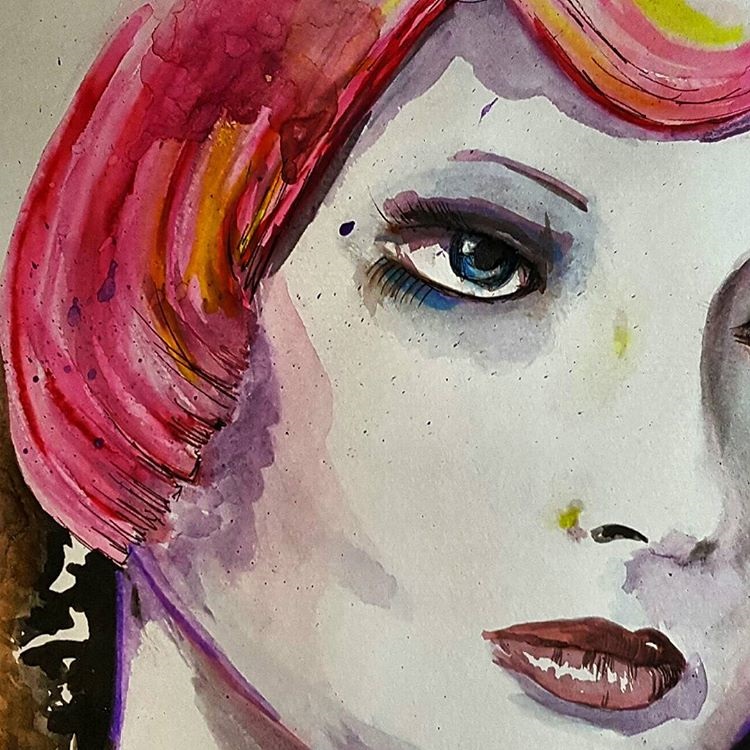
One of Lianne Moule's arm "Artwork". the watercolour bleed in the background is pushing what we think of as tattooing into another form of body art style.


One of the other aspects of the tattoo design would be the text or font used. I have looked at the various styles and designs, the popular designs tend to classic style, italic and flourished design and gothic. There is a cross over of English styled in symbolized icons like other languages.
These are some designs of the text styles currently used in most tattoos. I like the flourished and italic styles. I can see that I could elaborate on these designs and incorporate a design within the text font. 

A selection of on-body tattoos using fonts.

Using the basis of the colours and style of classic tattooing I had an attempt at just putting pen to paper to get a feel and nature of how tattoo lining works. It is not the same as drawing with a pencil as in the sense the shading and imagery is a flat white surface, the skin will be moving and the shading is sometimes more blocked rather than graduated, depending on the design and style of the work or artist.

Learning log pages - Notes


Overall, I feel I spent a lot of time on this exercise as I found this a new form of styling for me and quite difficult as the nature of the design was not flowing immediately, though I found my enthusiasm extended the more I wanted to see what can be created. 


Feedback - I had some valuable feedback over the book exercise and the menu card, I understand the points raised to undertake the use of free line drawing and to expand on some of my other thumbnail ideas and use these as guides to create some finished pieces that are not so restricted. I am hoping the free hand in this will come in time as often I find I am narrowing my versions down to fit within all expectations and not allowing a free flow on some of the final designs I choose. This is definitely something I want to work on in the future!! 
Exercise: Visual Distortion

Creating an illustration and narrative from the created collage, I think there is no set plan in this exercise as I had no idea or suggestion on what illustration I would create from my collage. As from the form of the collage to the drawing of the cat a personality developed where the viewer could see the eyes, expression and movement of the cat which in the collage was quite still and almost robotic in movement. The drawing after a few reviews and edits became a much more character based cat, which helped finalize this narrative. I initially thought the cat looked almost sinister but as I created him I think he became more friendly and here he is being in a heroic roll. I have to be honest with myself I do not know where the narrative is going or what it actually means but after a few sketches, this was what I liked the most. 


Here, Collage cat is helping the collage mice escape! Where are the escaping from? who built them? What are they made of?  -  I think I have created quite a successful piece here and filled the aim of it being a narrative. After my beginnings which I had pessimistic views I could not make anything from this, I am pleasantly happy with it. Maybe a further illustration could begin. I would use this method again. 


Exercise: Visual Distortion - Course Work
My first part of the exercise is to draw either a dog or cat, not being an easy task for me to draw an animal I chose a cat as I thought that they had a lot of movement and texture and shape. I found a picture of a cat that I liked which showed off their flexibility and stance. I did a sketch and worked it in colour pencil within my sketchbook.
I used a B6 pencil and gave the cat lots of movement and fluidity in shapes It looks like it is either startled or in process of a premeditated jump maybe.
The legs and body have some great lines to work from.


The next stage is creating the cat with just 5 lines, at first I expected this to be quite difficult, but I studied the cats shape and the negative spaces such as between the two legs and used these areas as points to start my lines from. I used a charcoal pencil and gave good fluid movement to the lines. I wanted the lines to be swift and smooth and cat-like.
Line drawing - creating the cat with 5 lines. I chose fluid moving lines. I wanted it to represent the animal and its sleekness and movements.
Moving from the line drawing, it is moved to creating a cat in collage. I scoured through some old copies of magazines and found shapes that were fit for my idea. At first I started looking for fur like items. (the main body of the cat is made up of a mole!!) but then in my thought process, I found an old lamp stem and thought ow tail like it was in bending, so then I started looking for items not necessarily cat like in appearance but had cat qualities in other ways such as the fork used as claws on the front paw.

My bizarre cat collage! I started out with being very connected to making it look very physically cat like, but as it progressed I started to use pieces that were of nature, or strong, structural and sharp. The position of clock hands reminded me of the down ward whiskers on the cat. The bladed knife cutting into the meat made me think of the muscle of the hind legs. All a bit strange but I actually really liked doing this!
This is my final pencil drawing of the collage cat! The use of all the items within the collage was a concern as I wondered how they would transfer as a drawing. However once I started I could see the shapes and styles taking place. After my initial outlines and shapes I started to review some of what was included. For example I omitted part of the rear leg as I think the red material didn't add to the character of this wily cat. Once the facial features were started I could begin to adapt the images to make his face more expression, I think he looks like he is scarpering. He looks like he is up to no good!

Exercise: Visual Distortion - (learning log)

I have done similar collage work previously but in a digital sense, but I found this exercise quite freeing and liberal. It did let me experiment and see how I can create illustrative work from other suggestions rather than the immediate. 

The line work also was a productive lesson, I found doing the lines quite intriguing and rather than doing it several times, I found it more worthwhile studying the object and thinking about what each line would show to the viewer. Five lines are quickly drawn and used but if I have to contemplate that it is all I can use, it is like looking at it completely differently. 

I am in overall happy with my finished narrative, this was one of those exercises I thought would be much a mountain but actually was not that bad! It is also a method of creativity I would never of thought of doing, but it does work, I think much is to learning to let go and try and be creative in a way one personally would not normally use or do.


Exercise: Character Development

The research in the first part of this exercise is to understand the dimension and purpose of an illustrated character. As each illustration we do is personal to ourselves as in much of that we are the ones whom create this illustrated person which in all purpose is to either evoke or create an emotion of sorts, even those designed for advertising and to convey or assist to convey a message.  I started collecting snips of various characters and cataloging them to create what I would suggest is my personal library. I started out with eight basic themes but ended up with nearly double. I used magazines and print outs from search engine finds etc.

My current sections are: Animal, Family life, Sports, Specialist, Workmen, Businesss, Baby, Bad kids, Princess, girls, and then I started in other catagories which though not suggestive of specific people they are more emotional themed such as moods, expressions and comic, graphic styles of people. 

Here is a slice selection of pages from my library, I have collected various characters and also I have incorporated other pieces I found along the way. The sketches were from a book I found in our local library which I photocopied, it is of an illustrator showing the methods of movement and stance within his child illustration character. I think this is good reference point for the future and for this exercise so I decided to keep it.
The process of creating a character from a book or from my own source or imagination, as I often can illustrate from my own production I thought the best exercise would be to use a book character for one of these parts of the exercise. I used a character called Mrs Madrigal. She is middle aged, an elegant but modern thinking lady. Laid back and relaxed, Mrs Madrigal is liked by all. Here I have used what I know from the books, and created an illustrated version. 
Mrs Madrigal  - I have come to this design and used this character to practice facial expressions, movement and stature and angles. I wanted to use a character not created by me as it would help me use the points of the exercise well. 
Using line work underneath the illustration to assess and suggest where the positioning of the facial features need to be within, this is useful for expressions, movement and constancy with how the character should look the same throughout a series of illustration. Also it helps keep spacing correct where needed and guides me to where I need to add detail, light and shade.

The second character I invested some time creating was from the opposite of my first character, I wanted it to be male, current, undefined, rough and modern. I decided to work on this 20 something guy who is stuck in his teens. I wanted this to relay in his expressions and stance and clothes. 
below is an image of my character post development. I found this exercise a huge assistance in development as often I just create what I can illustrate and rarely change or adapt or look at reproducing the character or image again, within this method it is sure to assist and expand this part of my creativity. 
For this character I decided to use a brush ink pen as I think the rough and thick and thin lines represent the character well and the sense of a little roughness. It was something I have not used before so this was good experience. I did find positioning of his face much harder than the first development. I think this is because I am not used to maneuvering my creations or thinking about movement or changing direction with how the character looks or moves.
Showing the line work to create the character, passing the positioning of the lines to the next facial expression so the haracter remains as designed and kept familiarity. Quite a tricky task!


Exercise: Character Development - Course work
I have added this in to the folder as I found the way the illustrator had given these random faces expression was brilliant, each one is not overly lined or detailed but you can instantly guess with a good suggestion of the mood of that character. Such as the shape of the eyes, the head tilt, the mouth shape etc. All helps build a picture of the character. 


The start of my character, I am using a fictional character from a book. I want to produce the illustration in a half comic style but not exaggerate the features overly. I want the personality of the character to be seen and felt.  I have brainstormed the things I know about this character and hopefully can portray this in the final pieces. 
I spent a bit of tine defining the character which I found quite hard, usually I would illustrate for my own purpose so to be restricted to the idea of one character and their persona already planned, I found much harder than I thought I would. Though it is much a learning process this part is essential. I have began the stages with getting the shape, the stature of the character and the details I know of her. I have processed through this in sketches until I start to find parts which fix together well.
Movement and positioning, how the characters underlines would change angles to create their stature and position.
Selection of facial expressions for Mrs Madrigal. I have tried to repeat the same shapes and moved them around as a solid object to create expression, movement and emotion in the face.
Left, right, front and back. Looking at how to illustrate the character from angles.The changing shape of hair, clothes, movement lines and positioning.


This is my first start of creating the second character, from the experience of the first character I am starting to be aware regarding eye positioning and centralizing the face and using the lines to express the movement and changes. I am struggling in some instances which I am working on. 
A selection that is expressions and facial changes. The lines have helped me convey feelings and facial expressions within the characters face, using this method will enable life and personality to the character.
Moving 360 around the body and looking at how the body shape changes but remembering to carry certain aspects through each degree and movement, I find that when a character is being created, moving from dimensional angles to side views etc. can be quite challenging to do and keep the character unchanged.
Facial and body movement and changes to the character. Including moving lines and facial features and adding lines or not using certain lines for example brow lines or nose lines.

Exercise: Character Development - (Learning Log)

Looking at the character 2 dimensional, what the fact are that I know of her and her emotions, feelings, physicl attributes and other indications of personality. The character is book based and hopefully this will lead to a depicted persona in illustration form. 
I have access to some illustration books for a few days so I have copied and used them as POI for my folder as with this character in the picture the way the equal positioning and underlying design moves and turns with the character but stays the same is a great guidance for me for this exercise. I often find it can be a tough call to actually put a character into a position or situation as it is often easiest to draw as we can rather than push the limits and see what the illustration can do.


Assignment Four: Magazine Illustration

From the beginning in the assignment I wanted to try and use methods I know but also expand a little in mixing the medias and seeing how it works. My initial design comes from an objective drawing, which under various processes and selection ended up as part of my finished piece. I think the working in the medias I chose was difficult to work from my visual to what it transpired as it did change slightly along the way, but overall the finished piece I am pleased with. 
The theme is "Guilty Secret". In this final piece I have tried to express the feeling in sections of the illustration.
The colours I have used are dark but rich. I wanted it to be a closed in feeling from the darker tones working into the middle of the image, but I did not want to express it s sinister. I think the finished colours work well. The text is representing similar style to impersonal as such a ransom note, unknown and non-description to hide identity,  Th paper bag is where the secret is kept. The lock is to signify that the bag is held closed, but it is impossible to lock a paper bag! A secret would not remain a secret forever. The overlarge key being dragged by the character is to represent the weight and size of holding a guilty secret. Rather than use the illustrated key originally drawn I photographed the key and used this as it shows the heaviness of the object.
I used the print on the bag to suggest the guilty secret would suggest a link to Love as most guilty secrets would be linked to love of someone or something. The introduction of the character is to represent the size of holding a secret and it is to lift the seriousness of the title and also to show that the guilty secret is not fun by the strained expression on her face.


Feedback - from my information from the report on this assignment I have looked at redesigning the image to create a more substantial message. The different aspects I had inputted had almost drown out the purpose of the illustration. It needed to be simplified and rectified. I added the tag, removed the illustrated girl and changed the bag back to a brown carrier. The key now represents the "Ssssh.." Secret and the brown paper bag is the shame of the secret. I think this works better, I am not sure. I think I did over think the final piece too much and have tried to incorporate a little too much into trying to get the message out there resulting in the message being a little mixed up.


Assignment Four: Magazine Illustration - Course Work

My original objective drawing from my decided compositions. I was trying to convey the guilty secret. I looked at how the bag should sit and lay, I used a ribbon to try the key to the make the viewer think it is personal. The idea behind the brown bag was discretion and understated as I would think a guilty secret would want to be hidden and unobtrusive, 
This was a second attempt at my initial drawing, this time I worked upon filling the line work in and making it more a solid set of shapes. I used shades of brown to establish plainness.  
When I had been away from this for a couple of days I had the idea to scan in my design and use the software to enhance and edit the design. I wanted to think of colours and darkness. I did suggest green as in jealousy as this would be an emotion linked to guilt and secrets, but I don't think it worked. I did like the blackness of the bag in one design bit I wanted to work more on it and see how far it could be altered and change.

A selection from my sketchpad of how I started work on building up my character, I wanted her to be tiny against the key, I wanted her to look tired or strained with the weight of the guilty secret in form of the big key.

The start of the character build up. I was a little unsure about whether to give the fave lots of detail or keep it minimal. I am concerned that too much detail can then distract from what I am wanting the image to say.


Assignment Four: Magazine Illustration - (Learning Log)

I wanted to try using a couple of mixed media methods in this assignment to see how it would suit to me. In the final piece I have used coloured inks for the background and watermarked and distressed the colours. The collage paper bag is mixed with illustrative line work to emphasize it. The key is photography, the character is created and incorporated into the image and the text is collage into the background. I really had to think of how to express the "Guilty Secret" in imagery, I did not want to over complicate the picture and think too much illustration would be detrimental to trying to enhance the accompanying editorial. 

I also found this website which had some great information on. I studied the illustrations on here to to see how they are designed. I noticed that on much there is very little to the backgrounds apart from textures and colours. This is what I have taken and used on my final design. I think this is important and I noticed from my thumbnails though to visual and to the final how the using the background changed the illustration to enhance the darker side of the theme.

Website link: http://www.creativebloq.com/computer-arts/5-top-examples-editorial-illustrations-81412592


I also looked at other collage illustrations to get some suggestive ideas on how others work and incorporate this in mixed media. One illustrator I found is Martin O'Neill. His work is very detailed and the collages he has created are collaborative of themes and very stimulating to look at. His book cover for Oliver Sacks is collage used in geometrically explosive way! The further I read about O'Neill his work from illustration has also lead to his work into interiors being commissioned for a ceiling design in a bar.

This was one of the first collage pieces that brought me to look deeper into O'Neill and his portfolio of works. This piece instantly drew me in with each collage circle.  The hands look like they are letting go of a hundred thoughts or memories. Again as in some other works I have noticed the limitations on how to use backgrounds and not overfill the image with layer upon layer. I suspect this is to stop the eyes gauging on too much to focus on and over reading the message the illustrator wants to say.

learning log page - Notes
Learning log page - Notes

No comments:

Post a Comment