Research & Reference Information
Illustration 1: Illustration Sketchbooks
Dr Emma Powell's Sketchbook tour.
The video of the talk through amongst the pages confused me at first, I was a little unsure what I was meant to be acknowledging. I got half way through, reset the video and watched again. Looking into someones sketchbook is like looking into a diary, I find it can be very personal and how it works depends on how the illustrator or the book owner perceives their view of the world. I can see how Emma has used her book to progress through her "working outs".To be given privilege to look through Emma's book is amazing. I completely understand it is no way a blueprint of how a sketchbook should be, but it does show the way it can be. I am going to hope there is no right or wrong in making and creating a sketchbook.
The method of binding is interesting and the use of how the compensating guards create "pre" space for insertions into the book as
I loved the use of photos, (might have to steal that one on some occasions), and the bulldog clips are an excellent idea. I know in Drawing 1, (previous course), I began over layering my sketchbook with extra papers and pages of sketches with tape and It became two things, over bulky and the processes became all noodled together in its stages. I was trying to make it read like a progressive story of my course in finished pieces rather than letting my creativity and ideas expand out and not restrict myself.
The showing of how Emma has constructed a sketchbook gives me some indication of ideas on for what the possibilities can be for creating a personal book. I have many sketchbooks. Some relevant to course work and some that are ones I start and never finish. I want to aim to complete some sketchbooks throughout this course and I will revisit this vimeo and draw ideas when I get blocks.
Research task 1:1
Researching various artists relating to sketchbooks:
Steve Huston
Prashant Miranda
James Jean
Will Kemp
Wil Freeborn
Frida Kahlo
Steve Huston - The artist here is a specialist at making beautiful sketchbooks. They look like they are pieces of work in themselves. Some of the pages I think a reminiscent of Da Vinci Sketches where he has worked in fine lined ink drawings.
The pages where he experiments in colour blocks and variations on the small lay outs of his painting ideas give him a catalogue effect of viewing the page and making judgement on what works and what doesn't. I think this may work in the process as similar to make a brainstorming pad.
I found on Steve Huston's Facebook page a descriptive that he provides about what sort of book he uses. He used to prefer an oatmeal coloured book but these were discontinued, I am not sure if this is colour preference or personal preference ascetically. He also likes spiral bound books. This can be optimum for the book to be flat, or for the use of folding over the cover. I think as he is uses gouache paint in his books then this maybe why this is preference to a bound book.
I noticed in some photographs of Steve going through his sketchbooks he does use a fairly simple filing system of Post-its. A good idea to use, they have a non marking adhesive and are temporary so can be moved around with the use of the space to write notes on.
I watched an interview with Steve, he takes about his sketchbook keeping and how if he makes errors, he does not abandon it, instead he reworks it. He tells us this can lead to new ideas. ("It can be a happy accident").
The sketchbooks are like looking through a memory book as the images captured all offer a light hazy photo-shots. I am drawn to his sketchbooks, the neatness and methodical way he plants down his images and fills and doesn't fill some pages.

His sketchbook shows the crossover of a sketched image to the processes of looking at shadows, tones, colour. Adding depth of the surroundings. His sketchbooks are very open and continual. They all have a similar plan of structure. Do I enjoy them? Yes, but do I like them? Well, yes I do but I do like the excitement of difference and not knowing what is included in the book.
What can I take away from this book? I engage with the pages as the sketches switch between painting theories and back to sketches. This does give a progressive flow to understanding and remembering what is captured like a written word. It does tell me, that if mistakes appear to override them, leave them there and work them out with what I am studying at that moment.
There are many samples of the artists books on Pintrest. He does tend to have a fixture of the style of pad.
Hutson has done some online lesson/classes for creating a sketchbook proving his popularity in sketchbook style that people would pay to be taught to imitate this style.
I would consider this sort of book as a sketchbook. I think the relevance is going to lie in my future of what medias that are worked.
Prashant Miranda - I found this artist while looking for some reference books, one in particular. (An illustrated life by Danny Gregory 2008, Publisher F & W. )
In the book there is a selection of artists, all from various backgrounds, countries and all vary in style. Prashant's sketchbooks drew me in with the journal diary on some pages that explain that day or that moment. I feel a connection to this as he seems to encase a picture and bring me in to want to know more about that certain moment. I have made notes in my log regarding him as I think he could be a good reference point to return and review again in the future.
His mediums are in the boundries of pencil, ink pen and watercolour, which all three I do like to use. He combines some pages with sketches of that moment or thought and he also adds textual areas to go along side. I wonder if this is a jump back to almost journals and using words to help explain the imagery, not to the viewer but to Prashant himself so he remembers or recalls what this was meaning.
In the video he discusses his books, and two parts I found very intriguing and I liked this almost imaginary scene setting. He draws from his memory of his times growing up and his senior relatives and moments he recalls but then he has captured them in sketch form. He also mentions further in that he does this with dreams that he has.
I never thought out this as a fuel for sketches, but yes, I guess when you actually think about it, where is the rule that says we can only sketch what is physical. The thoughts he ha as dreams are as real or true as for instance, a bowl of fruit on a kitchen table!
He has some very forward ideas with his books.
In the accompanying paragraphs around Prashant's sketchbook images in the A Illustrated Life book, he discusses his use of a wrap of leather and using loose pages to create and keep his work with him. The thought of the loose papers does upset me slightly, but the thinking process of having the liberty to not be restricted by tied in pages is also giving a feeling of excitement too.
This video is rather long, but it is worth watching. There is something therapeutic about listening to another artist explain their processes and sketches. It almost is a total voyeurism of his work!
James Jean - Taiwanese American Visual Artist, based in Los Angeles. His work can be seen on http://www.jamesjean.com both in sketchbook form and also his finished artwork. His style of sketchbook work is appealing. In that when you look at the pages you are taken into a very personal view of his imagination as some of his work progresses from what he visually sees and what he visualises at the moment. There are interesting pages of working on grid papers and plain papers and some are pure ink sketches (he also works in biro), I find biro / ball point pens an excellent implement for sketching, great for crosshatching and smooth swift working. He uses colour on some pages, some just one colour or a fully detailed sketch.
I appreciate his presence of traditional and graphic modern illustration combined on his sketchbook pages.
James jean has released copies of his sketchbooks but they are so rare and in demand they fetch ridiculous amounts of money. The books are pages of works of art.
There is a youtube channel called Sketchbook skool. There is numerous videos of sketchbook reviews over many artists, one is James Jean. The narrator gives a great insight and talk over Jeans work and sketchbooks.
I enjoy his sketchbooks because of the content per page. His study pages of when he is in situ (EG: on a train or plain, have graphic and precise feels to them. In some pages he uses ball point pens in three different colours and makes the sketches very atmospheric.
His studies of people are not complex but he masters the skills to capture the likeness and detail in as few lines as possible.

Looking at this example I find the way he almost micro writes fascinating, this could be because he wants to save space but get his thoughts down on the paper, or maybe he does not want us to read the information he has placed.
Jean draws his imagery over-layering the previous without worrying about losing any detail or missing anything out, he draws what he sees from that point of view.
I am enjoying the worked detailing in the face on one subject and then the body is made of lines but it does not lose any weight. I like he has even captured the moment out of the window. He must work fast and efficiently to grab these moments in such detail.
I would appreciate to capture that skill.
Will Kemp
Will has a very free and easy style with his sketches. This
I found to be a good source of not only inspiration but he has quite a good
knowledge on his website that can give great tips and pointers for sketching
everyday.
He does have quite a good piece regarding on how different
implements used can produce different styles of sketching and what is good to
use different environments.
He talks through his process as he sketches a urban scene of
a bike. The video link is below:
I found this useful. It does show that when sketching,
especially in a situation where the view may change or alter in a short space
of time, that there is a ways of composing what you see and picking out and
putting the essential parts in the sketch and producing that moment in a
drawing.
He uses a small sketchbook on travels and captures some
depth of scenes by using two or three pen thicknesses. I might look at making a smaller sketchbook
or buying one, as sometimes I do think working outdoors and using a larger page
can feel quite daunting and have the urgency to feel to fill the whole page.
Looking at Will’s sketching, it does give me some
indications on looking at sketching a little less formal. His lines on
buildings for instance, are not particularly straight, but they give the eye
something to follow and hold the perspective. Whereas sometimes when I have
done this sort of sketching, I have spent much too long on ensuring lines are
quite level and end up over working or making lines too dark which then messes
up the perspective/depth.

Sketching everyday objects is probably a good
process that most artists go through, I think it might be because we are
dealing with the familiar and we know the feel, the texture, the smell and the
purpose of the objects and items. Does this give us a conciseness to
re-creating it on paper?
There is a lot of Will Kemps sketches on Pinterest to view.
The use of watercolour on his ink drawings is something I have done previously
but because I find the bleed can be a bit uncontrolled I often give up, but
looking at his work, does make me think I should be less worried about this
occurring. Pointers for me to remember:
- · Mix my inks with using other mediums
- · Try a smaller sketchbook
- · Don’t try to be so precise with line work
Wil Freeborn
British Artist / Illustrator
Glasgow Art School
Wil Freeborns sketches in brown ink, he used to use black
but found the lines were to heavy so transitioned over to using a brown inked
pen and watercolours. He captures various scenes on his travels and locations,
I like that he is not afraid to include the people in in his moments. Some of
his sketches, I do not know if this is intentional, but I think he mutes his
palettes to two or three colour ranges which I think works well. He doesn’t do this in all his sketches, just a
few I noticed while researching.
I am now following him on Instagram, there is some amazing
images on here of his work.
There is a combination again of the ink and watercolour as
with Will Kemp. But I think this is because as a traveling journal or
sketchbook, these are quite non-imposing apparatus to carry round and get the
most from. Coloured pencils would break, take up space and using other paints
like acrylic or oil rely on air drying time.


This
sketch is makes me feel like I can smell the books and the closed air of the
cramped space. There is detail, then lack of detail in places, but it all works
and picks out what is happening. The near landslide of books and the chaos
around them and the over filled shelves. The small man surrounded by it all,
but he is so engrossed he is impartial to what is around him, he’s probably
quite happy with it!
I would like to aim to be able to capture these sorts of
moments and work towards this sort of processing of sketchbook keeping.
Wil often would set out on his bicycle and go to visit areas
to capture scenes, he suggests sketching as often as possible and trying to
sketch every day. The looking back over sketches is a way to gauge
improvements.
Reference:
An Illustrated Journey
By Danny Gregory Published by How Books 2013 edition.
Sophie's drawings/sketches are often quite local or within some sort of connection to her day to day living, bring the everyday into her books by maybe choosing subjects that Sophie is in position where she feels she can dedicate time to her sketching without feeling awkward or rushed.
Would this be a good angle for me to start sketching?
I cannot find anything that I dislike or find as pitfalls, I would think that as an illustrator Sophie has tried and tested methods and mediums, and what she uses is her tools that work best for her style.
The website belonging to Sophie does give some valuable tips into sketching, and though I have some experience of sketching I am still very new to this in terms of longevity in doing it. I am taking this as preparation for the exercises ahead and I have also invested in a book by Klaus Meier-Pauken - Quick & lively urban sketching. I decided to buy this to try and incorporate some ideas and hone in on how to build up my sketchbooks and bring in this method of sketching.


 Now, I know there is probably way more pens than any illustrator or sketcher can use, but I like o use them all and as they all fit in, I carry them all. I have a variety to give me the choice when I come the sketch. The Micron pens are brilliant for work I intend to add watercolour as they dry fast and are a very strong black ink. The grey, sepias and the very light grey, are used for a couple of thing. The grey and brown is very good for urban such a walls, roads, people scenes too, the light grey I have used for faces and people a few times as it is not as harsh as black. Also, using a lighter ink allows for play, mistakes can be left and lost under other lines, especially as sometimes I sketch with these three and either at that session or later, I might add more with the black pens.
The black pens are all different, I have brush nib which is super for fast quick flowing sketches, I have small, medium and fine nib liners and also a 1.5mm soft nib which is good for some basic solid line drawings or sketches. I do tend to draw with the micron pens, but it can also be what I am feeling at that moment.

 The accessories are quite simple. I have a pencil sharpener with a case to catch shavings. I have tried a few different sharpeners, I find some are quite unreliable and can be just as damaging to pencils as dropping them, by hacking or over shaving the pencil at the wrong points, all relative to the pencil shape and the type of sharpener. I have this as one as it has two different sizes and the it is easy to use and it works for me. I have a eraser pencil with a brush, I don't use this that much, but it does come in handy on occasions if I am doing longer study and have time to be a little more careful and want to correct mistakes, I also have used it to blend, though that is not really the purpose. The brush is handy for dusting off pages if they get grit or eraser marks on. The blending stubs are good for fast sketches and adding shade without getting fingers involved. I do tend to use the wider one more so, plus it can go in the sharpener to freshen it up. The putty eraser does get a lot of use, its good for adding detail by taking away some over drawn bits, and also I do use it if i make primarily sketches in pencil and then want to later draw it in ink.
 This is the extent of my colouring in my kit, it has only 12 colours, but it is enough. There is a sponge for dabbing and the brush has a water vessel within the barrel so I do not need to carry water separately. I do find I use this more so now than ever before. I think that shows by the state of the on board palette in the lid, but naughtily, I do use all parts, including where the brush lives! The best thing I find with watercolours like this is because they are higher quality, the pigments is stronger so it does give me the choice of being bold or tepid depending on what I am wanting to put down to paper. I see from Prof. Jo Davies list that there is tissue paper to place between pages for drawing/watercolouring while out and about so the pages don't stick or get too wet and transfer colours etc. I am going to look at this and see if I can try something similar to include in my books.
I don't always carry the caddy, my slimmed down version is usually, my B2 pencil and a liner and a ball point pen. No accessories. I find these three items will slip under the elastic of my books and stay secure, any more is too much and the reason if I am on slimmed down version is because I either have little space or it is going in my pocket, rather than a bag.
This is a brief look at what I am carrying around with me at the moment. I have currently two books that are non-coursework sketchbooks I use, the small A6 book - has elastic to keep it tightly closed. The paper is grid marked and the back has a pocket for collecting anything I want to keep. This lives in my work bag so I have something to sketch in as and when.
 My other book is A5, watercolour paper,very good quality, It is made of soft leather cover, there is no pockets or anything else except the elastic wrap to keep it closed. This is kept for when I am out and about, its my favourite book and I make sure it goes back on the shelf when I am at home, its size fits well with the caddy.


There is a differences in how documenting reportage works and the illustrations vary compared to how the illustrator works to achieve their drawings.
I have documented and kept records of the websites, made notes on factors, like how do they record sketches, also the materials, subjects and some have fabulous access to online sketchbook records. (Both Chloe Regan and Louis Netter are good examples of this).
Plus if any other students do visit this blog, David Gentleman has a very informative video as he goes and sketches scenes in London and talks through his processes and thoughts.


https://www.theatlantic.com/entertainment/archive/2015/07/doodling-for-cognitive-benefits/398027/
Frida Kahlo - I was initially thinking of investigating artists that maybe I had not heard of, ones that came up in the OCA statements of members favourite sketchbooks from Artists or Illustrators. The more known, I did think I would not possibly venture to.
But, then just by chance, (I was looking for something totally unrelated), I saw an open page photo of a journal. This belonged to Kahlo.
I then, decided to investigate a little further. What had intrigued me about this artist, came from the difference in her chaotic and filled sketchbooks and the quite clear crisp style of the artwork we see regularly as samples of her work.
The sketchbooks did embody her palette of colours and the boldness in some sketches of the strong lines.
Why did her sketchbooks resonate with me? The filed pages with text, paragraphs and underlined works. This sometimes filled pages, sometimes it spilled onto her sketches, this to me represents her, as an artist the need to make the most of everything and use her sketchbook/journals to full commodity.
It is not my style, as yet, I don't really have a style, but I so far have found her books the most intriguing.
 |
| Had to find out more! I prefer sometimes the physical presence of book rather than the onscreen information. |
I have researched more about Frida, as a person and her life story. Her path was at least to say very eventful. I can understand the passions and conflicts she lived through and can see how this helped channel her dedication to keeping such visual and capturing diaries or sketchbooks.
Maybe the extremity of the emotions makes these books what they are. Would they have held so much story telling, if they had been at her hands if her life had been uneventful or her beliefs were not as passionate?
I think the collision of all these factors have made the input of the books the reason they are so absorbing. I think when you look at them you can feel the passion and intensity of her persona.
(Book arrived: The diary of Frida Kahlo An intimate self portrait 2005 Abrams edition.)
This book contains the last sketchbook/diary of Frida from her last 10 years of life. The imagery is as if looking through her own personal book. I cannot understand the script, but this does not matter at the moment. There is a translation and commentaries of the book following the facsimile of the diary. Though for the moment, I am quit content with being able to browse the pages without knowing the text. I want to see how I read it and how much in tune to the sketches that I am to Frida and her mind of that moment the page was filled.
I can see from the latter marks Frida makes, the angst and frustration in her. There is more frequent text, and the images get less detailed. Is this her fading? her struggle to maintain her book as she neared the end? I don't know, but despite the lack of language, I can feel the pages are very much personal within the pictures.
(update: I am currently reading the book, understanding the start of Frida's life and her influences from the outside world and her afflictions. Before the book engages with the copy of the diary, there are two sections telling of Frida's beginnings and how her environments around her shaped how she became.)
Within the beginnings of the second section, there is a mention of Harold Rosenberg and also the term "Action Painting". Under the descriptive, I firstly got the imaginary thought of a tin of paint hanging over a canvas, hanging from inbetween the legs of a stepladder and a crude hole being punched in the tin and the tin swirling around, making mechanical type gestures with the gravity pulling the paint down to the canvas surface.
Well, technically not quite there, but as I researched into "Action Painting" I think my interpretation was not too dissimilar.
Rosenberg termed this form of painting from well know artists such as Paul Jackson Pollock. Though I am familiar with Jackson Pollock as an artists name, I was not knowingly aware of what his work has been categorized in terminology.
I found a video that thoroughly explained the coined phrase of Action Painting. The marks made are almost free. The artist has some control but the art comes from the secondary part where the medium touches the canvas, and the action is the movement and free air painting from the artist, their physical creates what is transferred to the canvas by what ever medium. I may be interpreting it completely wrong, but I see it as an open connection of what comes from the artists to the canvas etc, with little or no restrictive or controlled hesitation.
There is a video on Youtube that explains P.J. Pollock and his methodology and how the term "Action Painters" was coined by Rosenberg.
How to Paint Like Jackson Pollock with Corey D'Agustine in The Studio, (Pub: 24/10/2010), Directed by Plowshares Media [Youtube] https://www.youtube.com/watch?v=EncR_T0faKM (accessed 26/02/2020)
A short video from Allison Kunath. Allison talks through the process and the reasons for blind contour drawing. This is very worthwhile to watch as it is much easier to see the processes in action and understand the outcomes and the purpose and productivity from trying this as a method of sketching.
When I watched this I was impressed by the quality and individual expressions of the faces of the portraits. Allison locks onto her subjects and intensifies on making mental notes of the sitters face and projects it in lines continually moving and taking notes in this way.
I did find this useful, as though the exercise that this technique is used, seeing someone who has honed the method and produces work with her sitters also included in the video, the visual of seeing Allison work gives a good indication on hour contouring works.
Research task 2.0: Sophie Peanut
Sophie Peanut Sophie Peanut is an illustrator based in Halifax UK. She specialises in illustrations developed from rapid sketches conducted on location, and her website offers tips on conducting rapid sketches. Look at her work and compare her working methods to your own, then discuss any merits and pitfalls you can identify in her work in your log. Can you identify other artists whose work has a rapid style? http://sophiepeanut.com/5-minutes-sketches/
Through the courses I have kept sketchbooks and worked in my own private sketchbooks over the years. Through the coursework, the entries of my sketchbooks have been for the purpose of the course and instigated by tasks and exercises. All are well and understood but the purpose of sketchbook keeping is coming to light.
Looking on Sophie’s website at her work and her sketchbook pages that are view-able, I can see a distinct difference with my books and hers. My pages tend to be captured pieces, not realistic and often finished, planned pieces. Whereas Sophie is showing us how to manipulate the books and ensure we sketch into them regards of it being a five-minute slot on a bus or in a café, to spending a relaxed moment at home sketching familiar environments. Also, Sophie mentions adjusting after the initial sketching, such as adding a black background.
Similarly, I do use pen/ink as my main often "go to" tool, the comfort of it and the ease of use, and I think once you develop a relationship with a medium, it tends to have presidency over other materials. Sophie, does a lot of ink drawing with adding watercolour either at that time or later on after the initial sketch, both of which I do.
Sophie works within everyday themes too, but often her sketches are accomplished scenes often including people, family or friends.
This combination, I have not tried, I think this is a strong established method Sophie is using, as with the confidence of her materials and of the scenes and subjects have familiarity.
I will try this in my sketching to see how it progresses.
The positive on completely filling pages is a satisfaction I think Sophie must stride towards, however from the information I am already taking in, I understand also the resistance to let that pressure of page filling to be withheld. There are times in the past when if I have not filled a page, I have felt let down or not assured with my own work that I am doing what is right. Of course, from Sophie's narrative along side her sketchbook pages, she explains the mismatch of drawings within the sketches and how she works to obtain sketching at varied opportunities.
I find that from this the pages make very interesting stories, and they have the quality that draws you in to that moment.
Sophie's drawings/sketches are often quite local or within some sort of connection to her day to day living, bring the everyday into her books by maybe choosing subjects that Sophie is in position where she feels she can dedicate time to her sketching without feeling awkward or rushed.
Would this be a good angle for me to start sketching?
I cannot find anything that I dislike or find as pitfalls, I would think that as an illustrator Sophie has tried and tested methods and mediums, and what she uses is her tools that work best for her style.
The website belonging to Sophie does give some valuable tips into sketching, and though I have some experience of sketching I am still very new to this in terms of longevity in doing it. I am taking this as preparation for the exercises ahead and I have also invested in a book by Klaus Meier-Pauken - Quick & lively urban sketching. I decided to buy this to try and incorporate some ideas and hone in on how to build up my sketchbooks and bring in this method of sketching.
Peter Cusack is a American Artist and is work in overall appearance looks different to Sophie’s style but his methods and processes are quite similar. His sketchbooks and sketches are quick and rapid, and he makes a lot of quick portraits in his sketchbook. Living in NY his commute became a sketchbook study time, and while people were relaxed or engrossed in their own day, he would rapidly take notes and sketches.
When you look at his paintings, he captures the human figure and movement is large and fluid swipes of paint in brush line and colour. I am understanding this comes from his studying the human face and figure and breaking down the variations of what marks make for the importance of still telling the story.
 |
| Peter Cusack, (unknown), Peter Cusack work sketchbook, http://www.petercusack.com/work/sketchbook?view=slider#14, (accessed 28/02/2020) |
His sketchbook images a series of soft lines and marks that integrate to form the faces and expressions of the models. His quick sketches are not as detailed as Sophie's but this is because on a travelling situation I would hesitate your subject can be up and gone within a blink of an eye, so rapid working is president to getting likeness and capturing.
http://www.petercusack.com/work/sketchbook?view=slider
Peter works on what looks like plain ivory removable pages from his sketchbook, I think they look journal sized, so narrower and \i would guess this maybe to be discrete in public places such as transport or waiting areas.
Peter works on what looks like plain ivory removable pages from his sketchbook, I think they look journal sized, so narrower and \i would guess this maybe to be discrete in public places such as transport or waiting areas.
Noma Bar - (limited line drawing research)
The design work of Noma Bar is a very clear and example of the purpose of the exercise. There are dominant points to his work that are successful. His first being the limitations in the details that are in the works. His designs are often not what we think they are, but what we read them as. He uses block colour and simple shapes that are familiar to us, such as facial profiles, or shapes that are recognisable, but twists them by adding in another shape or form that is also familiar, both coexist together on the image but the way in which the viewer interprets the picture is entirely personal as to what is recognised first, is it a face? a shape, an object. But when I break down his simplistic designs they are purposely in a certain place or angle, this all plays part to the familiarity and how we read the image. He uses the way we gather information to suggest what is there or I guess, not there. This is mentioned in the Gestalt theory of where group objects close to each other to make sense or collectively make the objects into what we see and also the figure-background aspect of where we try to decide on focusing on the object/figures or the background to ascertain what we are looking at. For one example, he illustrates a book cover, the we see a black cover and the side outline of a cat, the figure on the cover is a facial profile which faces into the cat, but is that there? or is that the shape of the cats body and we just assume that is a facial outline. It is a very clever concept and as an artist, I think this must be a very difficult method to acquire as a skill because I would think it is hard not to dominate one part of a image for another, the balance has to be right for it to be successful if the limits of lines are there.
Though I know it is not as such a trick, but it is one of those questions of what it is the viewer is looking at. This could be a very good point for an artist as this means the audience is captivated for that moment while they summarise over the imagery.
The example below shows how Noma Bar uses the interactions of the background and the figures to create two possible visuals. Is this a face of a man looking over his shoulder or is a woman tumbling back into the darkness, her legs flaying as she falls? a very clever use of figure-background.
 |
| Noma Bar (2019) 'Killing Comendatore' [digital] - Killing Comendatore Omnibus Edition |
Research task 2.1: Lucy Austin
Lucy Austin - Painter & Print maker.
The best source of information regarding Lucy comes from her website:
Lucy Austin, (unknown), Lucy Austin Drawing-from-the-studio, lucyaustin.artweb.com (accessed 03/03/2020)
The viewing of the sketchbook page numbers shows the simplicity and mark making created by Lucy with the use of Gesso, ink and collage. I know I am studying the watercolour work but I was drawn to these sketchbook pages firstly. There is a connections to the artist watercolour work, but the sketchbook pages and the papers using just ink forms holds links.
Firstly, the gesso creates a depth and strength to the pages, the use of ink is so strong and defined. It give some great shapes and forms. From a previous research point in Gestalt theory, I can see some of these arrive in Lucy's work. Firstly, I see the use of similarity, where the colours are repeated, the lines and forms are all quite similar. The shapes also continue with repetition and this is also combined with the order of the lines. Not in all of the work but some, such as diamond shapes or the arch shapes. The third noted in Lucy's Ink on paper is the theory of figure-ground. Here the lines do not necessarily depict the objects or shapes nor do they pronounce the background. I am unsure if I am right to be discerning these in this way, as I know it is not the intent of this part of the research but because the Gestalt theory is fresh in my mind I noticed these points. Lucy Austins Sketchbook pages accumulate collage combined with bold marks and also reapplying cuts of her work onto pages, using textured and different thickness materials to create effects.
From Lucy Austins website, there is a section that contains some photographs. Lucy collects these photographs of everyday parts of the environment that inspires her and influences paintings. Such as her urban cone drawing, she uses watercolour, and though this is a lot softer than he sketchbook pages, the painting has sharp colour segments and the use of repeated shapes and colours has been used.
Does this come from the using a sketchbook to build upon ideas?
Lucy takes photographs of parts of objects or scenes that have interest to her and show some how man made and natural objects can create very satisfying forms.
The use of watercolour to paint the everyday objects is used in a matt method, almost in a print style.
One of Lucy's collections, Tender Machines (2012/14), includes watercolour art. The studies are of structures such as pylons. Lucy has broken down their forms to a simplistic style. Though this has been done I can still see the shapes, dimensions and forms of the structures.
Also there has been a limitation of colours, keeping a clean and uncomplicated palette. I think there is a basis of using six colours, there is three or four in some studies, or just two in another. Also Lucy does use the colours for a flat background on some of them, not all but some.
Am I seeing the Gestalt theory working here? There are definitely some of the principles in action. Similarity and order.
The way Lucy uses the watercolour is not as I first imagine watercolours to be used as, there is no build up or detailing, or using them as soft palettes but Lucy uses a thick brush with bold lines and deep colour in areas of the work. This is showing there is different ways to use mediums.
To consider another artist I came across an artist from the 20th century, George Grosz. George was not a typical watercolour artist. Though he was a century before Lucy Austin, I thought he was quite contemporary in his subjects and his style. For an example of this there is a piece I was immediately drawn to called "Berlin Streetscene".
 |
| George Grosz (1930) 'Berlin Streetscene' [ Watercolour, ink and oil on paper ] - private collection. |
The watercolour is used completely different from Lucy Austin. George Grosz uses the colours secondary to the ink illustration, the watercolour adds shade, colour, depth and by the density it also helps with perspective. Whereas in Lucy Austins work the medium is used to make the shapes and forms. This particular piece to me is atmospheric and despite the comical or characterising of the faces, the whole painting is quite dark. In Lucy Austins sketchbooks there is a mixed media range where watercolour is used, but it is used for mark making and has fluidity. George Grosz used the paint in a mixed media setting with the ink and oil, but it is defined and precise. Though at first I did think precise in placement, I did consider if this is not a difference with Lucy Austin as though her mark making may look like it is not as a precise movement, that is only me thinking that, when in fact, each mark could be just as well thought through as George Grosz would do in his watercolour work.
The subjects are completely different, but in terms of the inspiration to their time they are both relative sources. George Grosz used the political landscape and the current environment in which he was living and his personal views to create some of his work, where in Lucy Austins case, her landscape was the environment in its physical form as to her inspiration.
The other difference in the artists way in which they work with the medium also is maybe also relative to the time of the work being produced. Lucy Austin used watercolour in bold sweeps and also makes the imagery using watercolour in some of her work as the main medium alongside other mixed mediums. George Grosz works precise as I mentioned earlier, and for instance, in the image above, the paper is folded and creased, he was being an artist at a time when he was opposed by most for his believes and I wonder if this restricted his finances and availability for supplies, so maybe he had to be quite careful in use and by creating mixed media images he was also saving over use of his materials.
"In the latter part of his career he tried to establish himself as a pure painter of landscapes and still life"
Tate Modern (2019) Tate-Art-and-artists-George-Grosz, https://www.tate.org.uk/art/artists/george-grosz-1223 (Accessed 05/03/2020)
George Grosz changed his direction in the latter stages of his life. I found this out as I further researched into George Grosz and his work. I did struggle to locate images of his later work as he died in 1958. I found one from 1950 that was watercolour on Gouache paper, it was Manhattan Sunset. It was just watercolour, no other illustrative markings, and though it was detailed in the structures of the building and the colours were rich, I was surprised that when I looked at this, I could see similarities with Lucy Austins work, rather than differences, he used repetition in his objects and used strong bold lines in watercolour marks to suggest shape and forms and similar to how Lucy Austin uses watercolour for backgrounds, George Grosz had previously done an almost identical style for the sky background.
Research task 2.2: Christoph Niemann and Saul Steinberg
Christoph Niemann- Christoph is an artist, Author and animator. This research is in connection to the exercises 2.5 and 2.6 where the use of objects becomes central to the creation process or plays a part within the creation.
Lucy Bourton (2019) Christoph-Niemann-in-conversation at: https://www.itsnicethat.com/features/christoph-niemann-in-conversation-illustration-230919 (date accessed 10/03/2020)
In the interview Christoph Niemann talks about his general personal/family life but also discusses his processes and his abilities in how he works. He brings to the point on how if a brief is handed to him he can be confident in producing what is asked of him and over the years of his work experience in editorials it becomes a way of successfully completing a brief. However he also talks of how if given freedom to be send some where and be "inspired", this can be the most invigorating and challenging way of new work or ideas but also as the unknown is at hand, he also states this can be the most "Stressful".
I know this is not directly linked to his work in the context of the exercises it relates to but it is interesting to hear from an established artist how the unknown of taking a book out and sketching or being creative can be itself a challenge.
Christoph Niemann produced some books, one being "Sunday Sketches" (2016), his use of everyday objects is so creative and imaginative. When I look at some of them I feel that I could not see them in that way, but he must have a very good thought process to pre-see how they could double up as another completely different use or object.
Each sketch is simple and clean. He photographs the item in situation with adding brush strokes around the item to make it into something else. If the item was without the other marks then we would just see the object.
Some of them are so amazingly simple and not complex. In one Christoph Niemann uses a ink bottle opened, taken an image from above and the bottle is transformed to a camera by a few ink lines, using the ink from the bottle which also adds the use of the item.
It is how he looks at the object/s from the different angles and the overview and how they alter from different directions, almost like taking a look at an object, seeing what it resembles, or could be, then looking at a slightly different angle and then trying to suggest something again.
Christoph Niemann publish date unknown, Detail-photo-drawings, https://www.christophniemann.com/detail/photo-drawings/ (Accessed 10.03.2020)

The quirky kiwi! Christoph Niemann draws of the image and messes with the perspective and our mind. The green shrub growing on the other side of the road becomes a sign on the foreground side of the road for a kiwi, which represents the location of the photograph.
You can view a section of his photograph illustrations on his website, he has used this method in a lot of his editiorial pieces for National Geographic. I think the success in this is because for National Geographic, he can use the imagery of where or what the story is based upon and then include a simple line drawing in black to enforce what the story is about or incorporate some aspect of this into the drawing, whether it be serious or quirky.
Saul Steinberg
I had not encountered Saul Steinberg before this point of research but his style and artwork/illustrations do look familiar. I don't know if it is because unknown to me I have seen them before, or if it is because they have a familiarity of a style of illustration of his era.
His life started out in Romania, his father worked making boxes and book bindings, and his encounters of decoration and illustration came from the details in these productions.
His career was interrupted by the second world war and in 1942 he made it to the USA. I am noting this point as from previous research, it seems that the social movements of war does play a large roll in many successful artists of the last century. This must be a huge influence and dictation as to how they develop as artists. Would war restrict materials? It also could restrict topics, themes and political movements can enforce restrictions. I also think that the emotional reflection could be a point as to why artists or illustrators work in a certain way from their period. My other opinion is that coming from dire situations could drive such as Sau Steinberg to push for success and diversity after restrictions or conflicts.
Saul Steinberg had a varied style but for the points raised in exercise 2.5 / 2.6 I am investigating his collage work and how it is blended within his illustrations.
The use of his collage methods changed and worked differently from one to another, some he uses as part of the image process in a typical and predictive style. For example:
Saul Steinberg (1950). "Untitled" [Ink, coloured pencil, pencil, and collage on paper] The Morgan Library & Museum, New York; Gift of The Saul Steinberg Foundation.

Here, the illustration of the lady drawing or painting the images that are collages upon the illustration. The collage pieces of art work, and though within a book in the illustration, they are still pieces of art work and unaltered apart from the size or dimensions and being cropped.
This is a method using collage so the object applied is still the object it is but just viewable in context of the image without changing purpose.
However, in a later piece here:
Saul Steinberg (1970) "Konak" [coloured pencil, Pencil, rubber staping and collage on paper] The Art institute of chicago.
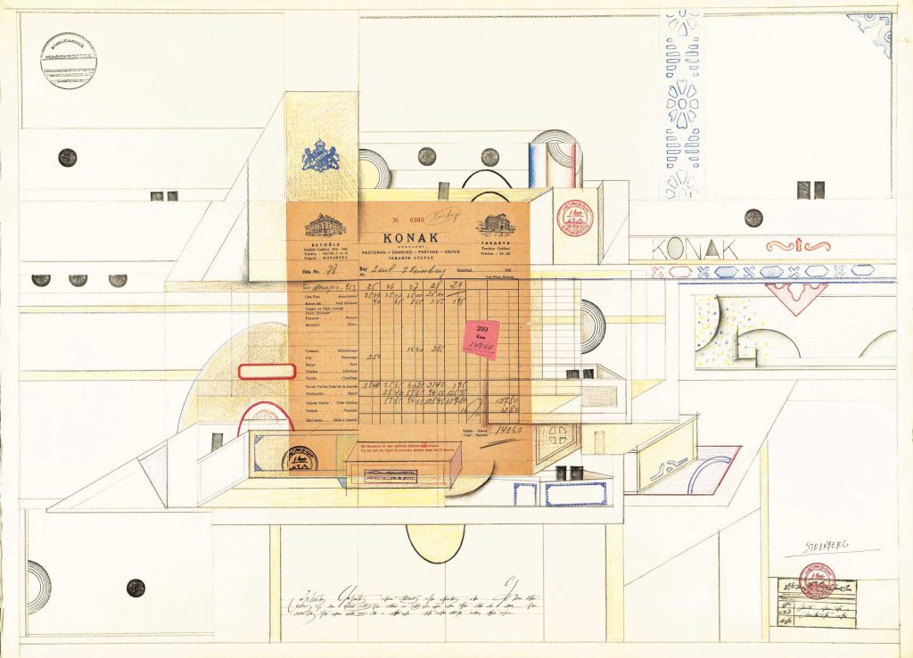
Saul Steinberg uses the Konak paper collage in a different way, incorporating other methods of illustrative lines and geometric shapes and I am questioning what the receipt or the paper is representing, is it part of another object or is it the background. Is it relative to what ;could be a table underneath or is it representative of something. I find this very encouraging that as a established artist that Saul Steinberg did not stay to one method of drawing or illustrating as often I seem to jump from one style to another and often think I am not establishing myself by doing this but it must be good to experiment.
Some of the Saul Steinberg illustrations convey clear stories and are easy to understand, even those with language barriers, other illustrations are quite complex and extremely detailed in ink drawings. The thumb prints, though a quite simple were pieces of work where he has taken an everyday thing (a finger print) and made it into shapes and styled into other forms, and some he uses very simple ink lines to make them into other objects. Again, I look at them and automatically read them as whatever Saul Steinberg has suggested and then consider them as thumb prints as secondary.
The two artists both use the human eye as a way of fooling or making the viewer perceive and interpret the art work in primary and secondary views. I think this can be personal in some cases as how our brains work and what pieces of the art we are automatically drawn to and what our brain then computes as to what we are viewing. As in Christoph Nienman: Are we viewing a photograph of a scene first, or are we viewing the roadsign for the kiwi crossing first, even though actually no roadsign is there, just black marks suggesting it? Saul Steinberg "fingerprints", are the creatures moving around with eyes and arms and features, is this picture of men in suits? or am I looking at a load of ink thumb prints in formation? Both the artists hold in common the process and trickery of using the human perception as how the art works. And often it is the second glance, and the penny drops, the message is read and we as viewers realise the joke, or the message be it funny or political.
Both artists do use humour within some of their work, though Saul Steinberg from his early career carried satire and political points within some of his works. The main difference between the two artists is the time frame of the productions, as in when they both have success and what materials and objects are around to be used and manipulated. With Christoph Niemann, he uses quite a lot of photography and digital work, which would not have been as readily available to Saul Steinberg, well definitely not until his latter years. The use of digital mediums does mean an idea can be tried and tested much more rapidly and erased, or saved within moments. Whereas, working in the form of pencils, paper etc. there is always that processing stage of knowing if an idea works, how much investment goes into each idea and equally how much time.
The artists work also differ in the amount of detail and illustrative qualities. Both I would call illustrations, but Saul Steinberg has a very fine and delicate style in places and whimsical, imaginary but observational in the way he studies the people or objects within his work.
Christoph Neiman works in a different manner and even if his work may have still entered and gone through the motions of ideas and finalising work, his photographic and illustrative work looks like it has been achieved on a whim, that the art is of that moment. For example, the ink pot that looks like a camera, and then the man holding the camera is drawn on the paper under the ink pot. This only works from the view from one specific angle but from this angle, it looks like someone has taken purpose to draw around the pot with little thought than to doodle around the object. Though of course, this would have been a lot more to this than doing that action. In whole, both artists have obtained the success to take the everyday objects or scenes and repurpose our views of them without actually disturbing or altering their initial visuals. A few lines or marks maybe added but it is not quite minimal in both cases on some of the works.
Apart from their generation differences and the different mediums I think that both Saul Steinberg and Christoph Niemann are working on a very similar formula for successful pieces.
Research task 3:0 Build a Tool Kit
I always have owned sketchbooks, pens, pencils and an array of colouring mediums, paints, brushes. It was when I entered my second course with the OCA that I started to take my collections seriously and use them to be creative, rather than those initial flurries of use and then they become a bit redundant as the creativity dries up for the idea I had for that particular pen or colour.
In the previous course some of the outdoor drawings started to become parts of the exercise. From this I did start taking selected objects with me, and some got used, some didn't, some I found unsuccessful. Some have become essential. I will talk through my kit below and explain what I have and why, but there may seem a lot here, but I compact it to bag size, and often I use an A5 or lesser size for drawing/sketching. Plus, if I am needing to be lighter, I often scale down, plus use my camera to help record things I think are relevant to my sketch or to consider a sketch at a later date.

This is my box of essentials. The plastic box was given to me a it wasn't needed, I don't really know what it was for, but it is perfect as a caddy. It fixes shut tightly and is very durable. It is just the right size for ruck sack carrying, it has rounded corners so not sharp and it i really sturdy, plus comes clean in a wash! It is deep enough, and it could be a smaller box but this has enough room for me to be a little frivolous on what I consider essential. I have had fabric caddy styles before, but found they are sometimes restrictive as often they need to be unfolded to us so space can be an issue. I have also had a pencil case, in fact my first sketching pack was in a pencil case, but I found that everything went to the bottom, plus, everything got coated in pencil dust and my eraser got seriously grubby! - I like this box as also if I am out and about and it sits in my rucksack, I can not have to be too precious about it being at the bottom or getting knocked, and up to today I have not had too many broken pencil leads, whereas in a case they do tend to suffer from less protection.

The black pens are all different, I have brush nib which is super for fast quick flowing sketches, I have small, medium and fine nib liners and also a 1.5mm soft nib which is good for some basic solid line drawings or sketches. I do tend to draw with the micron pens, but it can also be what I am feeling at that moment.

I originally carried three or four pencils, but with the sturdy case I extended to a tin of pencils. One problem before the plastic caddy came into my possession was that the lead in a pencil would often get broken or snap easily during transit. While they are in the caddy, they do tend to only slide about a bit, and the more that is in the caddy, does seem to restrict movement and helps this not happen. I have a HB, a B2, and a couple of softer pencils, these are ones I have found that sharpen well and they are quite good quality and slide over papers easy. The tin is being extravagant but it does mean I have a good range. Plus being in the tin and this being within the caddy I get minimum damages and still get to have a full range to use if I do want to use them.


I don't always carry the caddy, my slimmed down version is usually, my B2 pencil and a liner and a ball point pen. No accessories. I find these three items will slip under the elastic of my books and stay secure, any more is too much and the reason if I am on slimmed down version is because I either have little space or it is going in my pocket, rather than a bag.
This is a brief look at what I am carrying around with me at the moment. I have currently two books that are non-coursework sketchbooks I use, the small A6 book - has elastic to keep it tightly closed. The paper is grid marked and the back has a pocket for collecting anything I want to keep. This lives in my work bag so I have something to sketch in as and when.


Research task 3:1 A reportage Case Study
Veronica Lawlor reportage illustrator. Reportage refers the the way places, events and social history are captured in that moment and as it occurs. This can be done in words, photographs, drawings and sketches.
Lawlor represents her sketches with line work and colours interjected, the whole drawing often are not fully covered with colour but at essential points.
I visited Lawlor's website and made notes in my log book.
I can see that Lawlor has the skills in her illustration on making the images seem lively, moving and visually stimulating.
Her city images of crowds give the sense of movement and I can hear the sounds of the hustle and bustle of the voices, noise of everyday life.
The use of colour is used to enhance the sketches, show details to the viewer by drawing them in, plus the colour is often free and unaligned, giving the feelings of motion.
If the illustrations are dissected and divided into drawings there are often hidden elements underneath. I did two studies in my log book. Both of New York City, but one is a simple sketch and another has more detail and colour. The first is a simple line drawing of Brooklyn bridge from the side of Brooklyn. You can see within the drawing the quick and clever indications that tell the story, first there is an older looking property drawn simply at the foot of the bridge, this shows the age of the property and the proportion of the bridge towering above from the angle drawn at, you can see street signs, lamp post, traffic lights, people and in the distance there looks to be a cityscape. All drawn very simply and with marks rather than details. The people don't have arms, legs individually but again from the shapes and proportions it is read by the viewer these shapes are people moving around the city.
The trees and lam posts and signs show the viewer it is a street and a busy street, though these are simple details, each piece feeds information to us about what we are seeing in the sketch.
The drawing of time square, which I am assuming is time square by recognition and picking out small little hints of where the sketch is. These are very elementary parts of a drawing but not primary to the drawing itself. Lawlor uses certain colours (red and blue) to help recognise a flag, and within the sketch is another sketch under the buildings a small outline of the headpiece of the statue of liberty. Also, the use of colour in this pops the sketch to life, Lawlor uses swishes and marks of colour to represent the lights and the movements of the city, sharp block of yellow on a taxi, then streaks of swiped colour in the background, it does give the whole sketch a sense of moving as the foreground sketch of the people sat having coffee etc. are more static to show all that is going on around them. That is how I see that Lawlor has used clever sketching techniques to create this image.
I also looked at George Butler and Lucinda Rogers for fast sketches and also the slow extended sketches of Paul Hogarthm Olivier Kugler and David Gentleman. I have made notes in my log book regarding these and the notes on the work they produce and the reasons for sustained observations.

Sketchkon, (unknown), Sketchkon-Skool-and-arts-network-Veronica-Lawlor [http://www.sketchkon.com/veronica-lawlor/](accessed 30/03/2020)
Research task 3.2 Reporting and Documenting (pt 1)
- Laura Carlin
- Paul Hogarth
- Veronica Lawlor
- David Gentleman
- Olivier Kugler
- Lucinda Rogers
- George Butler
- Louis Netter
- Chloe Regan
- Emmanuel Guilbert
- Agnes Dechourchelle
- Evan Turk
- Maurice Sasek
There is a differences in how documenting reportage works and the illustrations vary compared to how the illustrator works to achieve their drawings.
I have documented and kept records of the websites, made notes on factors, like how do they record sketches, also the materials, subjects and some have fabulous access to online sketchbook records. (Both Chloe Regan and Louis Netter are good examples of this).
Plus if any other students do visit this blog, David Gentleman has a very informative video as he goes and sketches scenes in London and talks through his processes and thoughts.
Research task 3.3 Reporting and Documenting (pt 2)
After reading the Eyemagazine articles on war reportage I chose a piece from Olivier Kugler's work. One reason being during my research in the previous exercise, I really enjoyed looking at his website and his works, he studies are very varied but they are excellent at depicting everyday life in various walks of life.
Taking two pieces of reportage. One being an illustrative piece and the other photographic - comparing the pieces.
BELOW:
ORDINARY PEOPLE
Olivier Kugler’s drawings show people in Domiz, a camp in the Dohuk governorate of Iraqi Kurdistan, where more than 42,000 Syrian Kurds have sought refuge from the Syrian civil war.
Ahmed and Watha battle with the problems of keeping their tent dry. Hamed is an employee at Issa’s barber shop, one of several small businesses opened by refugees in Domiz to provide basic services.

BELOW:
Domiz refugee camp is located in the Kurdish province of Dohuk in northern Iraq. Each week, thousands of Syrian refugees arrive at the camp, which opened in 2012 and was designed to host about 2,000 families. A year on, however, almost 8,000 families live in Domiz, resulting in overcrowding and pressure on food, water and sanitation
Photograph: Christian Jepsen/Norwegian Refugee Council

What is each image expressing, describing or communicating?
Both the images are easy to read as depicting a situation of homelessness or settlement life. Both use have images of children, tents, people sitting on floors, expressing poverty and unease.
The illustration by Kugler has accompanying words within the picture, it does not stand alone as a picture and separate text. Does this help or hinder? I think it may help someone who may be browsing the article and then draws in with the imagery and starts to note the text, whereas a large written piece of journalism with the photograph maybe too long for someone to want to absorb. But this of course can work the other way and not enough information is present in text form. It would all be depending on the brief of what the work would accompany. Both successfully communicate what is occurring in each picture. Kugler has a good concept of capturing the hopeless look of the man he is interviewing in his illustration, whereas the photograph has a smiling child. Which equally is quite disturbing that the child sees happiness though their families are in dire situations.
Which image do you think is most memorable?
At one time, many years ago, photography was not how we communicated scenes, we had illustrations for news articles and newspapers and books to give the reader imagination to the the story or editorial it accompanied. This went out of fashion with the progression of the photograph and the instantaneous way it can transport us to that moment. But, I think that has been in someways a downfall for the photograph, as we are so saturated in these images, especially with the ability for instant contact with such as facebook and google that maybe we do not feel impact as we used to with photos and we can easily turn away or click off a photograph. An illustration works in two ways in this subject, Kugler captures the same information but it is easier and more adjustable to acknowledge than cold hard facts of a photograph and the illustration is personal, it holds sentiment more than a photograph in this case. I am not regarding photography as a lesser format, I think that interpreting how a piece is thought about and configured that Kulger has much more emotion and dedication than the photographer may feel from taking the photograph compared to studying and adding text to an illustration. I would remember the illustrative piece and the story more so than the photograph.
Does one image seem more truthful and why?
I was told by a tutor when I was at college that to believe only half of what you see and only half of what you read. I think this is referring to this exact point. Though we cannot doubt credibility of either a photographer or a illustrator in reportage situations we can only take what we see as face value. This is because when we make judgement on truth or fact it has to be what we can see and what we think is real and actual. Both an illustration and a photograph can be truthful, but equally both can mislead and be full of falsity.
Explaining this, I mean for instance, and though the likelihood is not so, we can only assume that the family in the tent is not staged, maybe the child was prompted to smile? maybe the extras of the cushions had been added and the mattress added, and were instantly removed after the photograph. I am sure not, but without knowing the works of the artist or photographer and their own history we can only assume both are honest or assume both are untruths.
Emotively, I think we may lean towards the photograph as it has visual and instant explanation, though if the illustration was studied, it would also have impact.
Which image would you be more likely to notice if it was in a magazine or a newspaper and why?
I am probably bit bias but I would look at the illustration, always even as child I remember looking in the Sunday supplements and being drawn to the illustrative works that used to accompany stories, I know I have interests in art and drawings, but I just found that they always absorbed me into that world and made me question what it was about and sometimes it would make me want to read the article. I think this is how our brains work but maybe it could be we are always drawn to a simpler way of depicting a story, and though a photograph took that role from illustrations for the majority of picture editorials I think as our minds work in logic and we gather information from visual stimulation then the illustration would definitely win me over to read the article and bring me into that particular story.
Research task 3.4 Creating your own version of reality
I regard the keeping of a sketchbook one of the most dedicated aspects of this course and keeping a personal sketchbook. By the access to view this extended collection of illustrators and artists sketchbooks and see page to page reality through their eyes and how they record moments, scenes, thoughts and imaginative ideas has certainly helped me gain a confidence and understanding. Though often the sketchbooks we see, tend to be complete, full and on the side of long and sustained studies this has been more exciting and as being a creative person I have definitely found an affinity with other artists on how these are created.
The range of examples shows how there is a rainbow of processes and methods of translating visuals into books.
Some artists use a quick sketch to record that idea or visual and then move on and this can proceed throughout the book. Snapshots of ideas or reality. I don't think this this is any less valuable than the books where you can see that the owner has taken some time to develop and extend an initial drawing or has completely filled a page with colour and shapes, objects or a single study that is micro studied to capture as many elements that it can.
The choice of how a sketchbook study works can be subjective as some illustrators may record a portrait of a figure passing or sitting on a train for example, but take that study and envelop it in their own style ad drawing method.
Again, it is all valuable as it is relative to that illustrator.
Some of the illustrators capture a study and rather than it be just one quick sketch it maybe a multiple sketch of the same item done quickly, ending up with a page of one item but produced several times. This could be a successful way of documenting as much as a longer study of one drawing.
There are several methods that I think I would like to start to incorporate in my sketching:
- collage and using collage within a sketch but using my own style to extend the image.
- repeat drawings, trying to capture one item, either from memory or as seen at that moment.
- Try to hone in on my style, not worry about being realistic or accurate within a sketchbook, use it as a point of recall for ideas.
I found all the sketchbooks an interest to view, but I think as artists or creative people, we all like to see others methods and processes. As I viewed the books I made notes within my log book of the names and the points I liked about their work or system of working.
For slower drawings, for example: Tom Neely, he holds his studies on his page as if you look as quite detailed graphic stylised drawings, which means some time has to be taken to obtain some accuracy. Does this convey a message to the viewer better? I am a little unsure as surely this could be objective as to what the message is. A crying face, is a crying face, if for example it is a simple icon of a circle face with down turned mouth and a tear from an eye, the viewer knows straight away it is an unhappy face, but for example one page Neely draws a study of a crying face from a couple of angles. It is still a crying face as same as the simple drawing. However, from Neely's drawing, there is more expression, more acknowledgement of familiar sensations of understanding how the face is contorted so it would communicate more about the crying face, (emotion - is it distressed crying, sadness crying?).
I think stylising work as an artist, is almost natural. Not all of us can draw precisely or want to draw in classical manners, but I am not sure that weakens or distracts how we can still document life or the subjects we choose. But this is not a bad thing, as surely, if as illustrators we all work within our own styles and methods the chances are we become more creative and expand from the expected.
Here are some of the artists/illustrators I noted:
Melissa Castrillon (pencil studies)
Kay Blegvad - ( simplistic illustrations)
Eric Ellis - (Reminded me of Jeremyville)
Leah Goren - (Face studies/ v. stylised)
Jing Wei - (Neat, accurate,like a mini library)
Hattie Stewart - (Stimulating, Print like art)
Alison Worman - (collage/fabric very abstract studies)
Jennifer Daniels - (Long sketches, intricate)
There is more notes in my log book and I have collected imagery of the ones I particularity liked or felt gave me inspiration the most.
Scott Campbell has a very fast and quick method of noting his drawings, crayon/pencil sketches. At a glance they may not suggest that much information but as a method of having a catalogue to refer to it can be inspiration to him. He also shows longer drawn studies that are detailed and capturing moments in life and compared to his random and swift marks are quite invigorating as to me it does say that a sketchbook can contain anything. It does not have to be anything or catalogued in a particular order and not all sketches need to communicate to any other than the keeper of the book.
Link to article relating to Doodling and the cognitive benefits.
Link to article relating to Doodling and the cognitive benefits.
research task 3.5 Visual Research
"Sketchbooks are crucial to how I work. I use them as "Safe places" to draw out ideas and roughs repeatedly, often then scanning my favourite to use as final artwork. I rarely work in colour, preferring to work with a dip pen and ink, and layers of tone with ink washes, emulsion paint or, and in the case of the banner art above, soft pencil". Pam Smy - words (the journal for SCWBI)
How does the character of the sketches relate to the final illustrations?
The process of research and testing ideas within sketches all point towards how final illustrations are decided. The discussions at the beginning of how the author and the artist all input ideas and partake in their thoughts and ideas of how the imagery is in their mind and not only this but the personal thoughts and ideas that come from the book and how the role of Lob should be developed from the words to a image that would be related to the text. The input of others that are involved with the story will expand Smy's ideas and help convey how the end illustrations will look and what is conjured up in the mind from the story or how they all perceive the green man character to be seen.
Once some ideas had been established Smy took her sketchbook and made detailed sketches of locations that were related to her imagination of how the story played in her mind after the initial brief and the discussions had cemented some imagery to her. Her studies, for example of the allotment sheds, delivered a final illustration, through studying the variations and the structures, materials and building methods of the sheds, Smy was able to concoct what became the illustrative version of the scene from the book. By using what she had studied, she was able to maintain a sense of accuracy and believably of the location from the book. By dissecting her sketches, Smy can cherry pick which parts will develop into the final illustration, it is a bit like building a collage from photographs, cutting out the bits that are favoured and looking at how they can sit on a new picture. The sketching style has not changed and this can be similar within the final illustrations, and the character of the sketches does still carry through, but the details and line works are more defined and intricate but this is possibly as with all final pieces, we work longer, take more precision on line placement and after many sketches, we have en devoured to understand what is working and what is not conveying what we want the illustration to say.
I think often when we sketch, doodle or draw, we add our own stories and do so sometimes subconsciously. The style in which we sketch can be quite telling too, are we making harsh lines, are we swirling the tool around the paper, are there thick dark lines, are we scribbling feverishly, all of these, in my opinion can help to tell the story within a drawing. Throughout this section, my prominent story has been the fact we are in a lock down situation and I have had a limitation of some resources but I have actually found that through the restrictions, I have managed to look at things around me I know are normally there but just blend into my every day. From exercise 1, I think I have successfully developed some ideas and had some fun twisting the items and making some great pages in my sketchbook.
Research task 4:0 Visual Diaries & Research task 4:1 Top ten visual diaries.
Visual diaries can be intimate, funny, observational, graphic novel style or comic book led. This depends on the artist or illustrator and how they prefer to work. From researching I note some of the diaries or journals I have found, it can vary quite broadly and some diary keepers cross borders of one style to another and often the written word plays importance to the time keeping, the word add a dimension of personal thoughts and contemplation's just as a normal written diary would be. The best thing about a visual diary is the lack of restrictive rules.
I made notes and kept details of some artists and illustrators as I found them.
As a starting point to get me off the ball I used the suggested sketch diaries of Myfanwy Tristan. Though the images used in the research task page shows some very detailed coloured pages, I found her blog more interesting, where it delves a little deeper into page keeping. Tristan uses a couple of already studied methods. One is the use of found memorabilia like receipts, menus, tickets from galleries. Some sit within her diary and add to the story. Another is study of scenes and moments within your journey. The capturing of the essence of the adventure.
I also liked how Tristan operates between telling the narrative with small quips of text and some beautiful sketches and using a comic book style and limitations of colour to tell a narrative of her journey to the FCR in Helsinki. The style also compliments the type of situation it is telling the reader.
I started venturing into the depths of the internet and found some other diary/journal keepers. I have kept notes in my log book about my points that I liked or maybe was not so sure of, I won’t say dislike because this is not work it is a diary so I can’t say it is a right or a wrong method of processing information or making a narrative. It can all be very personal.
Alex Hedworth (illustrator)
Peter Arkle (Freelance illustrator)
Cathy Johnson (Artist)
James Kohalka (Illustrator)
Christian Slade (Illustrator)
Cindy Woods (Illustrator/Artist)
Here are my current 10, I have looked at that many and made so many notes and saved images I am starting to become book blind. But its been a very enjoyable session, not referring as task as its been voyeuristic looking in so many books and reading pages. It has been taking life slices from these artists and illustrators. I have added some links for anyone whose interested in learning more.
1.Oliver Jeffers – tactile covers, make you want to look inside.
Colours of collage mixed with sketches, illustratively placed, photos incorporated and mixed mediums. Makes the pages very personal and use of typefaces
2.Joohee Yoon - Bright colours, print and print style illustrations. Entertaining, subjective to express narrative. Very visually stimulating.
3.Pep Carrio – Patterns integrated with collage and sketched designs, some pages pure collage and imaginative shape making, vintage ephemera and tactile quality to pages.
4. Christine Castro Hughes – good use of lined, gridded papers, simple word statements and commentary along side stylized illustrations and come pages of collage and colour washed pages. Very pure and fresh.
5. Bill Brown – heybillbrown.com Little comic images with captions and text. Clear, uncomplex and great story telling in the boxed illustrations.
6. Rick Beerhorst - His books echoed to me similarity to Frida Kahlo diaries. A boldness but deep thoughtful sketches. Mixed with collage and ink drawings and captured text.
7. Marilyn Patrizio – “my sketchbook is an anxiety killer” brilliant quote! Collage, comic characters, and very realistic sketches of portraits and objects combined with a layering of words, typefaces and print style sketches.
8. Frederique Matti – Visual journal created digitally. Very clear and crisp, like an art deco version of digital work. Subjects are varied and though technical very simplistic and effective.
https://dribbble.com/F_rederique Look here to see his graphic illustrations.
9. Kathrin Jebsen-Marwedel – Revisiting this artist. I love her style of illustration and the way she fills the pages and uses a lined book then draws everywhere and doesn’t use the lines! Lovely and stimulating.
https://www.escapeintolife.com/drawing/kathrin-jebsen-marwedel/
10. Carol Gillott – Because I have been using watercolours lately, I was drawn to Gillotts travel journals. Some pen drawings were washed in colour and some are pure watercolour but a quite blunt and bold which made me like the stories even more.
Research task 4:2 Case Study Brandon J Wallace
The way Brandon J Wallace has conducted a version of the film Get Out! in this particular scene, it is like he has taken then bones of the story, worked out which bits connect and the story still forms a body. The beginnings of the scene and the ends of the scene all materialise to create and then conclude the act. There are elements included here that are not created by the actual drawings but by the added tones and colours. First he uses the colour blue weaved in and out of the most important scenes of the characters that change the stories course. He also uses the dark tones and lightness to suggest the clarity of each character and their role, whether something is going to be bad, or dark or emotive. This is often the case within cinematography where shadows and light fall are often used to dramatise the effects and emotions within the story as it plays out. Though I do not know if colouring recognition is something that is used in films etc. I do no in adverts that this form of recognition is used quite regular to enforce branding and familiarity with that colour. This can be then linked to feelings and emotions. Is this what the blue also represents? I am not sure but I think it does present that the moments of the colour at critical points in the script.
Also I notice Wallace uses a combination of lines, grey, darks and white in some scenes in the story board, these may signify that they are stepping stones to the next crucial part of the story. It is the slicing of the scene to understand the parts that are significant and those smaller less significant scenes which do not need representing in the middle, this is because we can read from one scene to the next without the need to be precise about the moments between as the sections he uses tell the story still in the same sequence.

http://bwallzdraws.blogspot.com/2017/05/
Research task 4:3 Story Structures
The guidance for story structures in this research section looks further into the realms of the beginning, middle and the end and how each section has subsections with help to produce a narrative of detail. As with the exercise that deals with basic narrative structure, the three main connections of the story all still have to maintain the path that leads us from the vital start of the story (Statis), through to the end, (The resolution). Upon the way we take smaller steps rather than just one to the middlle and then to the end, from the setting of the story, statis, we visualise the placement of the story and where it is, the sort of place it is, the "everyday" of this particular story. The next step introduces the trigger, this is the point where something occurs within the story that distracts or diverts the story away from the everyday in the first step. The third step is the quest, this is the purpose of the story, often the meaningful reaction of the main character to the trigger and what may occur now the trigger has happened. This is now stepping into the middle of the story, this is made up of another three sections: A Surprise, this can good or bad, but it becomes the obstacle to the quest set in the beginning section. It gauges how the hero/main character behaves and their actions towards obtaining their goal.
The second section of the middle is the reaction caused by the surprise. This simple option then adds drama to the story and can unfold as the third step concludes. The third step of the middle is the climax. This is the penultimate point where the hero starts to reap from their choice/reaction. The final stages (the end) comes with the reversal where from the beginning the goals have changed to the initial purpose of why the "trigger" was vital to the story and how the dynamics can change. The end is sealed by the resolution where the story starts to return to the familiarity to the reader, the approach of return to normality, and normality being how the story began in the everyday setting for the narrative.
Another approach discussed in the research was the term "The Hero's Journey" also known as Monomyth, this terminology comes from the origins of how mythology produces narrative. The term came from the studies by scholars on the narrative structures. This basis, though some of the steps to vary, the structuring remains of the beginning, middle and end with various points that are used as directional pointers to develop the story. It is like a pattern a garment, it can be used in varied sizes and styles and seem unique, but the pattern is still the same with minor variables to change what we see.
I made further notes within my log book and found a very useful diagram of how the structure of the hero's journey works. The similarity to the 8 step guide in our research is both a god guide to have when coming towards constructing our own visual stories.

Girl Interrupted, a segmented narrative of the book by Susanna Kaysen.
The beginning -
Statis: Susanna is entering a psychiatric ward after an overdose.
Trigger: She becomes friends with a patent called Lisa. Lisa is wild a wild character and helps Susanna settle in.
Quest: Susanna wants to get better and leave.
The middle -
Surprise: Lisa's influence changes Susanna's behaviour. They escape but Susanna witnesses how dangerous Lisa can be.
A Reaction: Susanna reports Lisa and returns to the hospital without Lisa.
The Climax: Lisa returns and is unstable, Susanna and Lisa argue.
The end -
Reversal: Lisa breaks down and Susanna has to help support her.
Resolution: Susanna makes a full recovery and leaves the ward.
The use of this method will come in as an essential tool for the future, the simple breakdown of the three stages of a narrative will ensure that when creating future stories or sequence of images, I will have some guidance to use and ensure I maintain some critical elements to keep the story relevant. It can be very easy to have an idea but then become stuck because of the uncertainty where this could be going. By using these steps, the story cane be drafted out into various scenes before deciding upon the pieces that work or don't work.
The use of each step also safeguards against the narrative being lost or elongated unnecessarily. The formula is successful that it is used by many writers, artists and film makers, so it is wise to have this as a guidance to keep trace of the narrative being produced.
As a starting point to get me off the ball I used the suggested sketch diaries of Myfanwy Tristan. Though the images used in the research task page shows some very detailed coloured pages, I found her blog more interesting, where it delves a little deeper into page keeping. Tristan uses a couple of already studied methods. One is the use of found memorabilia like receipts, menus, tickets from galleries. Some sit within her diary and add to the story. Another is study of scenes and moments within your journey. The capturing of the essence of the adventure.
I also liked how Tristan operates between telling the narrative with small quips of text and some beautiful sketches and using a comic book style and limitations of colour to tell a narrative of her journey to the FCR in Helsinki. The style also compliments the type of situation it is telling the reader.
I started venturing into the depths of the internet and found some other diary/journal keepers. I have kept notes in my log book about my points that I liked or maybe was not so sure of, I won’t say dislike because this is not work it is a diary so I can’t say it is a right or a wrong method of processing information or making a narrative. It can all be very personal.
Alex Hedworth (illustrator)
Peter Arkle (Freelance illustrator)
Cathy Johnson (Artist)
James Kohalka (Illustrator)
Christian Slade (Illustrator)
Cindy Woods (Illustrator/Artist)
Here are my current 10, I have looked at that many and made so many notes and saved images I am starting to become book blind. But its been a very enjoyable session, not referring as task as its been voyeuristic looking in so many books and reading pages. It has been taking life slices from these artists and illustrators. I have added some links for anyone whose interested in learning more.
1.Oliver Jeffers – tactile covers, make you want to look inside.
Colours of collage mixed with sketches, illustratively placed, photos incorporated and mixed mediums. Makes the pages very personal and use of typefaces
2.Joohee Yoon - Bright colours, print and print style illustrations. Entertaining, subjective to express narrative. Very visually stimulating.
3.Pep Carrio – Patterns integrated with collage and sketched designs, some pages pure collage and imaginative shape making, vintage ephemera and tactile quality to pages.
4. Christine Castro Hughes – good use of lined, gridded papers, simple word statements and commentary along side stylized illustrations and come pages of collage and colour washed pages. Very pure and fresh.
5. Bill Brown – heybillbrown.com Little comic images with captions and text. Clear, uncomplex and great story telling in the boxed illustrations.
6. Rick Beerhorst - His books echoed to me similarity to Frida Kahlo diaries. A boldness but deep thoughtful sketches. Mixed with collage and ink drawings and captured text.
7. Marilyn Patrizio – “my sketchbook is an anxiety killer” brilliant quote! Collage, comic characters, and very realistic sketches of portraits and objects combined with a layering of words, typefaces and print style sketches.
8. Frederique Matti – Visual journal created digitally. Very clear and crisp, like an art deco version of digital work. Subjects are varied and though technical very simplistic and effective.
https://dribbble.com/F_rederique Look here to see his graphic illustrations.
9. Kathrin Jebsen-Marwedel – Revisiting this artist. I love her style of illustration and the way she fills the pages and uses a lined book then draws everywhere and doesn’t use the lines! Lovely and stimulating.
https://www.escapeintolife.com/drawing/kathrin-jebsen-marwedel/
10. Carol Gillott – Because I have been using watercolours lately, I was drawn to Gillotts travel journals. Some pen drawings were washed in colour and some are pure watercolour but a quite blunt and bold which made me like the stories even more.
These helpful notes that can be applied to a similar path as what this course is showing, so worth a read and consideration.
Visual diary ideas taken from Accessart.org.uk/the-visual-diary-journey-join-us/
• Draw part of an image/object and then develop it using mixed media – be bold! For example, combine drawing with eraser prints and collage pieces. If you experiment, you’re more likely to find your style or come up with a new one.
• Utilise old unused/unfinished drawings. Experiment and play! Use the whole drawing or cut bits out, increase/ reduce the size, exploring scale and composition.
• Try simple exercises in surface patterns, colour and design.
• Include words/symbols as part of the image.
• Create painted/printed/layered paper background surfaces on which to work.
• Draw an object then turn the page around to see if something unexpected is suggested, or lay down a random collage of papers, then see if you can develop an image using the patterns/shapes, (rather like finding images in clouds).
• Make a drawing of an event/object from memory.
• Redraw a previous drawing then develop the image with other media.
• Draw from the TV/DVD – not as scary as it sounds! Because you are drawing at speed it will be a different sort of drawing, but it does get easier with practice and you can always pause a DVD and draw if it’s all too much!
Research task 4:2 Case Study Brandon J Wallace
The way Brandon J Wallace has conducted a version of the film Get Out! in this particular scene, it is like he has taken then bones of the story, worked out which bits connect and the story still forms a body. The beginnings of the scene and the ends of the scene all materialise to create and then conclude the act. There are elements included here that are not created by the actual drawings but by the added tones and colours. First he uses the colour blue weaved in and out of the most important scenes of the characters that change the stories course. He also uses the dark tones and lightness to suggest the clarity of each character and their role, whether something is going to be bad, or dark or emotive. This is often the case within cinematography where shadows and light fall are often used to dramatise the effects and emotions within the story as it plays out. Though I do not know if colouring recognition is something that is used in films etc. I do no in adverts that this form of recognition is used quite regular to enforce branding and familiarity with that colour. This can be then linked to feelings and emotions. Is this what the blue also represents? I am not sure but I think it does present that the moments of the colour at critical points in the script.
Also I notice Wallace uses a combination of lines, grey, darks and white in some scenes in the story board, these may signify that they are stepping stones to the next crucial part of the story. It is the slicing of the scene to understand the parts that are significant and those smaller less significant scenes which do not need representing in the middle, this is because we can read from one scene to the next without the need to be precise about the moments between as the sections he uses tell the story still in the same sequence.

http://bwallzdraws.blogspot.com/2017/05/
Research task 4:3 Story Structures
The guidance for story structures in this research section looks further into the realms of the beginning, middle and the end and how each section has subsections with help to produce a narrative of detail. As with the exercise that deals with basic narrative structure, the three main connections of the story all still have to maintain the path that leads us from the vital start of the story (Statis), through to the end, (The resolution). Upon the way we take smaller steps rather than just one to the middlle and then to the end, from the setting of the story, statis, we visualise the placement of the story and where it is, the sort of place it is, the "everyday" of this particular story. The next step introduces the trigger, this is the point where something occurs within the story that distracts or diverts the story away from the everyday in the first step. The third step is the quest, this is the purpose of the story, often the meaningful reaction of the main character to the trigger and what may occur now the trigger has happened. This is now stepping into the middle of the story, this is made up of another three sections: A Surprise, this can good or bad, but it becomes the obstacle to the quest set in the beginning section. It gauges how the hero/main character behaves and their actions towards obtaining their goal.
The second section of the middle is the reaction caused by the surprise. This simple option then adds drama to the story and can unfold as the third step concludes. The third step of the middle is the climax. This is the penultimate point where the hero starts to reap from their choice/reaction. The final stages (the end) comes with the reversal where from the beginning the goals have changed to the initial purpose of why the "trigger" was vital to the story and how the dynamics can change. The end is sealed by the resolution where the story starts to return to the familiarity to the reader, the approach of return to normality, and normality being how the story began in the everyday setting for the narrative.
Another approach discussed in the research was the term "The Hero's Journey" also known as Monomyth, this terminology comes from the origins of how mythology produces narrative. The term came from the studies by scholars on the narrative structures. This basis, though some of the steps to vary, the structuring remains of the beginning, middle and end with various points that are used as directional pointers to develop the story. It is like a pattern a garment, it can be used in varied sizes and styles and seem unique, but the pattern is still the same with minor variables to change what we see.
I made further notes within my log book and found a very useful diagram of how the structure of the hero's journey works. The similarity to the 8 step guide in our research is both a god guide to have when coming towards constructing our own visual stories.

Keeping a record in my learning log and symbolising how the simple cat on a mat story had been broken into the 8 segments that cover the three sections of a story structure.
 |
| The basis of how The Hero's journey rotates around from the very beginning to go through the changes and development of the character to become the "hero", the stages are similar to the 8 points already raised, but this method has been repeated in many books, films and theatres to produce successful narratives the touch all these bases through the story. I also side by side looked at the 8 steps of the story structure we have here. |
Girl Interrupted, a segmented narrative of the book by Susanna Kaysen.
The beginning -
Statis: Susanna is entering a psychiatric ward after an overdose.
Trigger: She becomes friends with a patent called Lisa. Lisa is wild a wild character and helps Susanna settle in.
Quest: Susanna wants to get better and leave.
The middle -
Surprise: Lisa's influence changes Susanna's behaviour. They escape but Susanna witnesses how dangerous Lisa can be.
A Reaction: Susanna reports Lisa and returns to the hospital without Lisa.
The Climax: Lisa returns and is unstable, Susanna and Lisa argue.
The end -
Reversal: Lisa breaks down and Susanna has to help support her.
Resolution: Susanna makes a full recovery and leaves the ward.
The use of this method will come in as an essential tool for the future, the simple breakdown of the three stages of a narrative will ensure that when creating future stories or sequence of images, I will have some guidance to use and ensure I maintain some critical elements to keep the story relevant. It can be very easy to have an idea but then become stuck because of the uncertainty where this could be going. By using these steps, the story cane be drafted out into various scenes before deciding upon the pieces that work or don't work.
The use of each step also safeguards against the narrative being lost or elongated unnecessarily. The formula is successful that it is used by many writers, artists and film makers, so it is wise to have this as a guidance to keep trace of the narrative being produced.
Zine Building:
I researched zines on the web, basically to recap from the assignment one section but to give me so ideas and history behind them. I found that across the board the zines seem to intertwine between artists, music, illustrators and photographers. The majority are self published and they are a fantastic method of building captured ideas into one place, the theme does not have to be linked, but most do seem to maintain a narrative of the artist. I am thinking this could be something I want to investigate more. I currently am looking to see if there is an online zine club.
This video is one of many I have watched, but even though it is based on photography, I think the presentations and varied binds and sizes show how there is different possibilities to look at for self publications.
Research Task 5.0: Visual Language:
For this we are asked to choose an illustrator from:
Alice Wellinger
Lucinda Rogers
Lisk Feng
Peter Kuper
Holly Wales
I firstly googled images of their illustrations to see whose style or work appealed to me and would make me consider looking further into their commissioned work. As I went through the list I paused over Peter Kuper, and thought straight away, yes, I like this one, but I then decided to still forward to the Holly Wales to have a look out of curiosity. I am glad I did.
Holly Wales: Illustrator.
Key words:
Colour
Pattern
Bold
Wide marks
Vivid
Detail
Objective drawing
Crisp
Information
Location
Fonts
Shapes
Lines
Vintage
Emotive
Romantic
Flamboyant
Direct
Precise
Movement
The contradictions that appear are often from the different types of commissions, subject matter will always be the main influence as to how an illustration tells its story.
Wales illustrative works are unique using bold mark making with markers, the majority of her illustrations for commissions tend to lean to the commercial side and this is divided by some designs being objective and purposeful. Wales illustrates to co-inside publications as well. These illustrative pieces combine the markings and colouring's similar to those in her travel journal books but include detailed study drawings as well as a collage appearance.
One sample is an set of illustrative pieces for Trix magazine. Wales uses two styles of illustration styles and combines them in collage fashion. I also noticed how in some of the illustrative publication works, such as one for food sustainability the mix of the delicate drawing outweighed the larger swishes of colour. There is a defined difference in the use of the two methods regarding the subject.
The connections between her sketch pages and finished pieces include the vivid colours, the way in which Wales uses markers like brush strokes, bold and strong. Also one some pages there are small tinier details. These are not strong points in the journals but the dynamics of bringing the block like and swift strokes of a chisel tip pen with a smaller delicate nib can be seen and how this would be important in experimenting and understanding how to configure two different ways of mark making that works very successfully.
Though, some of the commissioned work is visually precise, some of her scenes in her sketchbooks echo in her pieces that have a combined realism and then for example, the peoples faces are crudely marked out, but the two ranges of detailing work well.
Wales uses a lot of font / type face in her studies and illustrations, I think this is important and it can make a difference and appeal to how a piece is interpreted as a serious message or casual, depending on the style and accuracy of the letters, if a illustration is of a product, the logo and the typeface must be fairly close to recognisable and also people can be lazy subject readers, so they need to glance and digest easily.

I can see visually how Wales practice of sketchbook/journal keeping allows these methods
Research & Reference Information
Drawing 1.
How to loose an afternoon -
Recommended to me and I recommend it to any other student who need to step back and think about their sketchbooks and studies and question their work and practices. It is one of the most valuable insights to other peers and artists. I love it! But be warned you can be viewing for hours!
Graham Little - From the suggestion to research the Artist -Graham Little from the exercises that bases around portrait work. When I first viewed Little's work I actually thought it was similar to older styled work. A very precious depiction of a young girl, but his contemporary settings and props and fashions show the true period.
His colouring style and drawing style has a softness and precision. The models are very beautiful and serene like.

The work above shows the detail of work by Little, the bold colouring does not effect the soft focus of the scene. Though it looks very detailed it is smoothly blended and changes from one colour to another with out harsh lines or marks.
I wonder if Little works from scene or memory to envelope the model within it.
Quote: “I guess that’s why the images of women I draw are so attractive — they seem softer, doing more gentle things. They’re incredibly exotic and beautiful, yet fairly non-sexual as well.” From Little in an interview with Eliza Williams on flashartonline.com.
In the interview Little explains his fascination with women and their strengths and their representation in the period of him growing up.
I think when you view Little's work there is an essence of the 1980s about them, that hazy focus, the softness and pastel-like scenes from movies or adverts showing a tranquil life.
Now I have seen some of the works by Graham Little it has inspired me to look at using other mediums (At this point in time I have completed a self portrait using charcoal and think my heaviness with the line work created a flat image. Here, Little uses a very little amount of bordering lines. His photographic style does use a reality but he fresh gentle colouring offers the description in his work without loosing any forms.
I have viewed some work (available on Gladstonegallery.com to view) by Elizabeth Peyton.
Her use of colour and brush strokes applied over other brush strokes but in a bold manner shows a very expressive method of shaping the facial features by using the borders of the brush strokes to show this. The portrait of David Bowie is excellent, the is this use of colour I really like, where the hair colour is super strong and though it has no fine lined detail the method of the colouration shows the light hitting the hair and reflecting outwards. The cool colour of his skin and eyes also push the brightness of the deep colours used. The head/face fills the surface and only small amounts of background can be seen. The focus is drawn to her subject and the intensity of it.
In another piece called Tim (profile) Peyton uses pastels on paper to create a profiled face of the man, there is a complete contrast of the dark and neon colours mixed for the skin tones and the bare areas of the hair, this is similar to looking at a negative of a film. To me it is like a face with reflection from a bright screen in a dark room. The fraction of light around the profile shows the contours and the tiny hints of bright yellow on the eyebrows indicate the features. Peyton, similar to some of the brush work, uses a dark/black pastel to sweep lines down to create the hair section and a simple sweep to make the cheek indentation.
The stark dark background around the face gives great contrast to the hair area and also the bright colours that are blended into the portrait.
Looking at the portrait even though there is the long hair, it is clearly visible to me it is a man, the very subtle indentations of the forehead, The darkness of the brow around the eyes and the strong nose line and the dark blue around the under chin gives me this reading. There is a very important control of where to position these colours and areas they retain in, the pastels, even though there are many colours, if you look the face is divided into three sections, Dark around the eyes, pastels to show the softness of the cheek and then the deep blues to show the chin and the lips and the nose. I am not sure if this is a structured choice when an artist does this or if this is what the trained eye can just place, a bit like a fast eye on a jigsaw and be able to place the colours and shapes in the right place and when you step back, it all configures to the image it should be.
I looked at Elizabeth Peyton's Bio and it was quite interesting that she is famed for her portraits and that her studies came from artists that particularity studied in photography and also caricature style art, whereas both these styles are different subjects, Peyton had experimented between the two to produce original styles of work. I would guess that this may come from the line and brush strokes used in cartoon imitations of a face and then the clear and precise detailing associated with photography.
 |
| Tim (Profile) - 2013 Pastels on Paper by Elizabeth Peyton |
Underlying Structure of the body - The first artists to understand the human body as a biological and mass of bone and flesh and its machinery started from the point of Italian renaissance artists, these pioneered in which the way the study of the human form had been previously captured in art. By starting to understand the functions and mobility of muscle and bone the artists became aware of how to recreate the movement and shape the body made and offering a translation of what they could actually see to what was then painted. Giorgio Vasari (1511-1574) understood the human form and explored this in his figures. Below I have circled some indications and noted details of how Vasari could see the underlying structures and how these were used for structuring the flesh and forms over the skeleton.
There are the points here: Firstly he has indicated the showing of the ribs as they protrude from the body as it is hoisted and pushed up at the unnatural angle. They show us the body is in a strained position.
He also indicates around the elbow the tendons and indents of the arm as it flexes inwards, this shows he was aware of the underneath movements of the body. He does a similar indication with the hip and groin, as it tilts inwards slightly he has captured the hip bone as it sticks against the flesh and shows the directions of the body.
The knee detailing shows also the joint protruding as the leg is pulled up, this would be less visible if the leg was straight or stood up, so it shows he used these points of the body structure to provide the bodies story.
On the figure behind, there is a turned head, as the head turns the neck line has moved and the flesh pulls against the vocal box and the muscle, he has enforced the detail of the turned head by adding this solid and positioned flesh in to the figure

Antonio Del Pollaiuolo - The studying of the human form was paramount to Pollaiuolo and his brother, Both Artists. Pollaiuolo also worked in sculpting, goldsmiths and engraving. The brothers used the method of human dissection to fully understand the workings and underlying movements of muscle under the flesh. At this period it became the leading method for artists to understand the science of the human to be able to recreate human life in artworks whether sculptures or paintings etc. it is noted in the early 1500's that artist superseded the universities in studies of the intricacies of the human form.
Information located Themet.org (The anatomy in the renaissance).
By understanding how the body worked the artist can then understand how the shapes and forms accumulate by the bodies movement and posture. This was a very forward way of thinking and though we are readily able to source these ideas today, in the time of these artists it was revolutionary to work within the field of science for the name of art.
Pollaiuolo worked on many pieces that depicted Ancient Roman Mythology and these often showed specimens of man in the ultimate physical form, with defined muscular posture and stresses of the body that played well to the knowledge both Pollaiuolo and his brother had learned.

One of Pollaiuolo's works "The Battle of The Nudes" shows 10 nudes fighting and slaying each other. The work is an engraving and shows each human form in its prime of muscular and strong and tense. It has a variation of poses and positions, each one has the detailing of muscle groups and skeletal structures. We can see ribs, shoulder blades, indentations of hips, ankles and tensed tendons across hands and feet alike. This engraving shows the immense accuracy and knowledge the artist has absorbed.
For it to be an engraving, it must have been taken from many sketches, and notes to accomplish such detail and accuracy.
it is widely believed this study shows the gladiators simply to establish the understanding and accomplishment Pollaiuolo achieved in creating the human form, as up until this point, it was sculpture that had started the study of humans to create art.
What I find exceptional is the perfected detail given to the muscle tones and the way he used the tones to create the shapes within the engraving.

This small section shows three very important understandings. The first, Pallaiuolo can clearly see the central axis of the body and understands the way it moves according to position and posture. Here, it is clearly visible running down the mid chest, through the abdomen and taut by the stretched stomach to the groin. He also sees the hips, an important acknowledgement for positioning a human body in realistic stance and balance. he uses lines in the etching to show the ridge of the hip above the buttock and thigh as it is outstretched.
The third clever observation he shows is the way he clearly picks out the rib cage, as the model gladiator outstretches his torso the ribs not only show, but you can clearly read this is muscle and strength around the humans body.
Baccio Bandinelli - Most famous piece is the statue of Hercules and Cacus. The detailing of muscle mass and shape of the male for is depicted in extreme detail and though it is not accounted for I wonder if it would be slightly exaggerated to emphasise the strengths and difference of being a Demi-god to a human. Almost like modern day airbrushing to make a celebrity appear flawless and perfect in appearance. His detailed studies of the human form complete the understanding from the artist of the movement and motion the body makes and all the lines and rotations of the tubular structures of limbs and torso.

Egon Schiele - This artist had a variety of mental and inputs from sources within his life. At the period of the early 1900's Schiele had managed to pursue his desire of drawing and painting and was positioned to bravely experiment displaying the human form. This piece is a self portrait. When I read the bio for this artist and his regards to his style, I think looking at the portrait he had a huge understanding of the human body. The exaggerations are a distortion but they are a truth as well, he has studied these lines and expressive moulds and shapes the body makes and using the over sized limbs and skeletal bones underneath to present how this looks to him in the mirror. But we all look at our bodies and think the feet are too big, or the stomach sticks out too much, etc. he has studied the body enough to be able to present it in a distortion but truthful way.
 |
| Self Portrait, grimacing 1910 |
 |
| Egon Schiele |
Update: I watched a very interesting video of a discussion from a curator regarding some of Shiele's work. And what was really interesting was the two pieces in the gallery they referred to. One was a landscape of the town where he grew up, he returned there after some bother and stayed a year with his mother. The drawings are expressive to me in anyway and look almost fantasist drawings that he has created loosely on what he can see from a window. I wonder if his return was a form of restriction as his work of naked models or semi nude models were probably deemed risky and he did suffer at court under the accusations of pornography. He used similar techniques in his studies of house structures against the human body, both are detailed bu dark sharp and angular lines but he fades out the parts that hold little interest to him. I noticed in his models they often have no visible feet or his details all stem from the torso and genitals and facial features and other parts are less demanding to look at on the paper.
Look for: Nude nursing an infant and also Naked girl with lowered head.
He does not do this in all, but most I think you can see the dedication and study and then the distance between areas he is say that are not important to view.


I liked this style very much. Some of his other work shows his influences from Klimt and the conformity of that style at the time. These to me seem very truthful and captured.
Philip Pearlstein ( part 2) - I have some sample images below of how Pearlstein demonstrates the use of foreshortening to explain how the female models body sits and extends from his viewpoint. The detail of the outstretched foot and the sense of the thigh to the ankle, though all is not visual, we know it is there and its shape and size from the vision of the parts we can see and the size and sense of shape he creates going from the foregorund of the body to the middle and beyond.
 |
| Philip Pearlstein - The example here is how the foot is larger than the head but is an illusion caused by the direction of observation Pearlstein makes. \the head is made smaller from this angle, and the thigh is slightly smaller and the calf and foot are elongated to show the position we are viewing he model from. |
 |
| This painting shows the foreshortening of the forearm and upper arm as the model reclines and the length of the limb diminishes from the viewers eyeline. |
John Berger's 'Ways of Seeing'. - I sat and watched the first episode of this series from the 1970's. For some of the narrative did become a mix of understanding and total loss of thread, but the points raised came through and understood. Berger explains the way we look and perceive art, and how we use the surrounds to influence our perception and explanation of the art work. How other beings influence how we read an image and how we automatically read what we are subliminally told.
The captured moments of a piece of art is what we see initially and without using outward input it is difficult to obtain an honest and unbiased view of its story.
John Virtue - John Virtue borderlines his landscapes with almost a fantasy feel of monochromatic print like effect. His use of black and white show the prevalence and importance of understanding mark making and how it can be powerful enough to be used alone in single format away from tones and colour. Again, Virtue studied his surroundings to gain the quality he has in producing landscapes.His work is contemporary but according to the information on the national gallery his admiration lies with Turner and Constable, Classic landscape artists.
Virtue worked mainly on canvas and acrylic and shellac. His location of residence throughout the UK gave him the source for his landscapes from periods in Lancashire and Devon, both renowned areas with beautiful and vast scenery perfect for capturing landscapes.
While Virtue was in residence in the National Gallery he created some huge canvases of the City skyline and scape.
The definitions of the buildings is not defined by lines but by a mix of the black and the white blurring and marking the canvas showing the atmospherics of a built up area of urban life.
It is like petrol fumes rising over the towers and buildings.
Virtue is quoted from an interview for The Times referring to not using colour as "unnecessary distraction". The choice not to use colour means that all explanation of the work has to shown in the form as much as the use of colour for tones and shades. He does this very successfully.
 |
| John Virtue - Landscape no:739 |
If Virtue uses black and white, I think his use of the shellac would be to create a second dimension and a clever way of adding light to the work by reflection and texture. The above scape shows the sense of the horizon blending within the air and space around it. You can see the dominance of the dome and how its size gives you the impression of distance, space and atmosphere.
Looking at landscapes and variations of horizons
 |
| Nial Adams 2015 - Norfolk Skies |
The above painting is a good example of how the landscape is divided from the sky but the distinction is not clear yet as a viewer we can see that there is sky and there is land. The softness of the palette and line work diminishes further into the painting and the landscape softens. This is like being stood on an endless horizon and not knowing where the land ends. The light haze from the skies disguises any strong outlines and creates the atmosphere above the ground.
The tones of the sky start at the top of the painting in strong blues and shades around the light reflective clouds, as the painter has taken the study of this and edged the lightness of the distant sky slip seamlessly into the darker sky in the foreground. This is mirrored in the land too.
 |
| Turner -c1845. - Oil Norham Castle, Sunrise. |
This painting above by Turner shows how the horizon and perspective had been shown despite the glare of the morning sun against the land and building before it. The slightest detail shows the castle and its reflection and the grazing animals. The sun is there in the distant sky but it is not an object of shape or form. The integration of the sky and how the sun emerges and by using the suggestion of hidden light behind the horizon we can work out where the land and sky meet even though we don't have a clarity of a marked line. The perspective has been captured by the midground leading towards the castle. It draws in the foreground towards the centre.

If I look at the painting and allow some simple guides to sit on top, it does help point to the points used. Though in the painting they have some slight vagueness as they are to show perspective and give the viewer the sense of depth and direction.
The vanishing point on the far side of the castle did move a bit which then made me wonder if the horizon is in the wrong place, but they perspective lines come from two parts that maybe varied due to their subject, the first being the reflection and the second being the actual purpose of the sunrise haze and whether this would distort these points slightly, as the purpose is to show how the sunlight hits the landscape in this view.
Perspective
The above video gives some great explanation into understanding the basis of perspective.
 |
| Quick sketches made while out and about. Looking at perspective of buildings and objects. Keeping notes where I can in Sketchbook. |
Researching into landscape Artists
Tacita Dean vs Georges Seurat - Gathering these two artists together under the research point to compare and dissect against each other, at first would be a largely obvious difference until I had seen the Seurat's Landscape with Houses and the Chalkboard works from Dean. These pieces carry quite a few similarities and I think they both suggest a silence of space and Deans work on the blackboard gives the sense of darkness of night and Seurat has a feel of a late evening sky descending on a residence and the fields surrounding it covering in the changing light. The time and dedication on the blackboard drawings shows a great dedication and ability to reproduce at a photographic quality. Whereas Seurat has a dream like or softness to the landscape. The landscape with Houses was a commissioned piece so this maybe why it is "dream like" as a pleasing response for the client.
I wonder on the Chalkboard work by Dean if the temporary holding of the chalk is artificially held in place or if the temporary sense is as much a beholding point to her work? The overlaying of the chalk and the retraction of the chalk in areas to create the sense of the face and textures. It is texture but the mountain side is so grand and to suggest it being just texture, I feel a bit flippant about it due to the expanse of the pieces. The only strong white parts are the very tip of the edges of the mountains and the touches of the other side. There is not a lot of solid white within the mountain sides. A very clever use of a limitation of just using white as her medium.
Seurat used the opposite version of this with the crayon adding onto the paper and building up tonal and textures of the houses and sky. It is quite selective in the lines of the sky as the small delicate buildup of shadows makes the sky reminiscent of the end of a later summers day and the soft and slow decent of the sun making the foreground of an unlit field in darkness and the bareness of the house walls just about holding on to the last bits of summer light.
He does not show a horizon, but the foreground is clearly marked in the dark area and we know this by the one solitary tree stood near the front, this gives us a sense of the ground and closeness of the tree and distance between the dark space and the mid ground of the houses. In the background is a soft edge of trees and the evening sky.


Similarities:
1. Monochromatic use
2.Tonal work
3.Use of large areas
4. Hidden horizons
5. Highlighted areas
6. Similar mediums
7. Using areas in black
Differences:
1. Size of work
2. Subject matter
3. Foreground in opposite with black
4. Medium on opposite background (white on black and black on white).
5. Skyline solid in Dean and tonal in Seurat
6. Tacita defined line, Seurat use of soft lines
7. Landscape contoured by harshness in Dean's mountains
8. Seurat uses a vast area and suggests a flat surface looking across.
Nicholas Herbert- Following the research web suggestion from the OCA Drawing One Reseach Point.
https://nicholasherbert.wordpress.com/
These paintings of the Chiltern Hills has a dream like sequence of snapshot images that can't quite be focused on. He uses two valid methods to get these images. His use of mark making, the marks represent the foreground, the mid and background, he gets the sky and land separate but there is no defined lines segmenting what is what but it is understood.
He also uses colour very smartly, some of the images only have a simple palette but he uses this at its advantage to suggest the scene and the feel of the grounds he is painting.
He uses mixed media to achieve the rough and wild sense of the land.
He studied at Central School of Art, London followed by Bath Academy of Art where he gained BA in Visual Communications - He now resides in London but previous lived in the Lake District.
I think his time in the Lakes would be where he took the time and space to understand the movements and colours of nature and the wild untamed elements of the landscapes.
www.nicholasherbert.wordpress.com
 |
| Nicholas Herbert - 2017 View Northwards from Rising Ground, The Chiltern Hills - Mixed Media |
Vija Celmins - I found the sample of this artist (mentioned earlier in research) in one of the reading list books. There is a piece called "Ocean" 1972-73. It is Graphite on Acrylic background. The interesting point I found on this came from the fact I was drawn to the images before I read the text. The images are a set of seven repeat screens of the sea. In each image Celmins had darkened and changed the lightness, before I had read it was a repeated piece, I thought it was a detailed vast expanse of water. But if you look carefuly you can discover the repeat, but by the use of tone and depth of shadow each section looks totally different to the other one and the shapes of the water changes, I feel like from the lighter to the darker, the water feels like it getting closer to the foreground. This is optical from the use of light to dark.
I touch on Celmins work earlier on from a vimeo clip relating to
Hannah Woodman - Another artist who creates landcape and seascape images, Woodman uses the seclusion of vast expanse to show the space and the distance of a landscape in various forms. Using different locations and seasons to show the changing landscapes and seascapes.
Again like, Herbert Woodman has lived in an area where it has inspired work. This is not because areas of beauty are essential, it maybe about absorbing what is surrounding us and understanding and appreciating what can be used. Lowry made us want to look at mills and chimneys.
https://www.hannahwoodman.co.uk/
Albrecht Durer. - Durer is a directed artist to investigate and research due to the documented landscapes of his era. Firstly, I think that going through this process is vital, would I consider the work before? no. Probably not, but under the microscope of looking at the recipe for creating landscapes, especially urban shows the need to train and develop the ability to draw what you see and to encompass the visual onto the paper successfully.
Durer was born in 15th Century 1471 - 1528. His father had originally moved from Hungary to Germany and the surname was changed in translation to adapt to German life.
Durer possibly could have found his way into art via his Godfather as according to records he headed one of the biggest German publishers at the time and had a huge catalogue of woodcut illustrations.
Durer started working life by gained apprenticeship with Michael Wolgemut, who had headed a large workshop in Nuremberg at this time, he was well respected as his predecessor too, giving Durer a very helpful step within the arts world.
His main works and depictions were religious based or portraits, I did read that Durer did work upon building many sketches to which he worked his paintings from. His career as an artist gave him this avenue to venture through to other countries. As an artist and to see other works in the flesh, must have been a huge resource pool. To visually see these works that were created under different influences to his mush have been an enlightenment to how he worked too. Due to his early years of training by his father, Durer had a good understanding of Geometry and this I am guessing would be why his watercolour studies of landscapes were precise and well portioned.
 |
| Innsbruck Castle Courtyard 1494 |
The above watercolour and Gouache by Durer looks almost fairy tail like to us now, but the tones and colours are possibly how it was to the eye. From his eye view I am thinking he may have been up higher than floor level, possibly from a window. The sense of the captured yard is very well done and his perspective is excellent. I had a go at deciphering the point of vanishing. I found some lines did not match up quite in placement, but this painting must have took some serious hours to complete and he may have moved or the walls may have not been as vertically pointed as we are used to seeing in modern builds. The central focus of the tower and the way he has caught the passing of day on the right hand wall light is amazing. His previous woodcut prints and the paintings could be from completely separate artists.
 |
| A suggestion of perspective and main focal point of Durer Painting. |
 |
| Duer - Watercolour 1494. |
The rolling landscape in this painting above has been caught. I can see how Durer has used the tones to give the motion of the hill sides and the distance and depth between the valley and the foreground. The simple marking on the first hill shows the ability to create the form and size without over working the need for detail and evidence of the hill side. From his marks we can see the shape, the direction it is going, the points where the hill slopes away and the points where the hills meet and entwine.
His use of taints of colour to show the sky in the distance,this also gives the viewer a sense of perspective and I think a motion of the sky moving away.
 |
| 1496 |
I think the above painting is especially relevant to my current studies as it shows it the clever study of a tree and also the interest of how to create a cloud formation, Durer has captured both, and with the sky he has shown a couple of variations on tonal study and use of colours.
www.metmuseum.org/
www.durerart.com
L.S. Lowry - Lowry is probably one English artist most people can name even if they are not a great lover of the art world. His style and unique landscape captured life in a time when it could have easily been photographed and catalogued, but his bespoke style makes for images we are all strangely familiar with.
Born in 1887, and his routes did not come from other artists within the family. His mother was musically talented and this must have influenced his imagination and creativity.
He was educated in a private school, but he did not gain qualifications in the any of the creative subjects apart from writing, which I think is a similar method of which we think. The use of imagination and placing what is not seen but is there and bringing that to attention must be a trait in both subjects. His family did not support his wish for being an artist and he became a Clerk like his father, but he enrolled himself into the Municipal College of Art in Manchester. His studies lasted for many years and all the time he kept working in employment throughout his life. The family move after some financial difficulties meant they were outside the wealthy properties of Victoria park but in Pendlebury and the scape was of mills, chimneys and back to back houses.
This area is the most famous inspiration of work we are all familiar with. He was quoted in an interview in his later life that he disliked the area immensely for a year or two, then he got used to it, and eventually he obsessed with the scenes and created the classic images we know today. This to me, shows that the typical visions we think of as landscapes are not all there is, and proven by Lowry he eventually saw an interest and a wide interest of these snapshots of daily life, the characters, the spaces, buildings and actions. This type of are is voyeuristic and he was very clever to pin this out from where he was in his life.
 |
| Lowry 1930 Sailing Boats |
I was fascinated by his seascape "Sailing Boats" 1930. It looks very old classic style and I would not guess it was the same artist. - In researching Lowry I also discovered he later had more lessons, one of the tutors being Adolphe Valette who was a French Impressionist painter. He may have influenced Lowry into experimenting in his styles and choices. This, as a seascape is strong and detailed and has a mood and presence of a classic style from another period in my opinion.
Lowry.co.uk
Masterpieces of Art - L.S.Lowry by Susan Grange
Art: A Visual History by Robert Cummings
George Shaw - His modern view of landscape and what we call landscape is fresh and objective to how we see the world around us. I really enjoy this piece below. One thing that is defining this work is clarity in tonal work and the details used to suggest the movement of the light around the artist. The tall shadows and dark crevices of the buildings show that despite it looking like it is almost dusk like, these show strong low light force and give a mood and dreamlike quality to the work. His angular and precise shaping of the houses are crisp and solid. The clever use of lighter colour on the glass and house details gives it all a realness and familiarity. In the example of The Passion: Number 57. Shaw depicts a row of plain unobtrusive houses. All similar and nothing extravagant about any of them. His eye level is almost like he is sat in a chair directly on the opposite side of the road just beyond the kerb edge and the viewer looks at this and the anticipate is whether to cross the road? He has a very clever use of the lighter colours and reflective light from the windows of the houses. The change of light from house to house shows how the reflection gives a sense of angle and direction of the artist.

Sarah Woodfine - Another modern take on landscapes from artist Woodfine. Using completely different methods. Woodfine encases the landscape within a space and rather than this be a restriction on a view point it adds the viewer more to see. Her precise and detailed drawings and the 3D aspect of her segregated cut shapes makes each part of the scene account for its presence. The limited monochromatic palette gives us the clarity and definition of what each form is.
I find the lesser of what is in the scene is the simplistic and more effective way her work does provide to the viewer for an added space to create and imagine what the scene is telling us, what is the story and what is there beyond.
Similar to John Virtue, the use of black and white is backed up by the clever use of reflective materials to add an added sense to the work.
The image below is an example. There is two points of reflection, one being the obviousness of the acrylic outer case but the water, (Assuming the black is liquid), you can see a clever light refraction from this giving the look of a liquid. The reflection of the boat and the shadow on the white floor.

This video link detail maybe in the OCA Drawing one research point but if you can't find it, it is here:
Vija Celmins Video Vija explains in this video how she creates work within the exhibition. The three most valid points I took from this very intriguing documentary piece are the repetition she uses, the use of dark and light and the use of space around the focal points.
Artist who use interior:
As suggested in the research point:
Anthony Green. - Study for Mrs Madeleine Jocelyne with her Son 1987.
I took me a moments to guide my eyes around this piece of work to ascertain what is happening within the artwork. Green has used the room like an exploding box and found many angles and directions that are visible in the room. I am not sure if Green has used just one point of view and rotated his direction around the walls and windows. The spaces are peculiar between the walls and the furniture and the splayed walls but they are all familiar as well.
His view from down into the room is almost voyeuristic and camera like. He used oil pastels, watercolour and pencil. He may have crossed over his medias to get the variations of the room. The walls leaning out and the heavy detail of the carpet. He has used shards of shadow around some of the furniture and though from that position the window/s may not cast in that direction, if you was to cocoon the room back into a soild shape you can imagine this is how the sunlight would have streaked through and made this shadows.
Green also did another piece similar to this: Mr and Mrs Stanley Jocelyne - the second marriage. In this piece the detail seems much sharper and the landscapes and horizons on either side of the room put you somewhere nice. His models are well dressed and very glamorous and the setting is the sitting room again. Apparently he based the version on 'The Arnolfini Betrothal' - he used symbolism of items as in the original to signify the marriage of the couple in the painting.
He creates shadows again with light through the window like the sun us strong in two directions which would not be possible, but he has shown the meeting of both sides which must of been created on different times.
The detail and style of Green in this piece shows the house to a period of time and it has been well captured and the 1930's style doors and the old TV suggests a home that has not changed much in the 1950s -1970s.
 |
| Mr and Mrs Stanley Jocelyne - The second marriage. |
Philip Pearlstein.
 |
| Philip Pearlstein - Male Model with Kimono, Female Model with Mirror 1985 Watercolour |
Pearlstein has a very bespoke style and he works on different mediums but all his work carries this pallet of colour and vividness.
 |
| The tiled kitchen - Harry Brush 1954 |
 |
| Alejanara Hernandez |
This is a very contemporary artist and the use of the bold colours and birdseye view of the room is very energetic and lively. There are elements that suggest the depths and shapes. There is a defined shadow line around the bath. The toilet has a darkening as you cannot see beyond the pipework and the small puddle of water sat in the sink. These are complex indications yet the drawing is in a simplistic style. I very much like this.
Mixed Media Artists:
Looking over Picasso's catalogue of work while doing research into Cubism, I also found he had used collage in some of his work. (EG: Bottle of Vieux Marc, Glass, Guitar & Newspaper.) He used some interesting line work and the integration of the newspaper print starts the diversity of collage. I can recall going to a visit to Tate Modern a while ago and seeing a PopArt exhibition, and one piece by Richard Hamilton. The artist had used varied sources to create an complex and effective picture. It is almost like the first starts of upcycling, taking something and remoulding into another form.
Picasso may have come across the use of mixed media because he may have had the choices from have some success and experimentation was available for him. The other option could be the restrictive resources and he may have been forward thinking and looking at what can be used to create art.
I found a very interesting piece on tate.org it is an interview with Chris Ofili. He has created successful mixed media work.
His style and choices are almost primary and his images are sharp and illustrative. In the interview I note that the artist originally wanted to work in the 3D area of design. He discovered through the foundations of the course his skills for art. Maybe his original state of mind allowed him to think of the use of other mediums and applying this to canvas. Even the use of dung!
Also one of the successes of mixed media is the cross over from art into the home and how it is often used in modern commercial canvas prints that imitate the collage/paint/photo mix. Also, being able to create ones own mixed media projects due to the volume of items available to us via easily found sources.
There is a huge following for mixed media being used in bespoke journals, art books and sketchbooks. The use of mixed medias often produce one of a kind designs that cannot be recreated easily.
Light & Shade
Edward Hopper uses a great deal of light and shadows within his artwork. They hold many tones and mixes the colours within to get the tone variations as they would form from the angle he as drawn from.
I did a couple of pages within my Sketchbook to sample his work.
 |
| Looking at Edward Hoppers "Chop Suey" The dark corner of the restaurant holds some strange and mysterious shapes but all is not black, he has used mixed tones to suggest the depth and shadows of the dark corner and what is beyond with the gentleman and companion at the far table. |
Negative & Positive
Suggested artist to start from: Gary Hume
Using Gary Hume as a starting point for investigating the use of negative space, looking at the methods and how he has used blocking and line work to create suggestion and form with the sections besides the object or items.
I have viewed some of Hume's work and looked at the various methods he works within to create his pieces.
He seems to work in three different methods of using the negative and the positive spaces within his still life. The "Two Roses" which shows a detailed line drawing of two rose heads, around the flower is a sharp halo of yellow paint which forms the background and pushes the roses to the front of the work. The rich pinks and reds against the sickly yellow pops. The formation of where the back ground shows through gives the detail to such as the rose petal shapes and the movement and direction of the grey rose leaves below. He has used colour very selectively and of importance.
The most important being the red roses and the second being the sharp tangy yellow as it creates the picture around the rose heads, filling out the space and it helped project the flower heads to the front.
 |
| Two Roses - Gary Hume (2009). |
Patrick Caulfield
Another mentioned artist is Caulfield. I have looked through internet searches on Caulfield's work and his style is very illustrative and technical. As an artist, he was not afraid of using white space and here in the image below, he has used the space around the top of the jug and also the assumption the white lines represent the table edge or a mat. My first view of this piece I immediately looked at the dagger and was not really proportioning the rest of the still life. Then, my eye is drawn to the use of the white jug rim. This is popping out as it sits on the block of blue and the triangle of blue inside the jug, the blue must show the dark shading of where the light was not hitting the jug. Any light above would show the highlight being the rim of the jug, but here he extends that by simplifying this to represent the shape and the same with using blocks of blue against the shaded areas.
I am no sure of the burgundy feathered shape, maybe it is another shadow as the light moved direction as he created the work, hence the points of the jug spout from different shadows, maybe. I like how he has taken the detail of drawing the jug spout and the jug belly, but still filled the area in with the same colour as the jug, he has used the same colour in a positive and negative space and it still works.
I think there is an influence from this generation of artists. Born or raised around and after the war, it had lead to another movement of use of colour and shape and looking at art with graphic detail in mind. Also it spurred on a huge push of using colour in new ways. I think this may have been from the new way of thinking after the war and also the introduction of media and advertising in a colossal way with TV and print.
 |
| Still Life With Dagger 1963 Patrick Caulfield. |
Victor Vasarely took negative and positive shaping and used the basis of it in the most simplistic fashions and created Op-art. This is not something I particularly liked but as I found him in my research, I wanted to make a note of him. It is not the negative importance, as both the positive and negative form the visual, but it was an original method of using both.
Angus Fairhurst used a technique in some of his pieces where he lay line work upon line work but each space filled the layer below, this had given some great negative outer spaces of the images as they entangled with the ones below and on top. He came from the same period as Hirst and Hume, and he was more know for his sculptures, but I can see the link as with sculpturing there must be some awareness of space and the shapes it creates between the sculptured parts and a lot of successful artists seem to have dabbled in these fields.
 |
| Unprinted II - 2006 A. Fairhurst. |
Today's Still Life
The process through looking at the still life work from these different eras and periods of change has given me a great insight to the adaption and choice we have over creating a still life. The interpretation, presentation and selection of what we see and produce is not sworn to what is seen by everyone, I understand the vision of seeing around space and also the objects, what it is to convey them, does not always fall as "like for like" by the artist.
I found some samples of contemporary Still life work and how it differs and also how alike in some aspects it is to artists of the past.

The first image is by william Selby - Blue Box. It is in Mixed Media, which in itself will help produce a completely bespoke image and also the textures will possess certain senses to the items. The Composition is too awkward and not set as traditional. This adds instant interest, almost like a snap shot of what is happening on this surface right now. The shocking colour scheme, maybe the bottle is not bright red, but the red represents brown, the brown of the glass, brown of the handle.The previous artists have allowed colour experiments to go forward and no one will judge a painting by its life acuracy. Also he as observed the items from almost above direction, a bit similar to stages within the Cubism movement. Also this is carried through in blocks of colour.
Vanessa Bowman - Carnations, Limes & Black Shell, this version of a still life,pushes into two styles of art. The flower heads are done in such detail and are "3D" like and hold structure and they stand up with bent leaves, as traditional drawing of the flower heads, but then Bowman flatly creates the jug, the limes and the shell. The background is block coloured. It is a pure mix of styles and abilities. Again, this has influences of methods and they have been used to create a really effective painting of a still life in the modern art movement.
louise Young - Balance. Here it is without any background detail and the observation is like a print drawing from an old study book from 19th Century.. but the shocking blue colour and the softness of the detail is much sharper and the use of modern watercolours are bright and crisp. This is taking still life that became photography and taking it back to a still life in art. The study is precise and accurate like in the fine arts of previous years and the choice of light background is modern and the composition has been delicately laid out in its pyramid.
Composition: Artists now have a much free reign, the influences on this are the fact we have such vast materials and media to work with that is much more affordable, allowing us to experiment. Also I think rather than composition being about what would sell the art, it is much more about what is pleasing and personal to the artist. This is a luxury artists of past did not have until they had establishment.
Subject matter: Due to the vast opportunities we all have, I think subject matter can be so varied. And now, with art we want to tell stories as much as any other method and this has allowed us to move on and create any objects into images than before. For example: In Selby's Blue Box, why would we want a painting of matches? But we do, it creates part of the story of his painting. It is again another luxury we have against previous artists of older generations.
Materials: The opportunities to use different materials is here, and I am as guilty as the next for sticking with what I know and holding on to what is near me, but the reality is there is so much accessable now than before, and the boom of Acrylic being an affordable option for most painters this has also meant the use of more and more colour selections and crossing over and mixing our media sot give texture. Also the introduction of technology means we can manipulate and create our work in many other ways too. it allows for changes and also the cross over from photographic still life to drawing still life. Both can be integrated.
Louis Marcoussis
One of the Cubist artists who created a lot of still life work in the style was Louis Marcoussis. His style of cubism showed the familiar points of this period. He, like Gris, used the sense of texture and some parts such as wood grain are so easy to pinpoint that it helped the viewer create the image into its natural perspective, where as some of the other Cubism movement art had much more complex dimension where the direction and objective view had been taken from many angles and broken down simplistically beyond what the still life objects were.
 |
| Nature Morte Cubiste 1914 by Louis Marcossis |
The above piece by Marcossis shows his take on the dimensions of cubism, I think as a general art lover, who may not understand complexities of the style would undoubtedly be able to appreciate and understand what the image is showing. To me, I think when he painted this he was looking at the objects from three different angles and not only has the lines shown the different view points and shapes of the objects, he has also used block shadowing, which would have been seen from different perspectives. For example, this is really noticeable on the drinking glass. He has captured with lines, the view of the glass lip, but only the piece that holds I am suggesting the reflection of the bottle, then, from another angle, he gets the solid shape of the glass as it leads down to the stem, almost like he is looking over it, and finally the base of the glass, has been caught in a ghost like fashion from a third view point.
Update: research into Louis Marcossis. He was from Poland originally and like a lot of artists in this time, he moved to Paris. he changed his name from his original Polish birth name.
He became a french citizen after serving in the French Foreign Legion.
I think that maybe from his background the need to succeed and be successful in the art world must have been a huge drive and the stigma Jewism at the time would not have helped his fortune with the pending disarray in Eastern Europe. This could be reason for his name change, I did read, Marcossis had been considered as "The Jewish Artist", even though he and his family had converted to Catholics. Amazingly, he also was an expert at Lithograph/printing, which seems to have been a pre-occupation or skill of a lot of artist from this period, Kathe Kollwitz, Odilon Redon both acquired this skill too, it must have been a forerunner in the changing of art at the end of the 19th Century, before the explosion of Modern art began. This could be because using lithoprints, the artist had to work out the importance of line work and shadowing, shapes and form to convey he image without over complexity, or indulging in fine art details.
Picasso
The period of Cubism looks to have been a huge and pinnacle turn for artist and the perspectives of art. My first insight into Picasso I viewed his work and for the first time tried to understand and find out the meaning and progression of his styles. His earlier and later work varied so differently as he matured and morphed though his career. I think the influences from the stages of his life have been pushing his reasons and motivation as to what he produced.
The earlier work, which I have found to be referred to as "Blue Period" & "Rose Period" were typical and though slightly bohemian they were not breaking ground or discovering new styles. This maybe because reading about his history, his earlier years were quite poverty stricken and so to paint to sell rather than paint to create personal exploration.
The main study I took from his work came from "Les Demoiselles D'Avignon", this painting expresses the modern movement in its extremity, to me it would not be at all offensive or not considered art, but to think he did create this back on the turn of the 20th century, the colours, style and theme would have been very daring.
 |
| Les Demoiselles d'Avigon 1907 Oil on Canvas. Pablo Picasso |
 |
| Page from Sketchbook - Notes on Picasso |
 |
| Study notes on Picasso Cubism style and use of shape and interpretation. |
Study points:
- Line work: partial and intermittent lines create the shapes and forms, each line is presented and angular. It is simplifying what is visual to the painter.
- Colour: The paint is blocked and is cleverly placed to create the definition of highlights, shadow and shade. It adds tone and such as the clothe, texture. The palette is not overly complex and is made of blues, creams, browns and white.
- Negative spaces: Around the women, there is vast blue shapes, these fill the space and thought they have no defined form, they are what is behind and the study is on the images of the women and bizarrely the fruit bowl.
The study that Picasso made of the women shows how the use of minimal lines, and minimalizing secondary details, he produced a very full painting. The expressions of the women at first do not look detailed or even emotive but is that because they were expressionless? being paid to stand and pose? It was maybe just a job and standing there naked, is not going to make anyone over zealous. Though, I think the third figure has a wry smirk. The use of the line in paint just has enough of a flick to suggest she is smiling just ever so slightly. I am not too sure of the fruit significance. It is the most drawn piece on the painting, the grapes and bowl all are outlined in dark paint and have shadows of greyness. Is this representative of something? Like previously in the Realism Still life, items had a meaning/symbolism.
The cubism seems to me like it was the first experiment into presenting what the artist saw as the important detail, and not encasing themselves into only perspectives from one standing point behind the easel. It adds power to the use of lines and colour, it is almost removed from the previous studies of the fine arts, though both create still life images.
Juan Gris
I viewed different still life work that is in Cubism state and found this piece called "Newspaper & Fruit Dish". Immediately I was drawn to this image. I think my first attraction came from the sharp colour and angular lines within the painting. It was create by a Spanish artist, Juan Gris. He knew Picasso and others in the movement of modernism.
This artwork is forward of the fashion of the Art Deco period and it is typical of what I imagine would be desired by art collectors and admirers of the period.
Gris could have taken his influence from Picasso and Braque but he developed his own style and think in terms of looking at Picasso and Braque's work, I think Gris had taken the theme of cubism and almost manufactured the style to a commercial level. Its bright colours and lines and the sense of texture from the collage styled paint. It looks very tactile and has motion.
As previously noted it is always worth knowing the artist and the history as this is part and parcel of their influence. Gris was from Spain and was known for still life studies.
He started his artistic career in form of illustration/cartoonist. I can see that this would have helped inject the use of the solid colour and and use of creating detail in texture, for example: the wood grain on the table top below. He worked in Oils and Collage and also sculpture.
Update: I did a little more research and Gris died at quite a young age and in the art world he became considered the only true Cubist as his style did not change like Picasso or Braque and the progression only saw Gris work more into experimenting in brighter colours and clarity. I also found a piece by Braque, a still life "Le Jour", it was several years after some of the pieces produced by Gris, and I think braque had been influenced by Gris, though Braque looked to be considered more of a serious contender for Cubist artistry.
 |
| Newspaper & Fruit dish by Juan Gris 1916 |
Traditional approaches to still life
As suggested in the research point, I have investigated back into the era known as Dutch Realism. This was a new style of producing still life and observational works. Often in their still life works the items selected were of great importance, not because of their value or majestic qualities but because they were significant suggestions to the viewer to understand and read the story of the painting.
Willem Kalf
Kalf, one of the most famous still life painters of the era, his fine art and skills honed in on the delicacies and richness of the Dutch success. His still life work is accurate and detailed. The paintings all have the dark almost eternal backgrounds, and the objects are in bright vivid colours. He must have chosen these items to contrast against the background to make them more vivacious, I am sure. I am not sure if he symbolized his items as much as some of the other artists at the time, but I think the items were picked for the colour and textures and also to show great wealth, one painting has a bright red lobster and a half peeled lemon and even today, these would not be everyday items we would have laying around, not as influential but never the less.
He used the pinpoints of light very strategically, as though is some of is paintings, we don't see beams of light as in Harmen Steenwyck's paintings, we see light is coming in somewhere, as tiny, tiny dots of white reflect of pinnacle points on objects. I think this may have been done to stop any light invading the background, to keep that in darkness as much as possible and then it highlights the sharpness and richness of colour in his painting.
 |
| Ewer, vessels and Pomegranate by Willem Kalf (Mid 1640's). |
The most striking and known painting from this era is "The Vanities of Human Life", I found this came up again and again under the search engines. I can see why it is so intriguing.
I can appreciate the quality and immaculate portrayal of each item and the composition is balanced equally against the light fractions from an imagined window, the light is coming down from what I imagine as a high window, making me think this is in a cellar or below street level room. It is very odd. But the light lines up with the skull and the window may have been blocked to achieve the strong rays. There is pinpoints of lighter tone on the vase, the skull, glimpses on the blade handle and the shell. These are the very basics we have been shown in the assignment 1 exercises in Drawing 1.
I researched the artist and this particular painting to see if I could find the symbolism in the chosen objects.
 |
| The Vanities of Human Life by Harmen Steenwyck 1645 |
The period of Dutch Realism, was like an upgraded system of painting and creating imagery. The technical and detailing of the still life and life drawing scenes, showed traits of the human body and shapes that occur in day to day movement. The precision and expressions are caught immensely well. I have looked at previous art from the previous century and the style of how the facial design and expression is created is completely different. It is moving to creating depth, dimension and realism of capturing that moment, there as it is and not an artists illustration of what they or the sitter wants it to be perceived as.
Rembrandt is probably the most famous artist from the Dutch Realism period. There is many of is works that could be investigated and I have been lucky enough to see The Night Watch while in Amsterdam.
Research information gained from the following:
wikiart.org
tate.org.uk
artuk.org
manchesterartgallery.org
The Story of Painting by Sister Wendy Beckett (enhanced & Expanded Edition)
Kathe Kollwitz 1867-1945 The Graphic Works - A Kettle's Yard Exhibition Guide (1981-2)
Art: A Visual History by Robert Cummings
The Art Book - New Edition by Phaidon Press
Redrgallery.co.uk
Suggested Artists by Tutor
Emma Stibbon - After looking at Emma Stibbon's work I can see the impact and sensitivity of using monochromatic work and the difference on light and dark and how each plays its part in offering deeper strengths to the opposite.
Her landscapes and choice of settings capture the feel and sense of space and surroundings by the intense mixture of tonal values throughout the palette of going from black to white, and using those hues as they cross light and hide in areas of natural shadows and shapes and forms. It makes for an interesting view of how the colourless work is just as expressive as coloured piece.
Her subjects are reflective to the dramatic use of monochrome images. I can see that the them of the environmental issues can be re-enforced with the seriousness of the black and white imagery.
This video is worth watching, it shows the artist along with assistance, create a very dramatic 4 piece work using the solid black ink, thought the background is of colouring, the sentiment of the image overall is only powerful by the detail of the foreground and the solidness of the ink being unforgiving against the lightness of what is behind. It has two effects, the demand of the what is black, and the demand of all the negative spaces Stibbon has created that both combine to make the piece exciting.
Vimeo video - Emma Stibbon
References taken from:alancristea.com and royalacademy.org.uk and emmastibbon.co.uk
Stephen Felmingham www.land2.leeds.ac.uk/felmingham/
Stephen Felmingham - I followed the advised link from my tutor to view Felmingham's work. His art pieces are quite haunted and atmospheric. He uses the monochromatic palette to acheive this and by using different mediums the contained effects increase the eerie feel to his work. He used his influences of his past and the surroundings of his familiarity to enable him to pinpoint feelings and sensations in his works. I particularly was drawn this one below.
I find the messy uninhabited room cold and scary, the charcoal holds a sense of a haziness to it, ,like it is a memory of the viewer or the artist. His use of black and white is different to the previous artist , Emma Stibbon. He has used techniques to soften the depth of tone and shades around the solid objects and the shadows are even muted to an extent that they do not express darkness. The perspective and angles of the walls show the changes in light and the subtle slightly deeper darkness of the ceiling and floor. A very clever use to extenuate the rooms sense of space and how we can move around in the image.
 |
| Charcoal and Ash on Gesso Panel by S. Felmingham |
Vimeo Video Stephen Felmingham
Odilon Redon
 |
| Odilon Redon, Two Trees, c.1875 (Charcoal on paper) |
The space between the trees has be used to show shadows of what you cannot see in the background and the dark block makes the lightness of the bark stand out. I can see how the light areas of the two trees let the viewer see the details and movement of how the trees have grown. The line work up the tree bark and the line work on the grass bank all give the sense of texture and direction.
Your eye is drawn from the bank, through the light and up the trees. There is not much detail in the background yet I have filled the picture in by suggestion. The shapes of the distant trees and the shadows are all created in blocks of shading.
The twisted tree is given shape and movement by the lines drawn up the bark and the crosshatch work around the top of the tree is done in variations on distance to make the roundness of the tree appear and the shading is created by the depth of the line work too.
The use of light has been worked around the base of one tree to emulate the dampness and texture of moss and spores growing around the base, giving the sense the bark is wet.
The lack of shading and shadow before the trees maybe to let the viewer use this as the path towards these two trees, but would the path extend beyond them? I feel this is a clever image and represents the basis of drawing techniques.
 |
| Coquille |
 |
| Vase of flowers |
 |
| Guardian Spirit of the Waters |
Update: My tutor has suggested I look at the art theory and more knowledge regarding Redon. I understand now the importance of this aspect, it shows how the artist derived his work to a point and also the influences of surroundings and emotions from the artist that would direct the subjects and their style.
I was a little unsure to begin with as to how to approach the art theory so I did what most people tend to do and I engine searched the subject. What I have taken from this is the understandings of the bare bones of art and how it becomes what it is. Understanding the artists life and pinpointing the essences of how they became and how the art work became.
For Redon, I started by researching his upbringing. As with all of us, we all start artistically often from a young age. It is when we are at a crucial point in life that it either becomes secondary or none existent with in us due to lifestyle changes and influences.
Redon came from a wealthy family, and originally started out studying to be an Architect, which is quite interesting as his movements in symbolism and his works in lithography and even pastels are the sort of mediums and styles that are not known for sharp lining and accuracy, they are more free and lines can be strategically placed but cannot be a hundred percent controlled as such as pencil or ink line drawings. Maybe his inner self was much imposing past the need to be an architect and having wealth behind him maybe he saw this as opportunity to allow for his creativity to flourish.
He also spent time in the French war of 1870. When he returned he started to create more work with the use of charcoal. The influences of war may have darkened his palette and moods. It may have also provided a much required theme and sense of humanity for him to create symbolism within work. The Guardian Spirits of The Waters would have been around 9 years post war, his sense of guidance and godly intervention maybe prevalent from going to war and returning, opening his eyes to a different world or more of viewing his world differently. I noticed that Kathe Kollwitz was also producing dark charcoal and lithographic works at the similar period. Though her influences of symbolism came from social deprivation and inhumanity within her country at the time. Both countries linked by the discomfort in Europe on a whole.
--------------------------------------------------------------------------------------------------------------------------
Using points of reference and interest that I have found to help guide and give me knowledge within the realms of Drawing. Its means, methods and motivation. I have started from the key points to look at suggested artists throughout history. The points being how drawing has challenged us as to its function and to what is classed with in the field of drawing. Artists using the expected process of sketching in pencil/charcoal format and producing imagery that is planned as a sketch for development or for understanding, for the image created to hold a meaning, markings that all understand and can perceive as its story.
--------------------------------------------------------------------------------------------------------------------------
Leonardo Da Vinca
 |
| Water lifting device by Leonardo Da Vinci. - A sample of drawing to use in formative method to explain an idea. the intricacy and study of the detail is so precise for this sketch. All these centuries later I can understand what the drawings mean and can read them. The accompanying text shows how as Da Vinci worked his sketches he processed his accompanying thoughts too and added this to his work. |
I can see why the suggestion of Leonardo Da Vinci, I am aware of his works, but in all honesty I have never looked at his drawing or researched into him as an artist. I was surprised by the volume of sketches from his books that can be viewed and the vast array of subjects. His mind being influenced by his scientific curiosity enabled Da Vinci to explore and study and produce works never seen before in nature. The anatomical studies could offer guidance even today for a novice to look at and understand function and form of his images. I think to look at these now without contemplating we can be quite dismissive of some works being just sketches, this is because we have all got used to the production of drawings/art and seeing so much of it in everyday life, but when I think these were the first steps into this way of drawing and detail studying for example parts of the human body, it was truly ground breaking and I can begin to comprehend his magnificence and huge influence into why we produce work and drawings in the way we do now.
One of the most outstanding and noticeable part of Da Vinci drawings is the feeling of shape and texture. The lines on the muscles in his anatomy drawing show the lumps and bumps that you would expect. His darkness and shading brings the feel of his drawings to life and depth. If for a moment we say Leonardo didn't exist, would some other person in time pick up their pencil and create the same images, think to study the human organs in the same way and create the same style of work? would we have waited decades, centuries before these discoveries? It is quite awe inspiring to think this one person had such an effect on humanity and the way ideas form these drawings and sketches have influenced the world we live in today. As always, every idea comes from and idea whether it be yours or someone else.
 |
| The study of the human body. The understanding of how the muscle and bone structure holds us all together is clearly understandable through these drawings. The markings of light and shade and the importance of what areas to detail and the objective views of the body are near perfection to a visual image. He must have spent so long perceiving the underlying details, breaking down the movement and tone to derive as to where to draw his lines. Now, this is studying your subject to the ultimate level! |
Kathe Kollwitz
 |
 |
| Is this one of the most haunting self portraits? |
 |
| A Charcoal drawing. |
I am trying to understand the basis and importance of mark making and how being an artist I can create work with lines, dashes, scratches, marks. Any method of mark making to make an image work. The figures are understandable and we can see what it is. It is the lines that fill out the image. First I am going to point out to the infants head. The expression, the hair falling down over the are. If it is closely examined. Not much is there. No heavily detailed fine hairs drawn or elaborate shading, yet I can see the light hitting the hair, the surprised or scared look on the face behind the hand.
Also I am not sure if I am reading this right, but it after all my personal interpretation of what the markings mean and how the help spread the purpose of function, but the woman and child are more fluid, curved and I would say tender, the woman's hip line fades inwards as it has been drawn. The shaping is more shaded and structured. The figure behind, uses a lighter faded, unknown line work, it is peaked in angles and the line work shows collar bone and the darkness of the eye socket. I think I am going to see if I can obtain a book on Kathe Kollwitz to read more about her.
UPDATE: Found a catalogue of Kathe Kollwitz work, second hand but i great condition. Hopefully will arrive soon! It looks like in German so while have to translate the titles, but excellent value and find.
 |
| Inside the catalogue that originally accompanied Kollwitz exhibition in 1981 |
--------------------------------------------------------------------------------------------------------------------------
Cy Twombly
Cy Twombly. I am not going to pretend I can read his work. Though after I have spent sometime looking, I do make out shapes and can imagine what some of the markings are suggesting. But, on this point, I completely understand his significance. The range from his diversity in work is all directed at mark making and creating a piece of art from these infrequent structures. His use of colours and methods are not what most would call pleasing art, I have to admit, sometimes hen I see work like this, I wonder if the artist is playing the world for a taste of The emperor's new clothes storey, a bit of if I can get one person the suggest its fabulous and deep and only for elite the rest will follow in fear of feeling lower ranked intellectually while all the time, the artist is playfully creating away and letting the world read into his work what ever they like. Or, on the flip side, is it that the work is so significant it does take a lot of thought and processing to understand its meaning, a fleeting gaze is not enough to work out what the lines, splashes, swirls, etches and scratches mean?
Once of the pieces, to me looked like a repetition of a window, but as the window/shape enlarged it look deformed and expanded. Is this making how an artist makes marks to produce something that tells the story? It was interesting that the presenter mentions the view of the general public perception of modern/abstract art and the negativity we give it as being childish or wasteful. Once the explanations move forward, slowly I can read the pictures.
 |
| Museum of Modern Art 2011 - Cy Twombly collection. |
 |
| Untitled 2004 |
 |
| Cold Stream - 1966 |

--------------------------------------------------------------------------------------------------------------------------
Jenny Saville
Jenny Saville is a British artist finding major success with her studies of the face and human form, by using a thickness and boldness of oils, Saville produces many images of poignant scenes or poses that reflect quite modern scenes. Her most known work uses the oil to create striking and bold definition in imagery. Her self portrait is so defining of her work. The shades by colours and scratches of lumpy oil makes her work unique. Some of the figures are similar to Freud's portraits, but I m sure this is more than coincidental. He would have been a great influence to take on board.

I quite liked the greyness, sketchbook quality of this piece above. It is the confusing lines, of which figures or positions hold the importance. It is breaking the rules, of the art being underneath and the ideas of the line work being on top. It is like ghosts. The lines show the figures as they were, or is it the figures as they will be? I am not sure. There is sections of great detail and sections of distortion. Again, like going back over my studies from earlier, Da Vinci had the human shapes down to precise movement and foundation, I think under her years of studying, Saville seems to hold the key to understanding how to make the shapes make the right positive lines to give the realness of the human form.

These artists that were suggested all have common themes, not the subjects but they all offer different ways in which their marks, lines, scratches, lightness, darkness, heaviness and softness help create the feel of the work. I am quite novice to understanding the way an artist can create, not because I don't think I cannot create, but maybe because at this early stage I am unaware of why I might put a dark line here, or why it feels right to smear a finger over one corner.
--------------------------------------------------------------------------------------------------------------------------
Reference Information
Illustration 1 Key Steps in Illustration.
This section is collections/artwork/images and information I have collected as I have studied, some of it is not relevant to the exercise or assignment in hand, but I have kept it here for either future reference or just to browse and inspire. Some information and designers and illustrators/links have been pointed out to me by my tutor over the assignments I have completed as they a relevant to some of my pieces I have created. In these instances I may have not even seen the importance of some of these directions but as I have once created the work and then seen the professional work of some illustrators or designers it gives me guidance to how I am still in a very early rough stage of creativity and how it can be filtered and refined to use in many, many ways.
 |
| This is a piece by illustrator Laura Callaghan - Her line work is brilliant and I love this piece that uses a limitation of grey scale and one colour. Her comic styles are directional with the colour modes and speech bubbles. It has something crisp and sharp about it. www.lauracallaghanillustration.com |
https://caribbeanbookblog.wordpress.com/2009/11/05/nikhil-singh-speaks-out/
 |
| Nikhil Singh - All along the Watchtower. A exceptionally popular gothic/comic novel. This cover print reminds me of Aubrey Beardsley style of work. |
Laura Laine - Julie Verhoeven - Megan Hess.
Super great website found to use by accident. Was recommended Pixelovely but came across this website in search of and its handy to have as favourite link! Line of action
 |
| Beautiful illustration from 1950's by Coby Whitmore. (research from Using Reference in Assignment 2 section). The glamour and richnesss of colour use! The selling of beauty and perfection the the public! |
 |
| Bernard D'Andrea - grey scale and similar palette. I have noticed the modern illustrator uses this technique today! This illustrative piece is part pen work and realism but some of the aspects like the back ground look exceptionally hand drawn. |
 |
| Lenoard Baskin 1952- It maybe strange but I really enjoy this piece.I think it asks a lot of questions of what it is referring to. |
I did not get chance to visit this when at Somerset house in London. But throughout 2016-17 the gallery will tour so hoping I may get chance through the next year! I did however get to The House of Illustration (details on front page of blog - luckily they had Quentin Blake exhibition plus a great selection of Russian children's books over the last century!
WIA2016 Exhibition
 |
| I love the colour combination and clarity on this poster. I found it on a site recommended to me by my tutor. It has some great references and some amazing poster images. I have saved the site in my favourites and have used it a couple of times fr various bits already!!! |
Jazz posters
 |
| Font finding - Lost Type Co-op website has some great fonts to browse!! |
http://www.domandink.co.uk/
 |
| Alison Jay |
 |
| Alison Jay |
 |
| Alison Jay |
 |
| Amy Proud |
 |
| Amy Proud |
 |
| C. Tunnicliffe |
 |
| C. Tunnicliffe |
 |
| Caroline Church |
 |
| Caroline Church - scraperboard. This piece has amazing detail. |
 |
| David Weisner |
 |
| David Weisner |
 |
| Ed Young |
 |
| Ed Young |
 |
| Ed Young |
 |
| Ed Young using collage to create the illustration. |
 |
| Dima Rebus |
 |
| Dima is a Russian Watercolour illustrator. His work is not what I associate with watercolour as the norm and it is brilliant. The objective style crossing into surrealist is dark and twisted. |
 |
| Martin O'Neill - collage illustrator. |
 |
| Dog beneath the Skin - Martin O'Neill (collage) Love this piece - the colour tones and the sense of infinity with the dots! One of my new favourite illustrators found by researching from an assignment! |
No comments:
Post a Comment